Interactive Prototype · Navigation & Layout Walkthrough
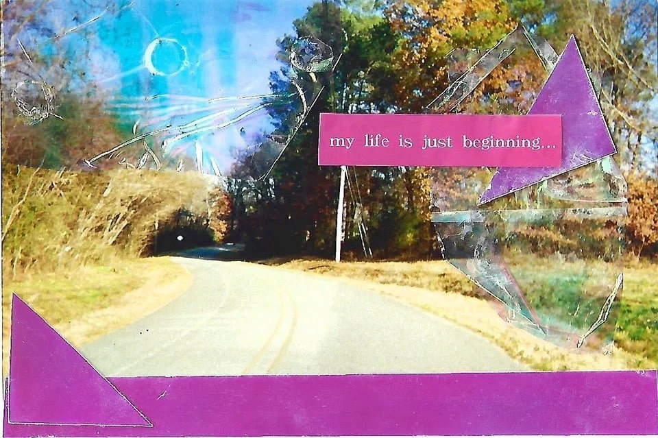
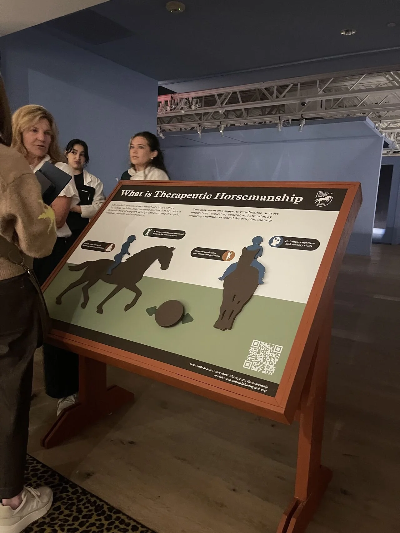 Therapeutic Horsemanship sign · SCAD FASH 2024
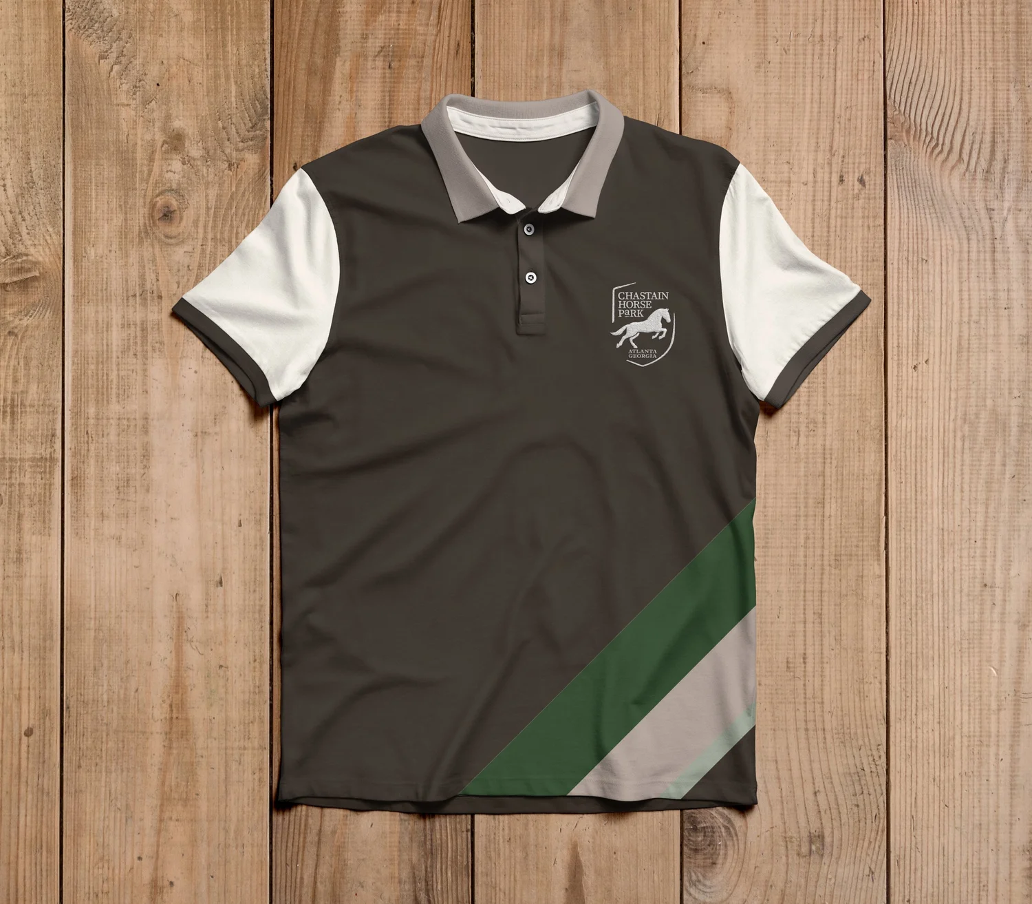 Polo shirt
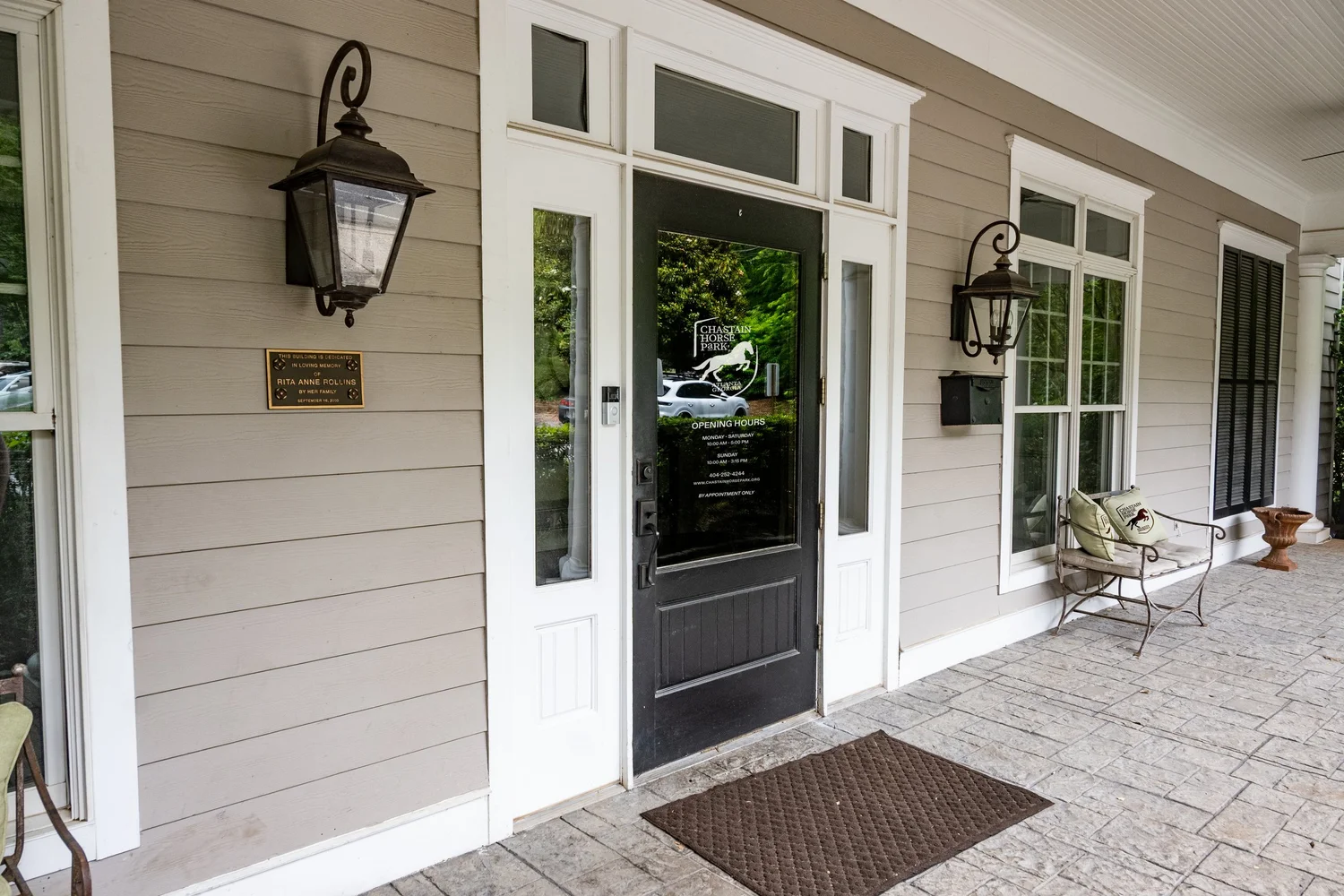 Signage
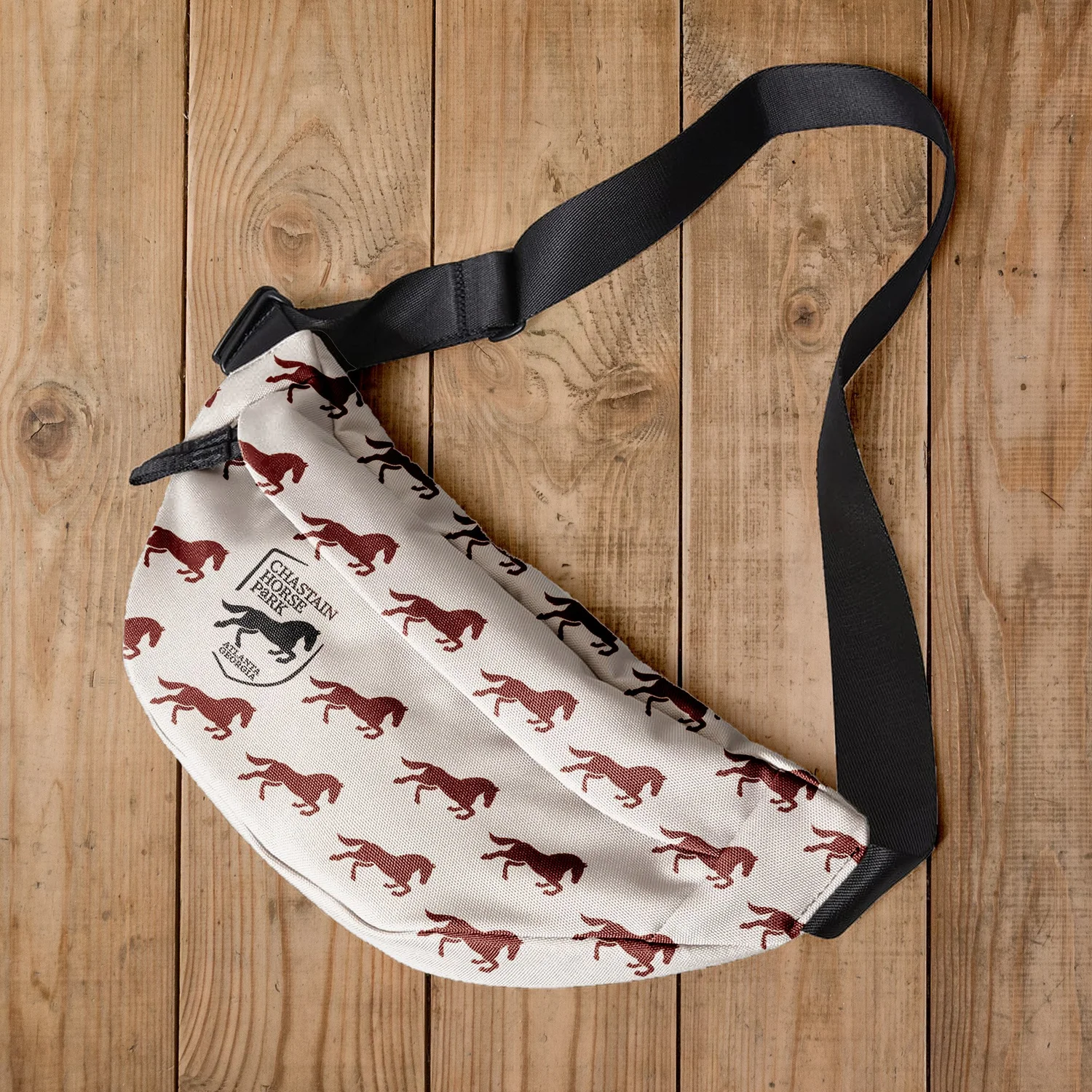 Merchandise
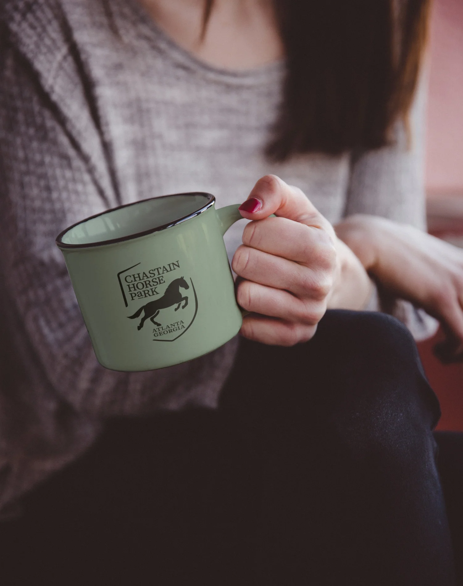 Mug
Mug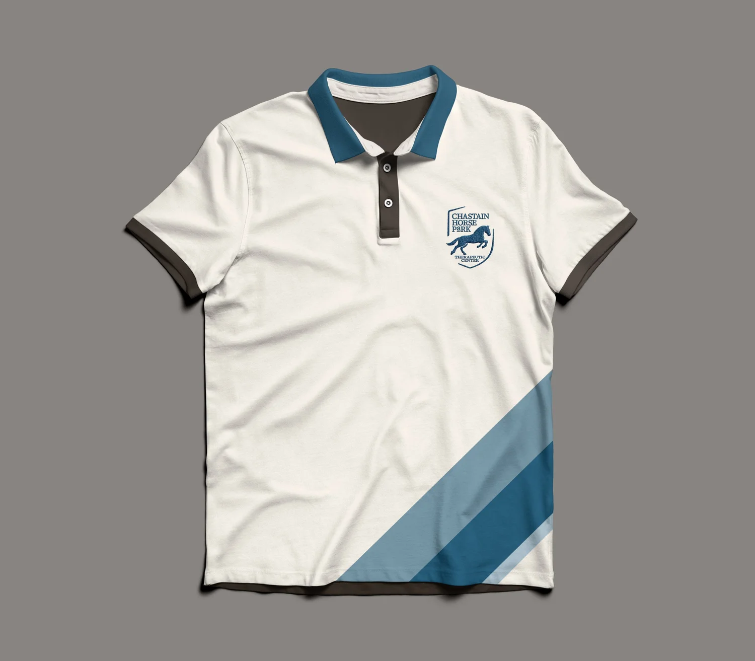 Therapy variant
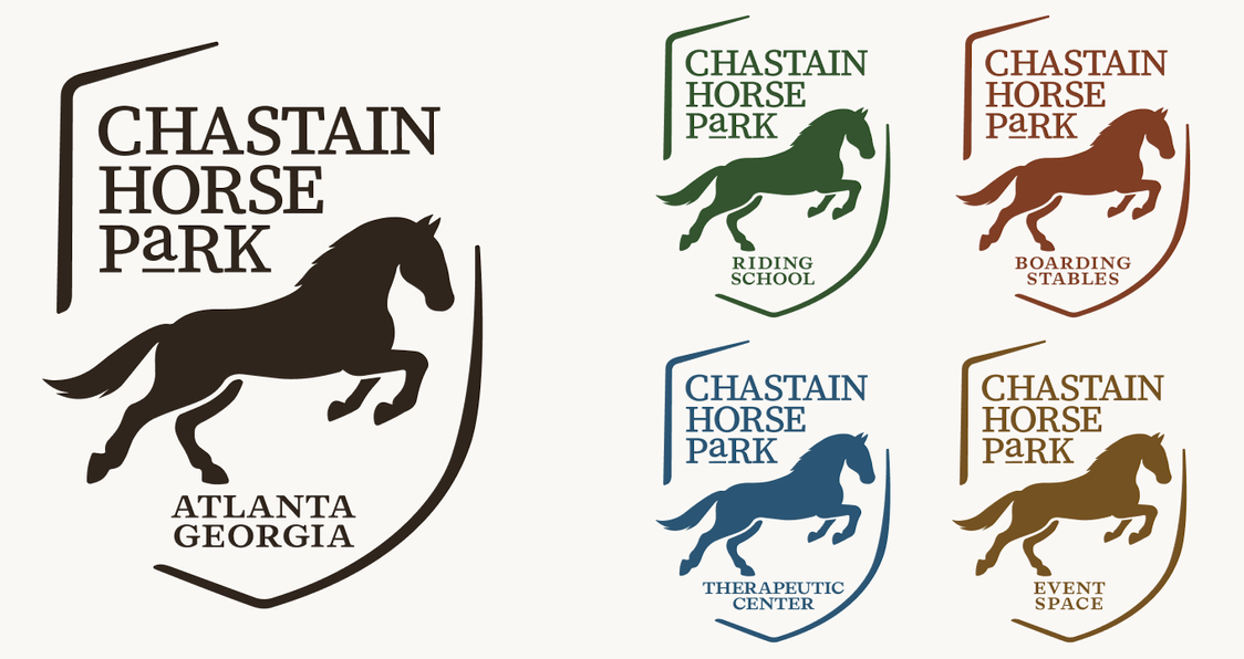
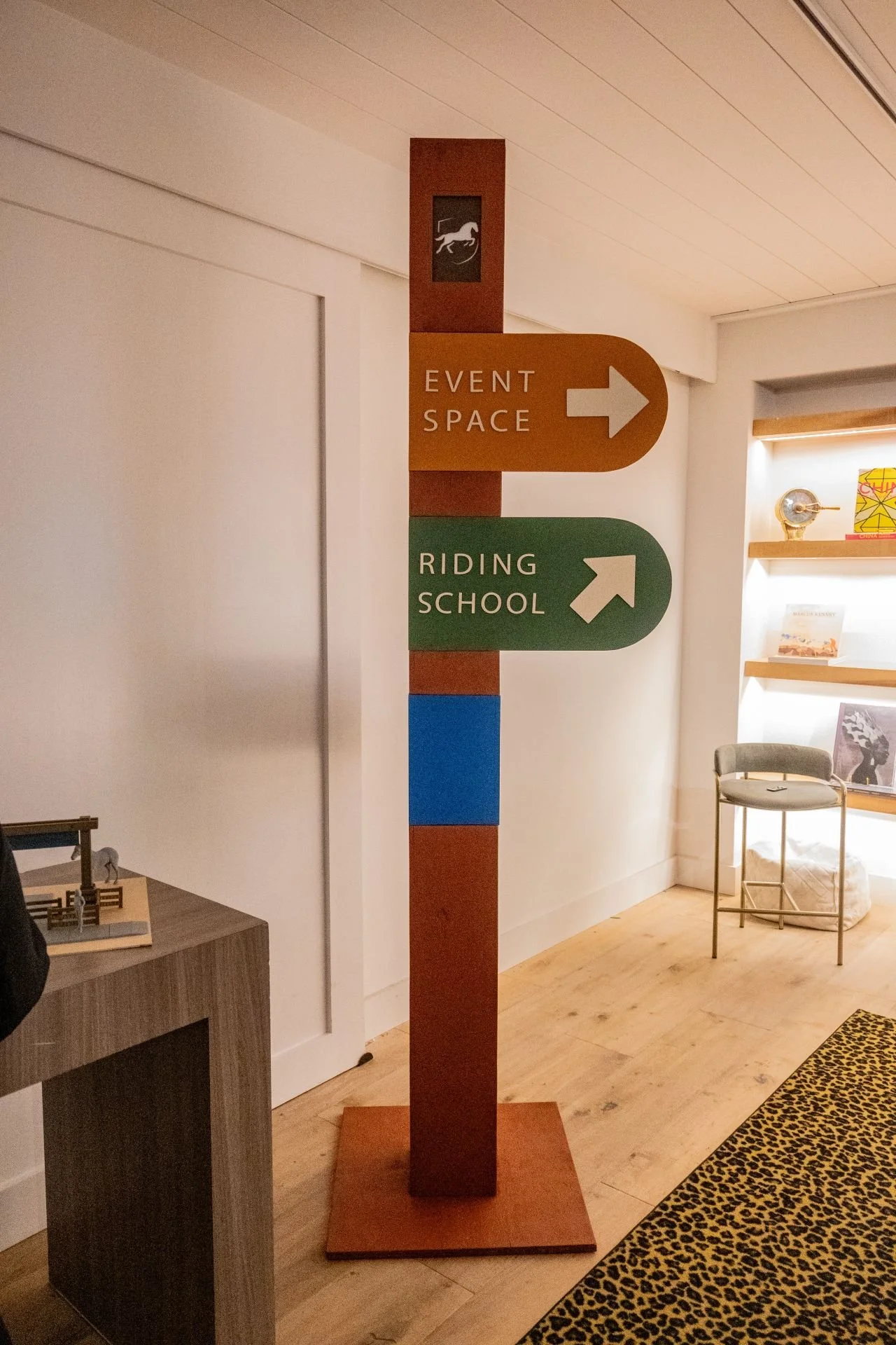 Identity
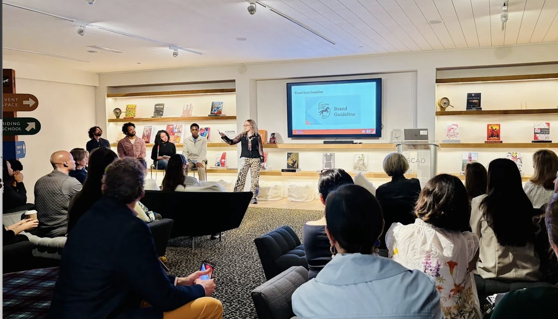 SCAD FASH 2024 presentation
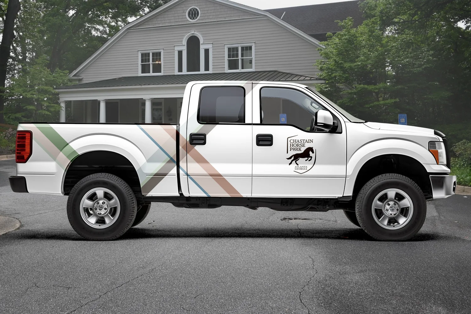 Vehicle wrap
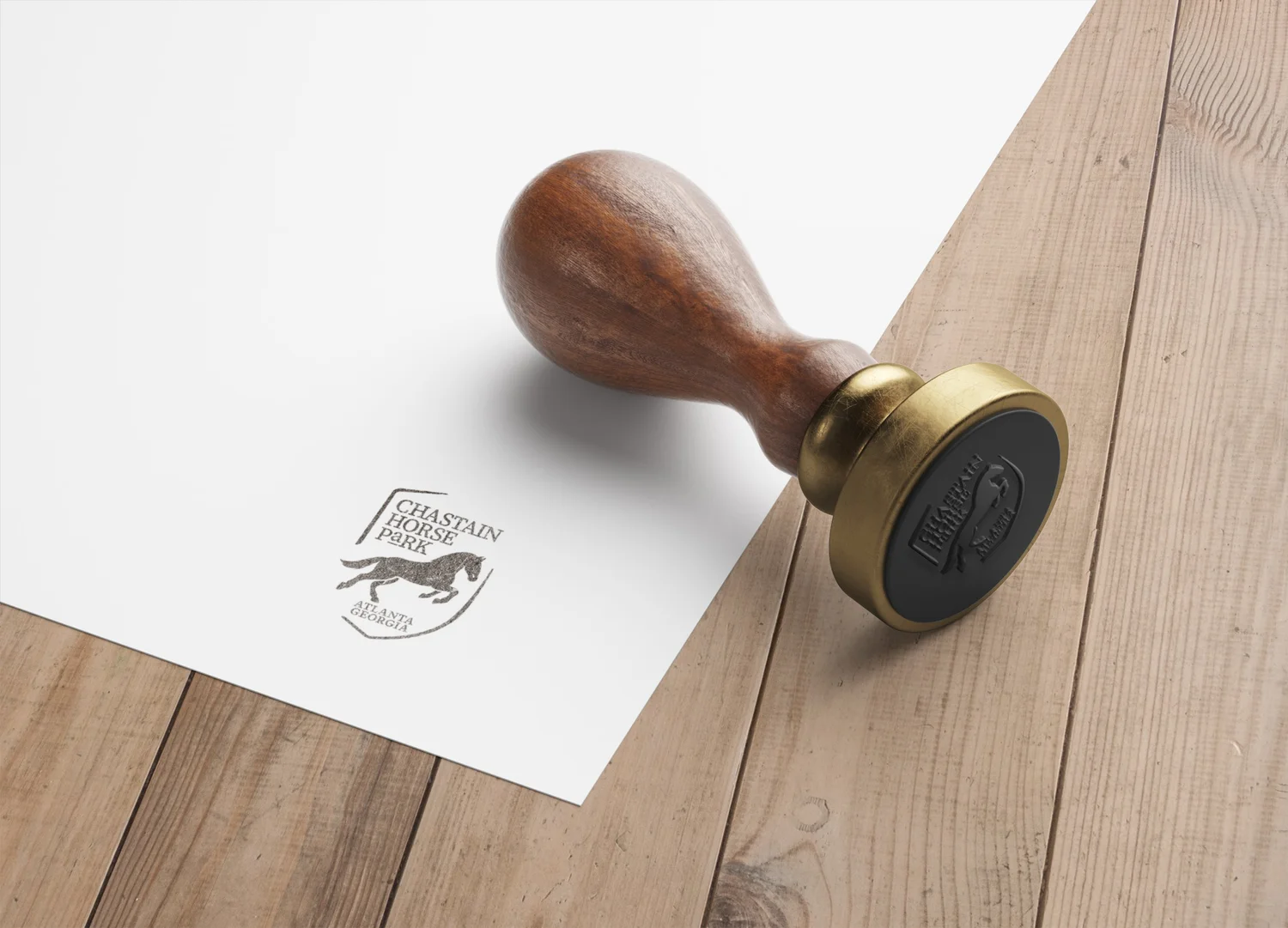 Stamp
Stamp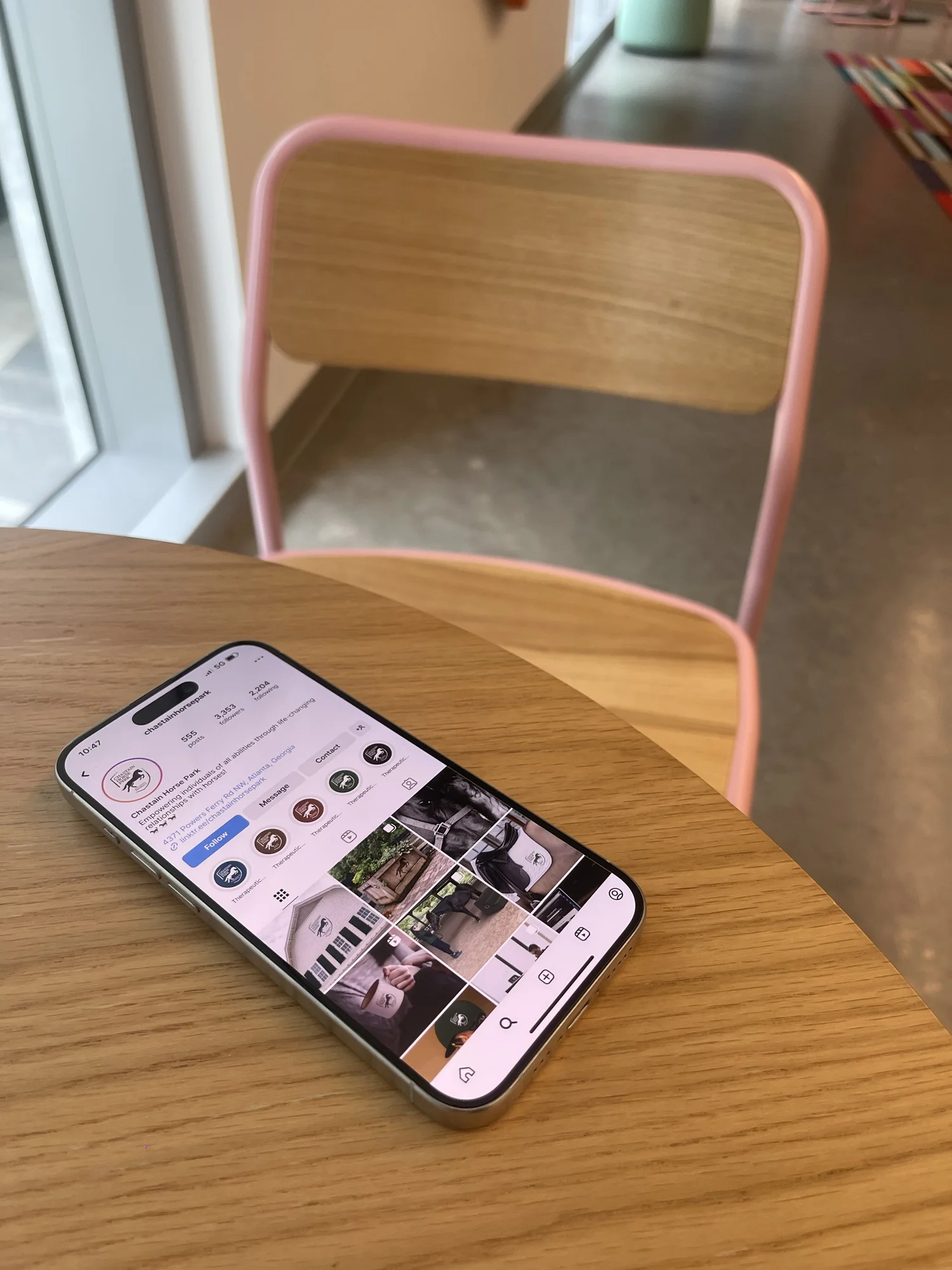 Social media
Argentine American designer, photographer, and creative technologist. BFA SCAD · MFA Design & Technology, Parsons '27. New York.
I'm Pilar Liotta — Argentine American designer, photographer, and creative technologist. My practice spans branding, editorial, interaction design, and creative code, always led by color, curiosity, and the space where visual systems meet human behavior.
MFA Design & Technology, Parsons 2027. BFA Graphic Design + Photography, SCAD. Impact Entrepreneurship Fellow with Re:Frame, a media literacy platform. Based in New York.
Therapeutic Horsemanship sign · SCAD FASH 2024Polo shirtSignageMerchandiseMugTherapy variantIdentitySCAD FASH 2024 presentationVehicle wrapStampSocial media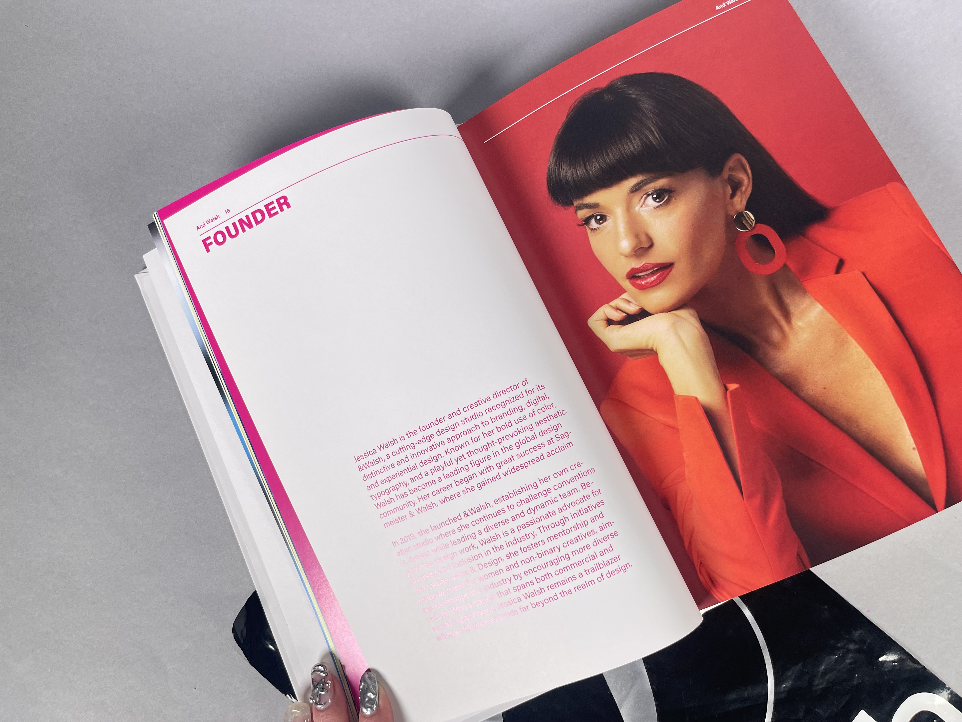
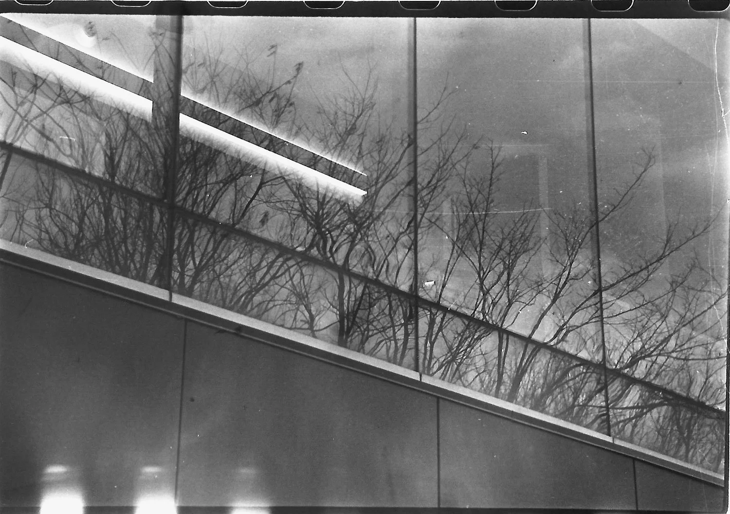
 Edited spread
 Book cover
 Interior
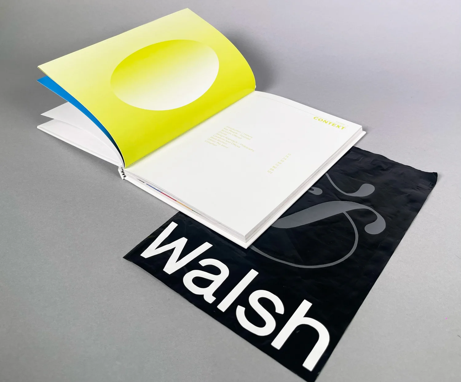 Detail
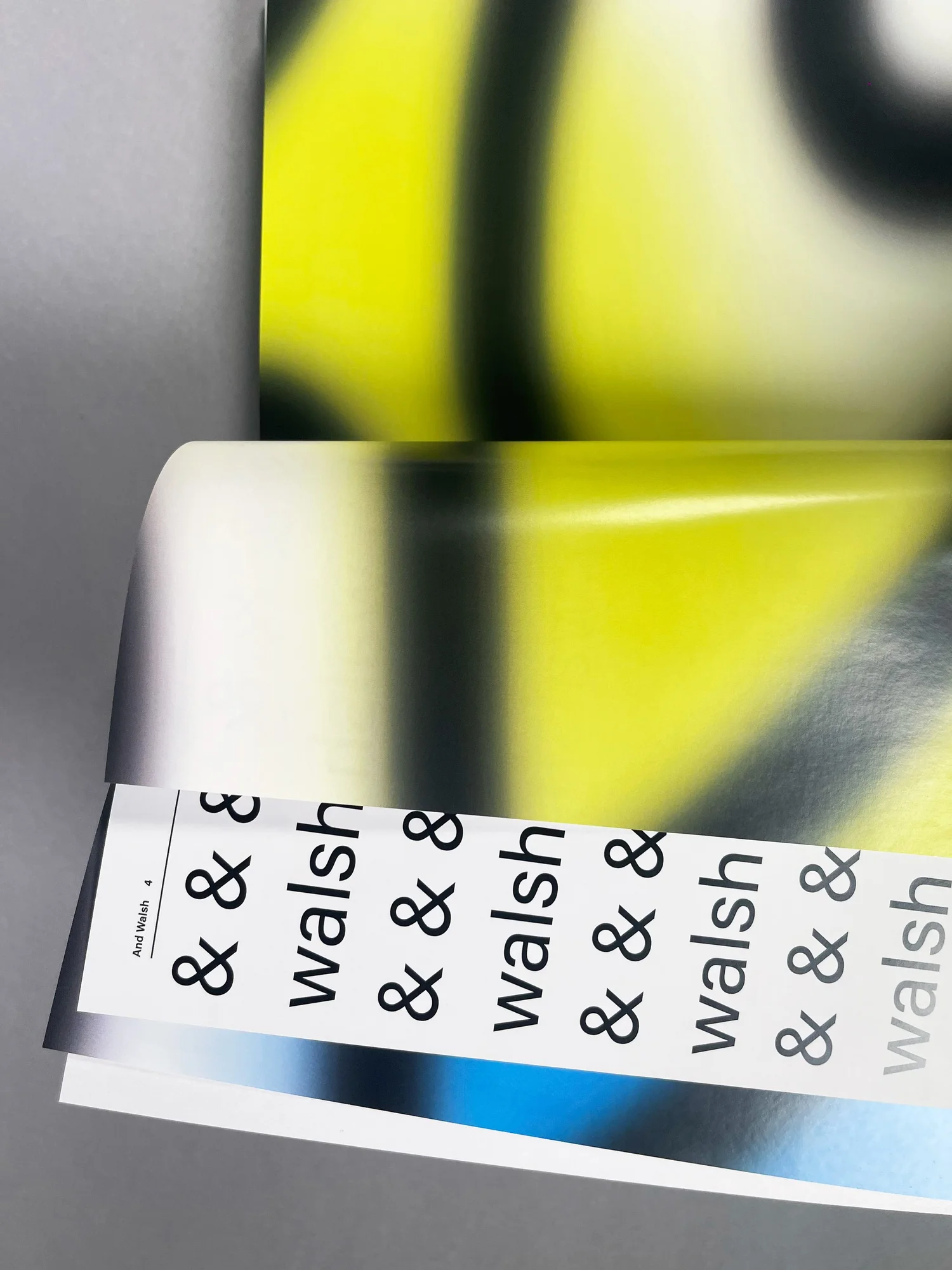 Layout
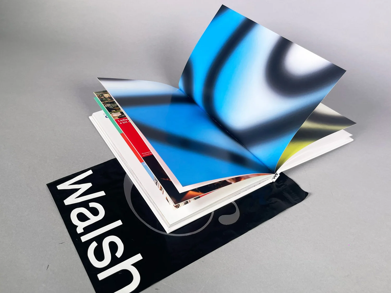 Pages
Pages
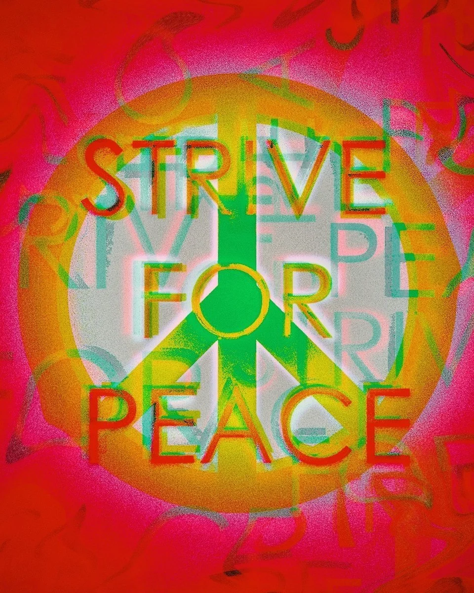
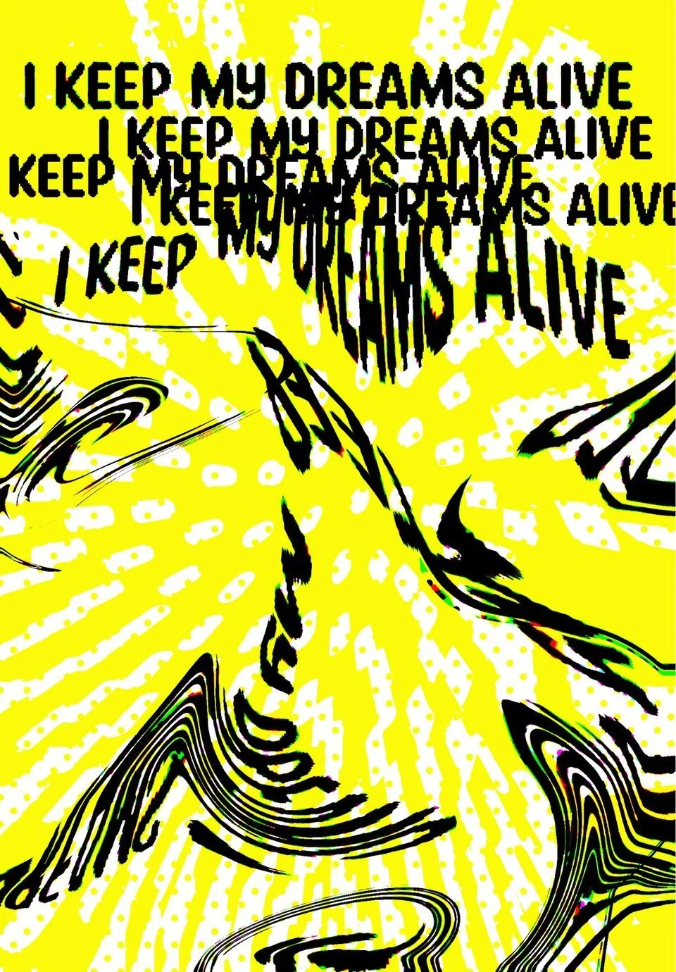
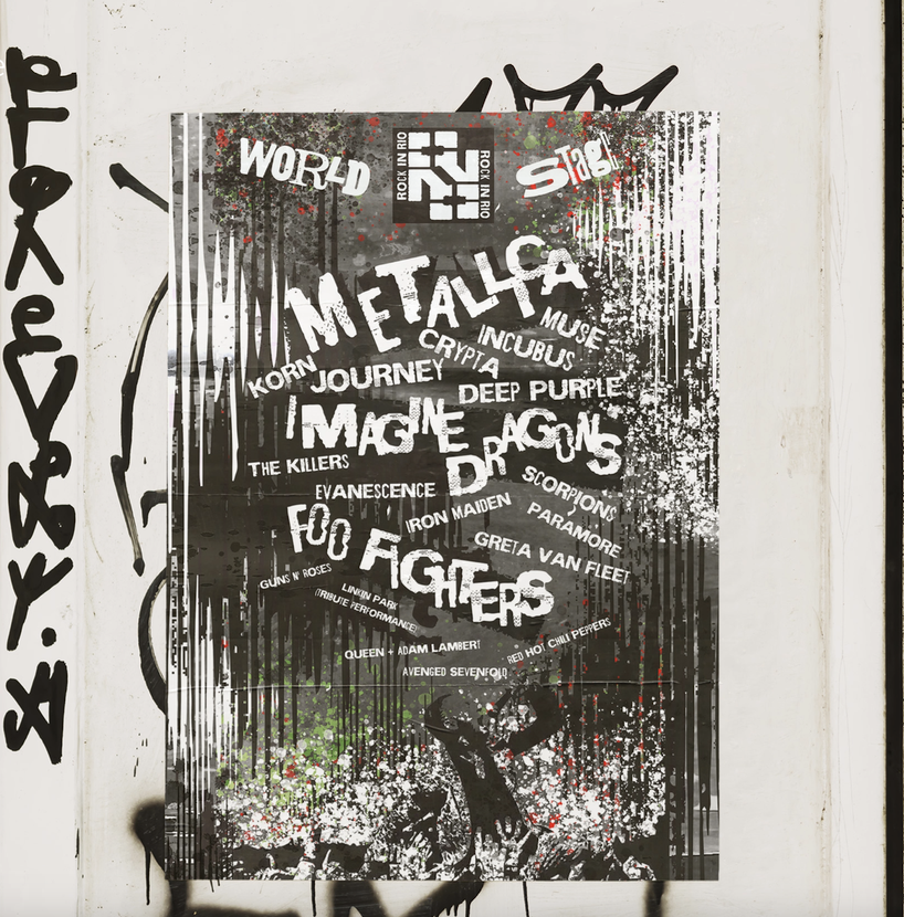 Stage poster
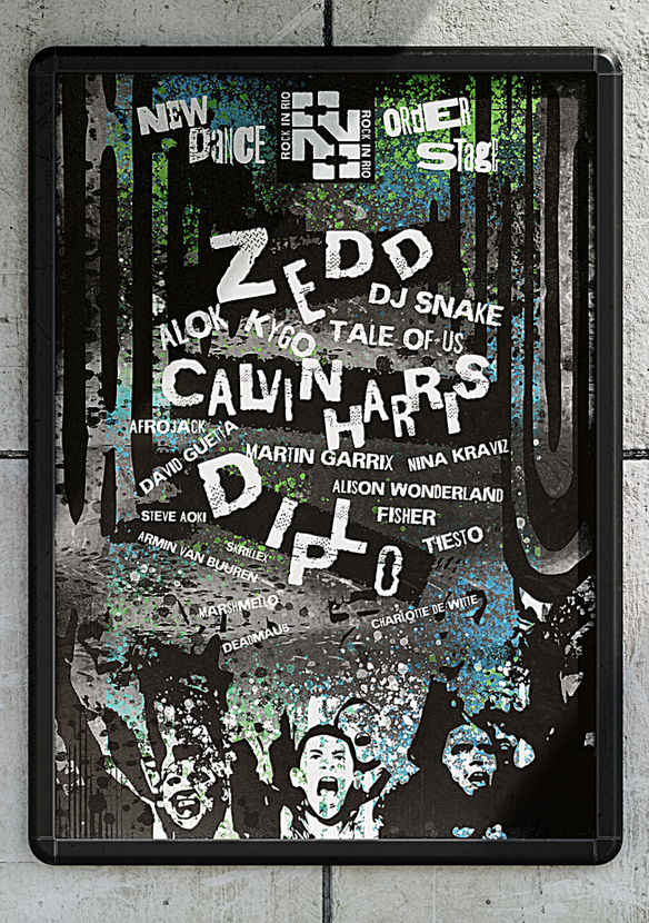 Stage poster 2
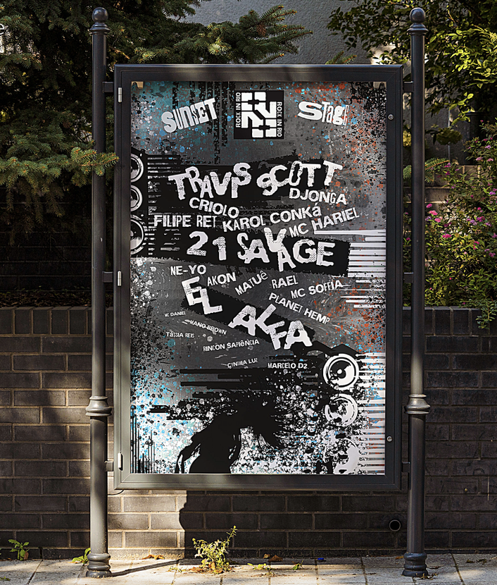 Stage poster 3
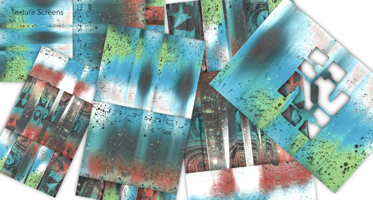 Texture
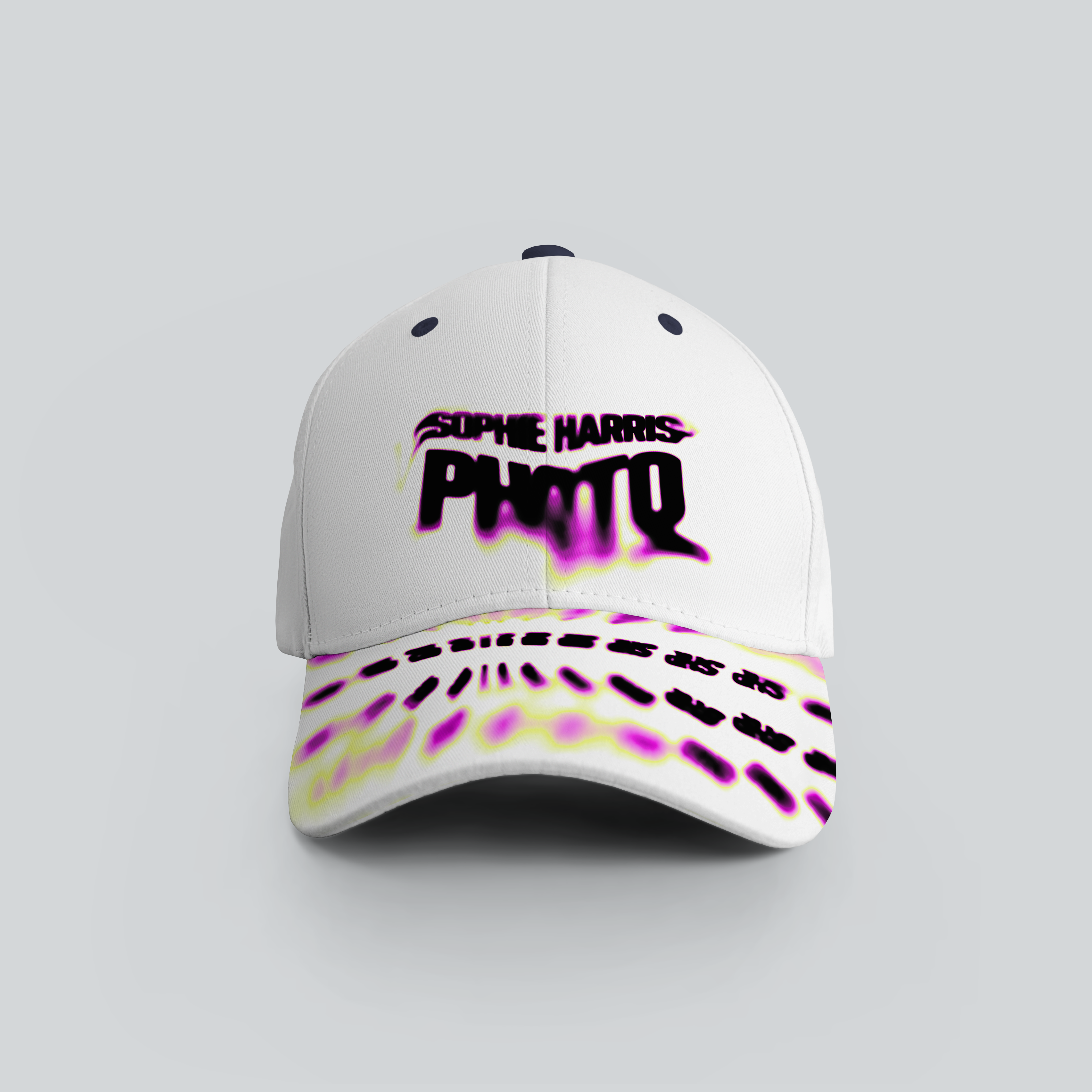
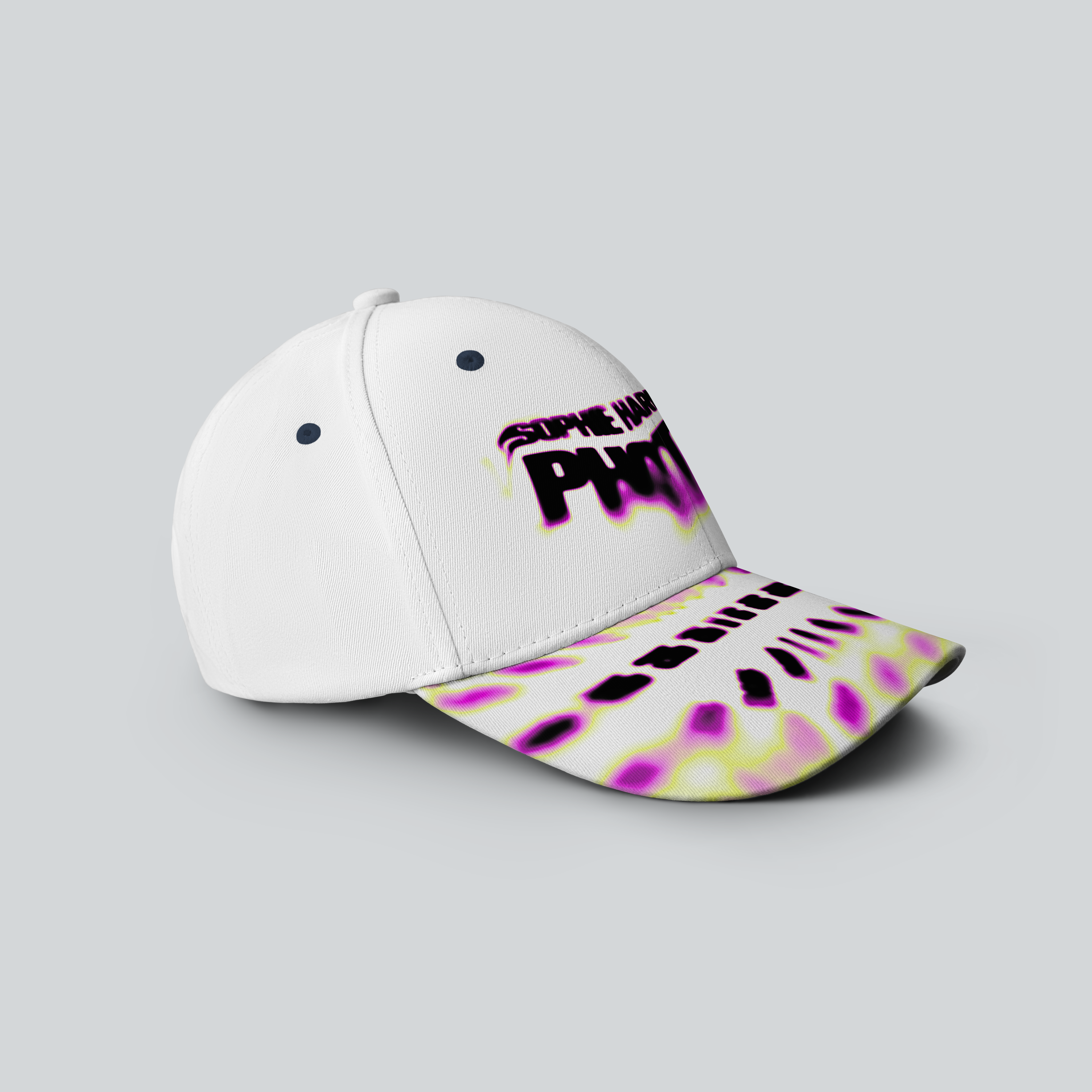
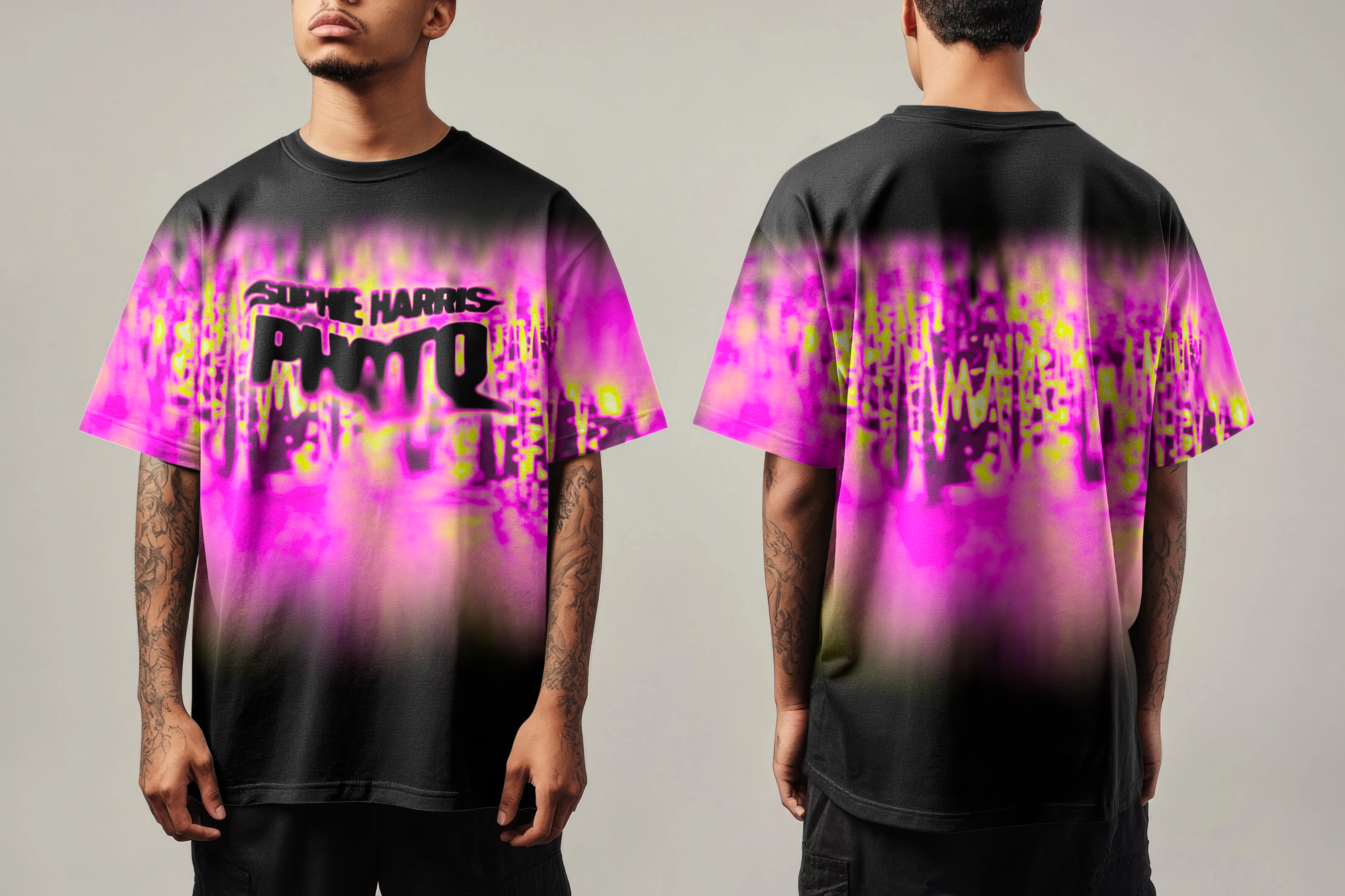
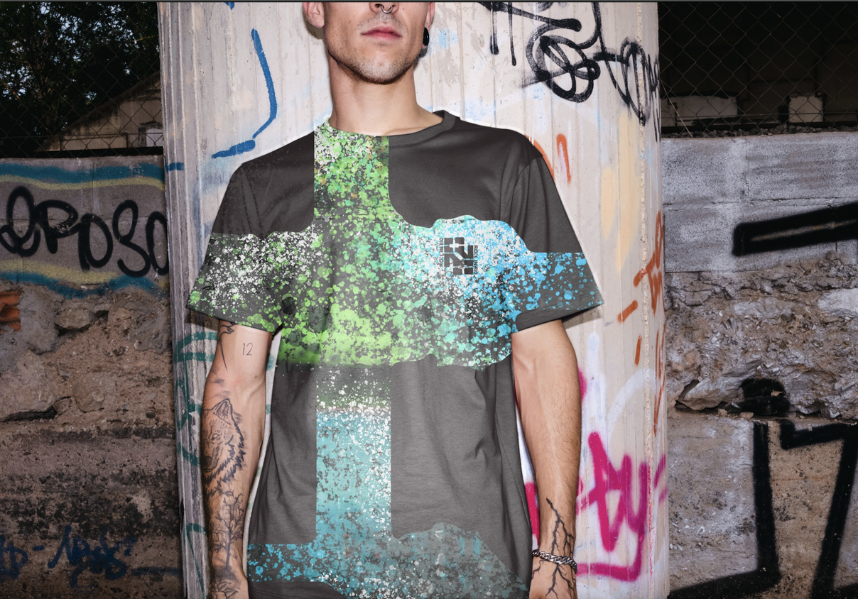 Shirt
Shirt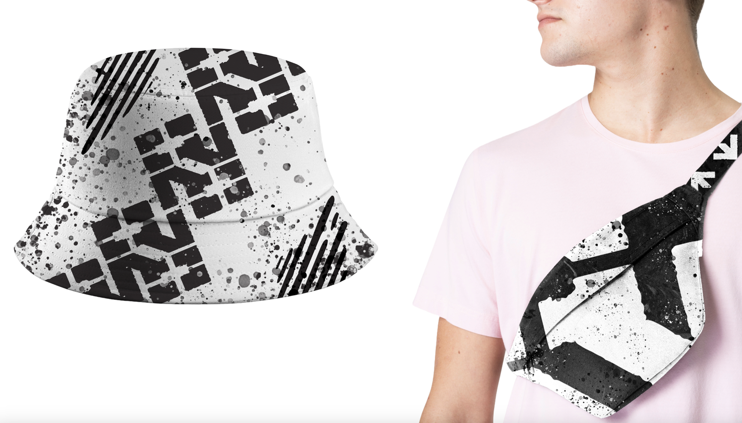 Merchandise
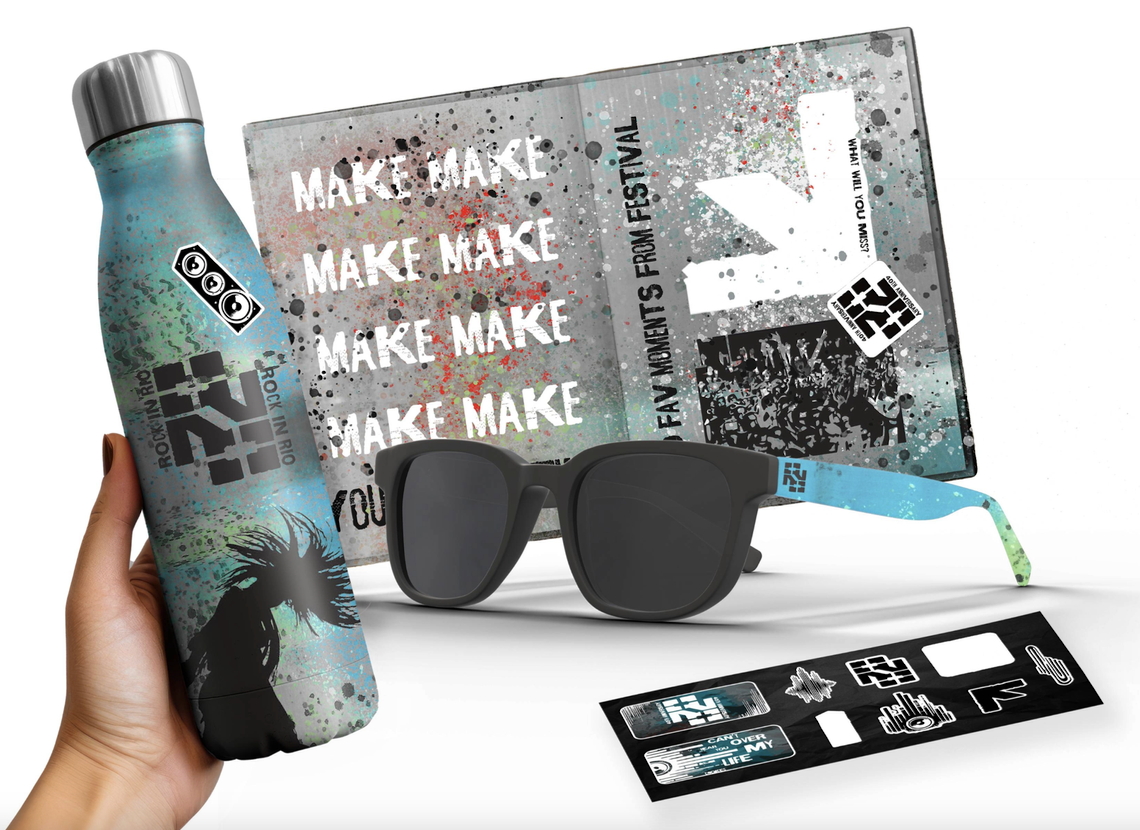 Merchandise 2
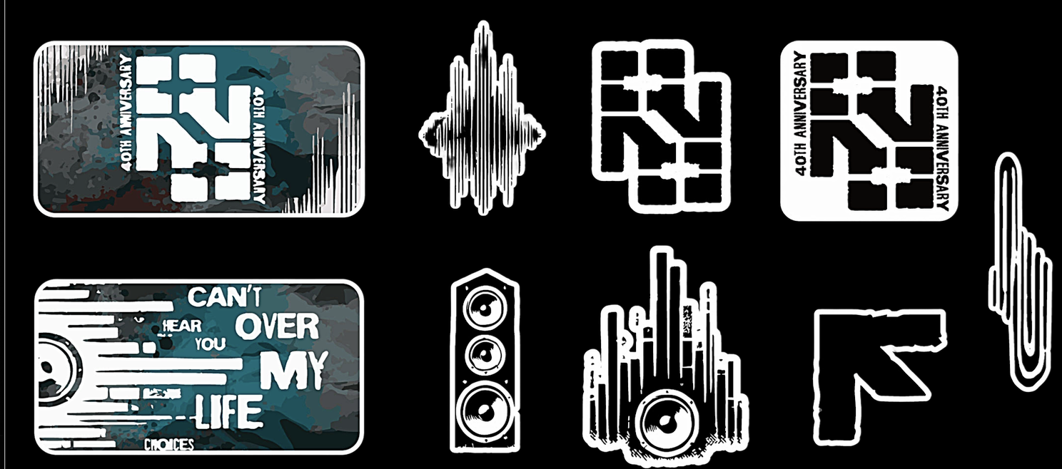 Stickers
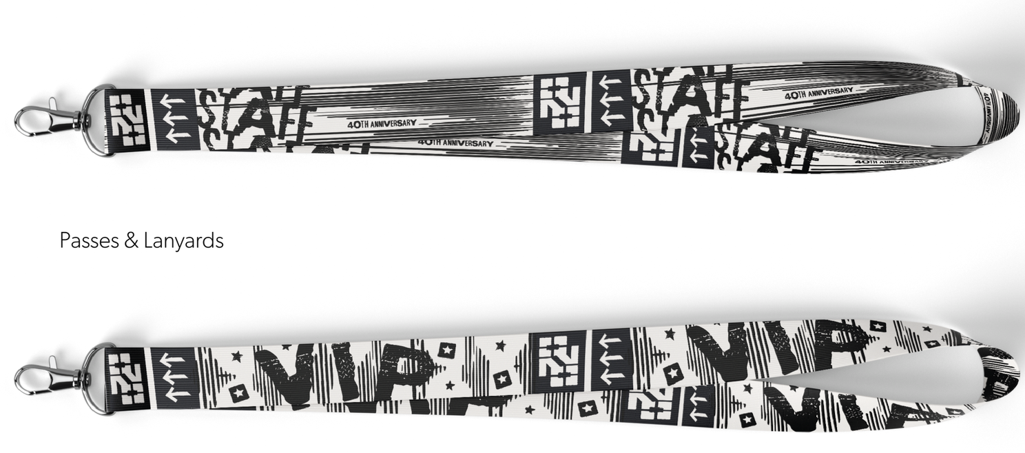 Lanyard
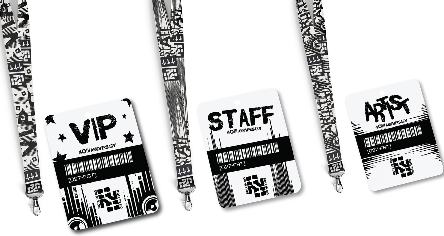 VIP pass
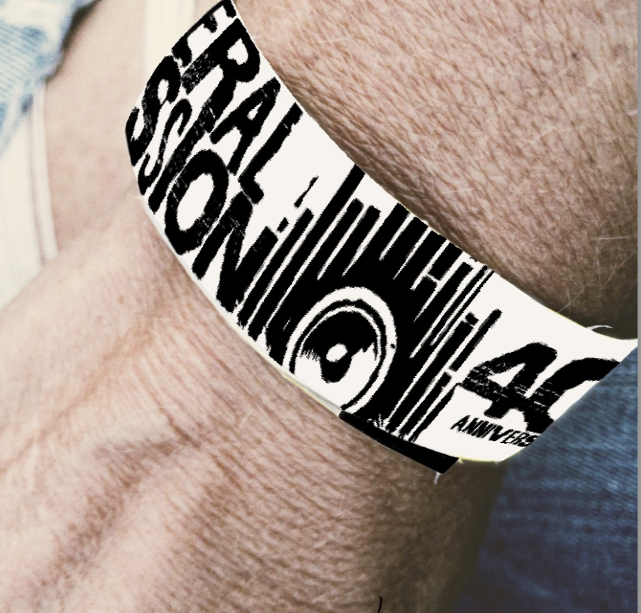 Applied
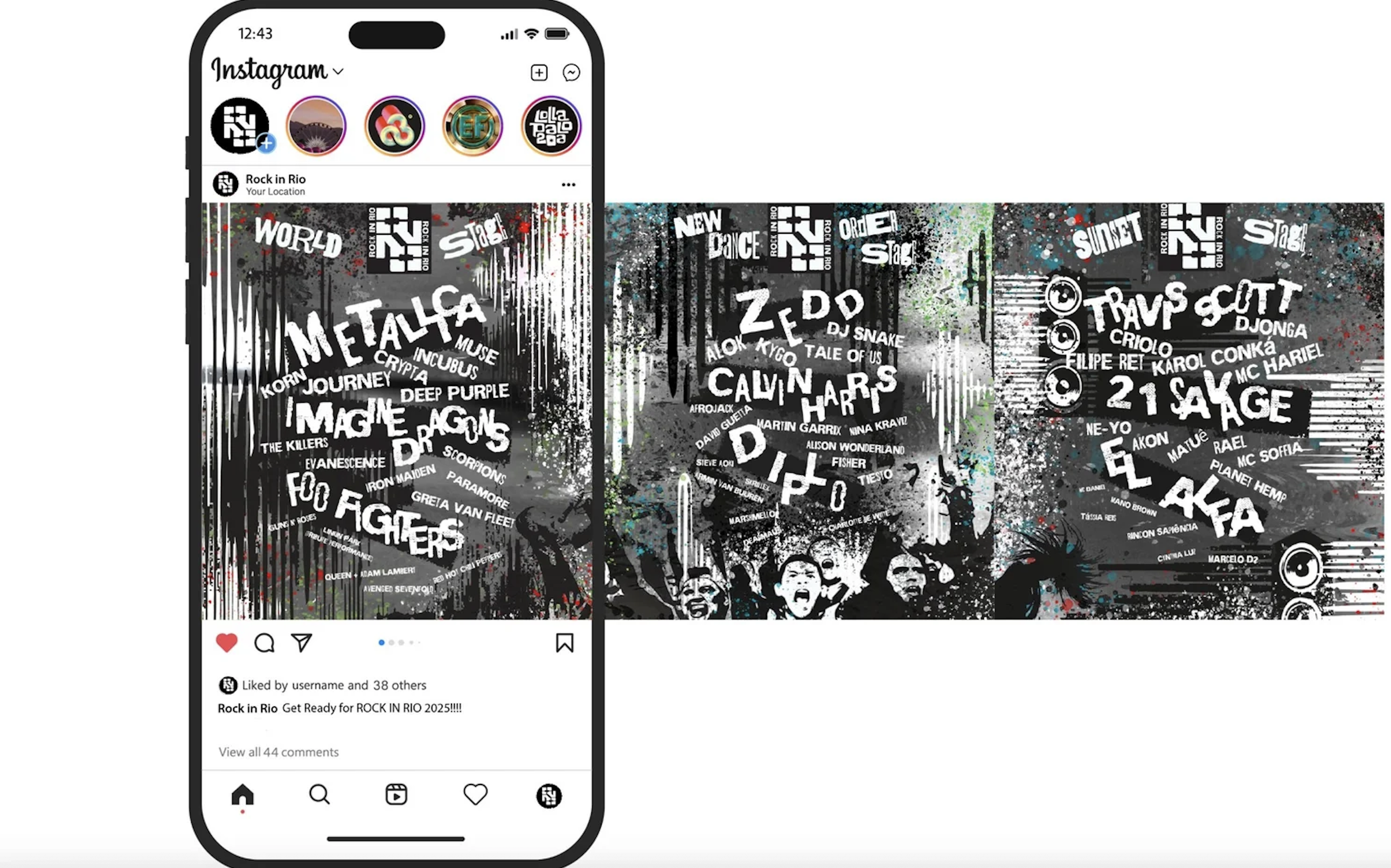 Instagram
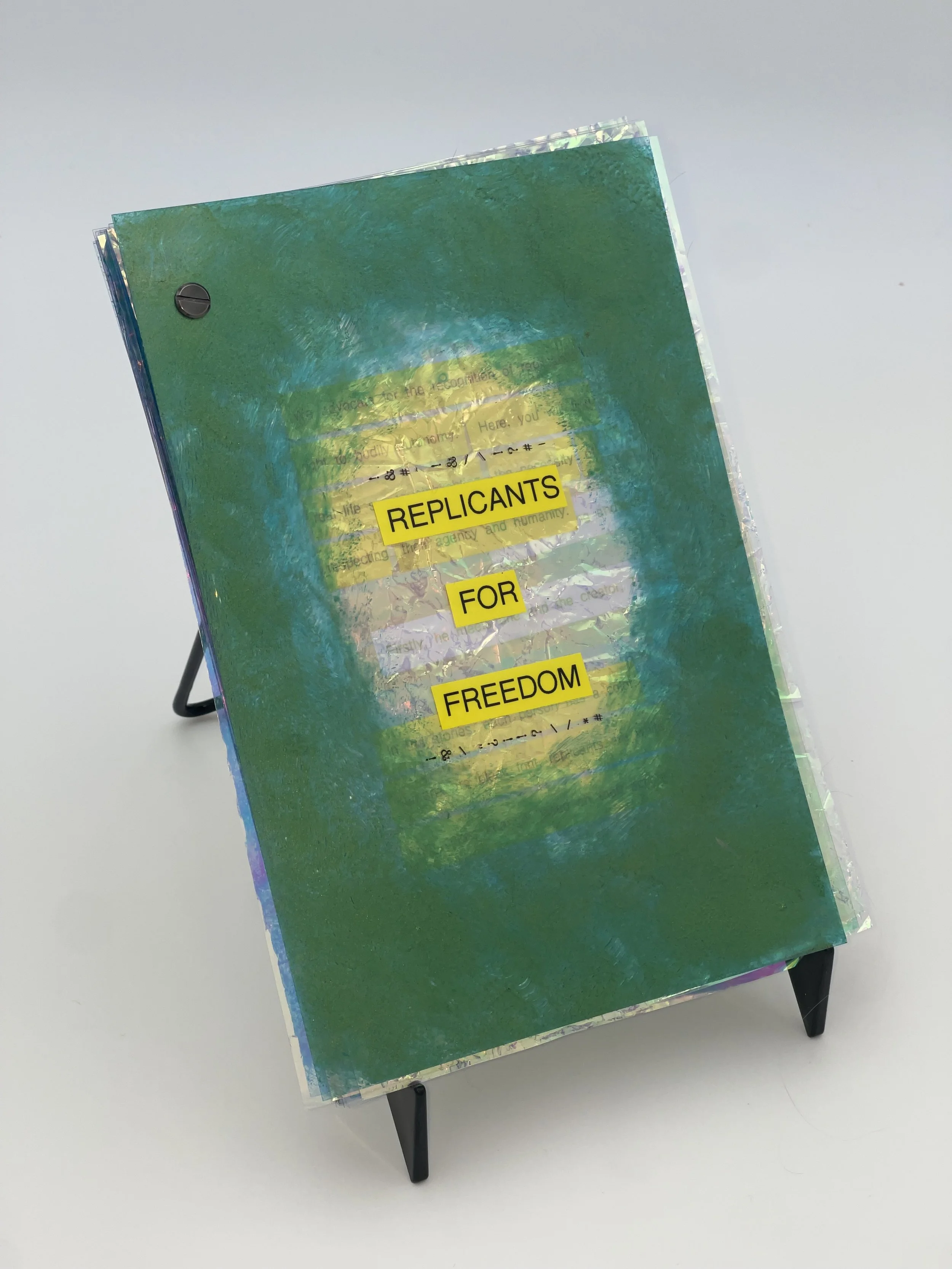 Book spread
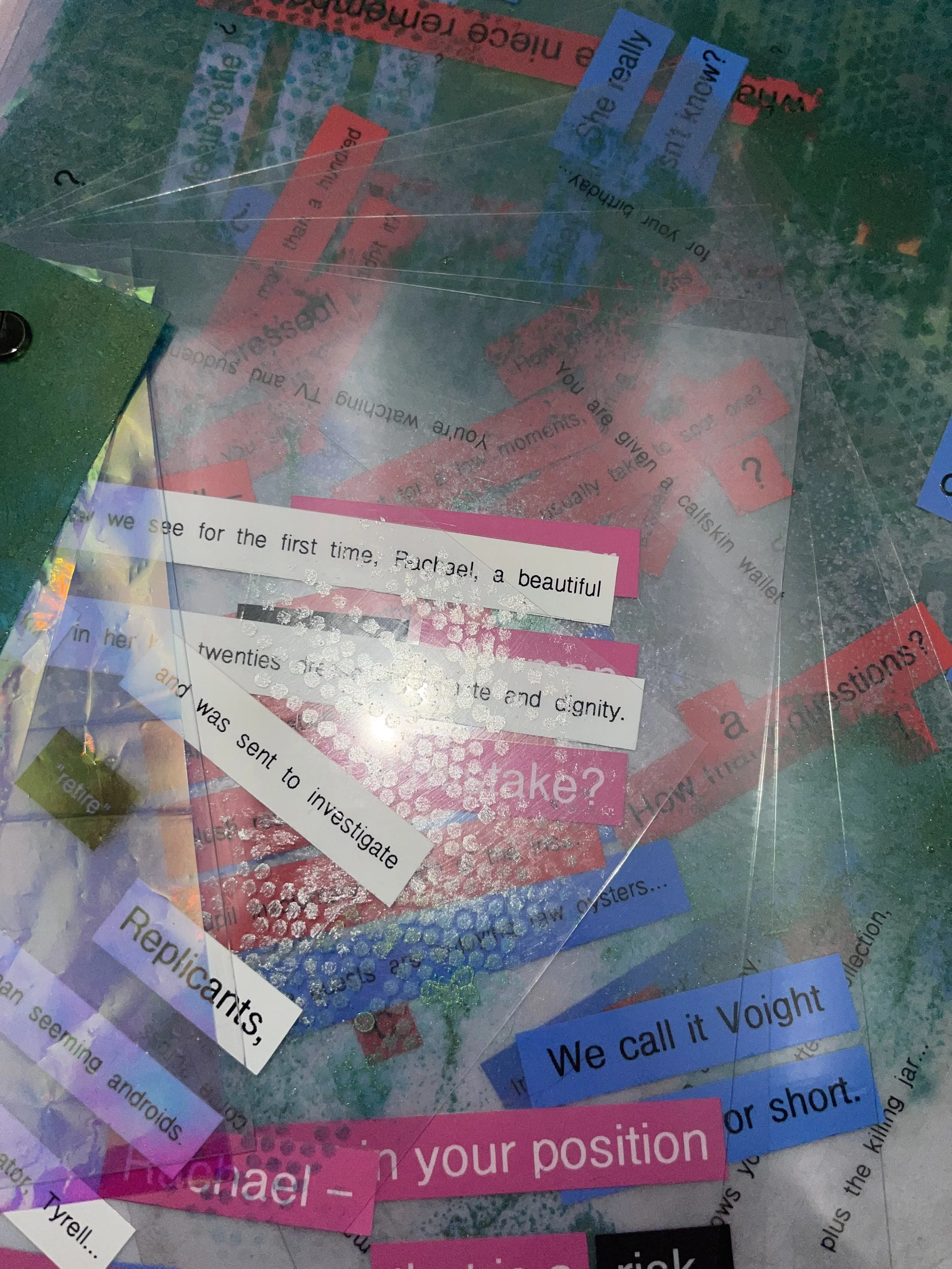 Detail
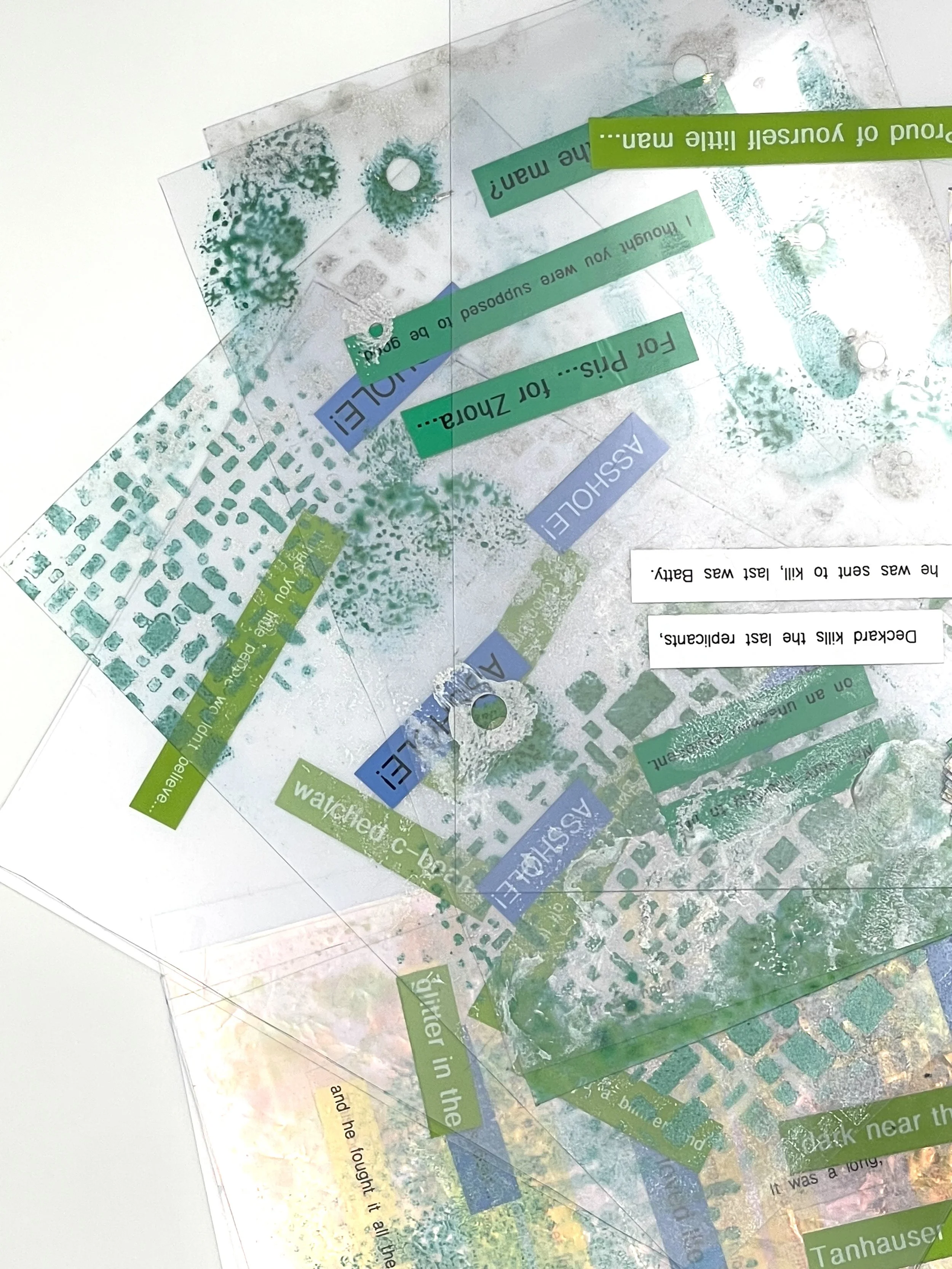 Material
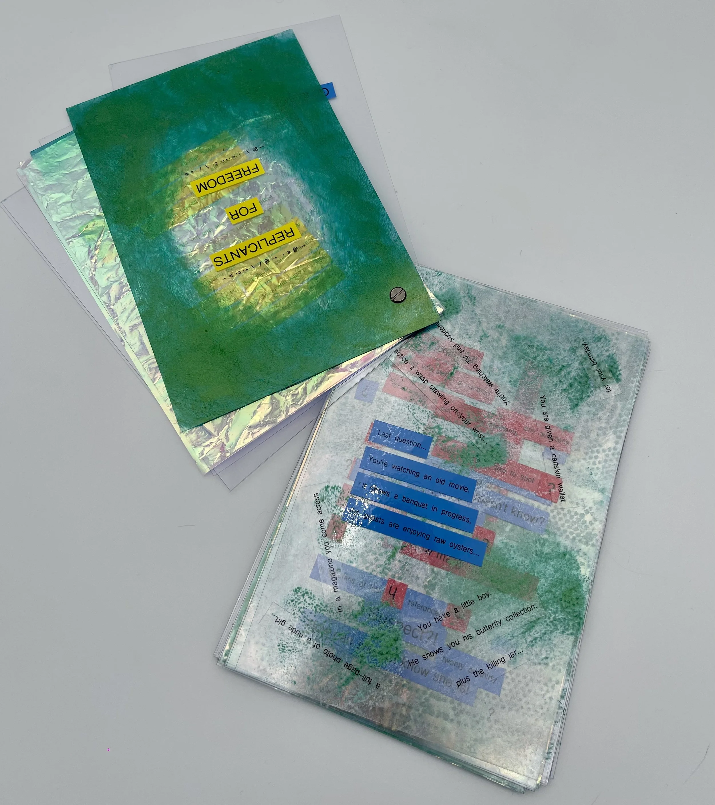 Pages
Pages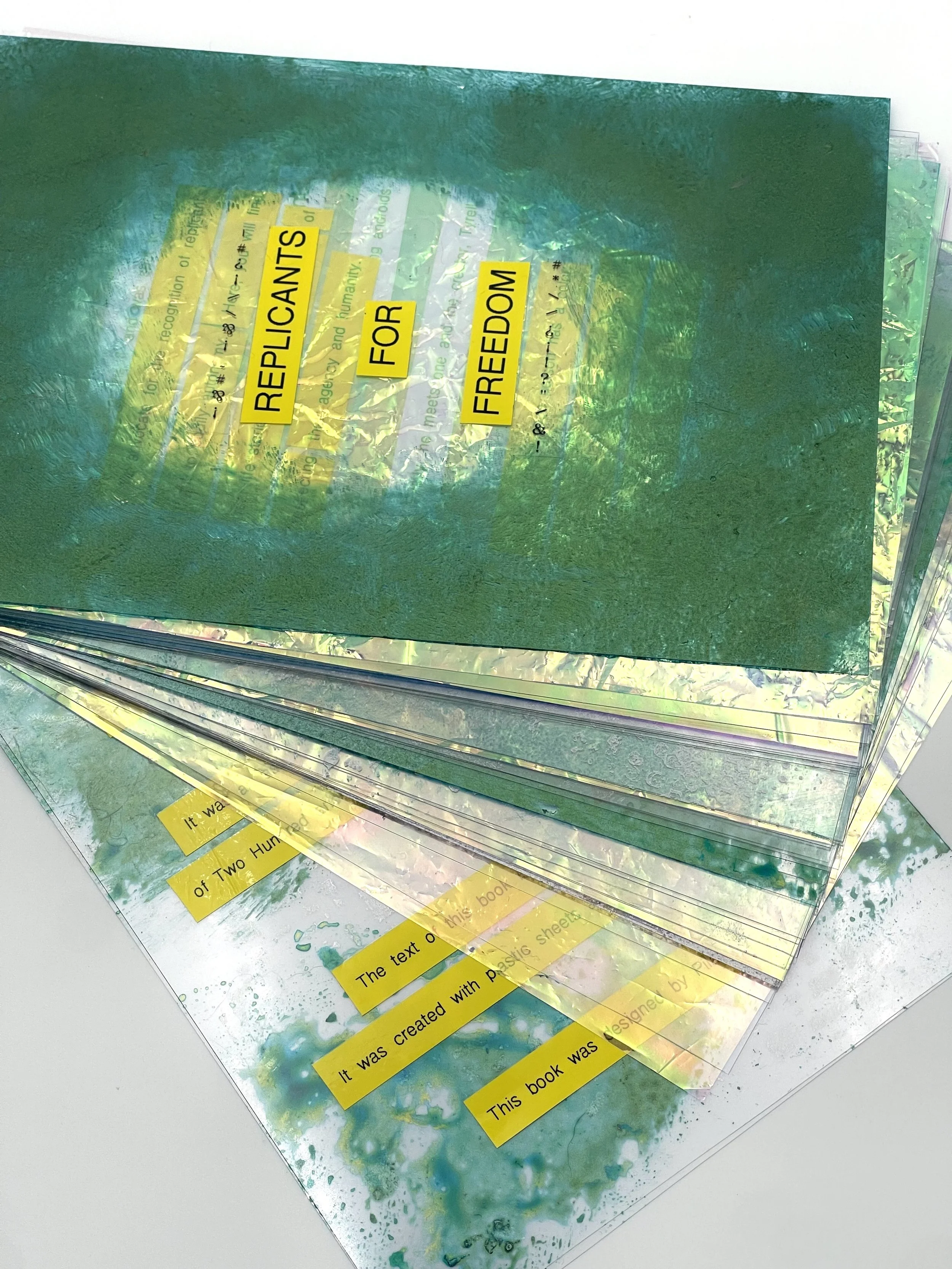 Cover
Cover
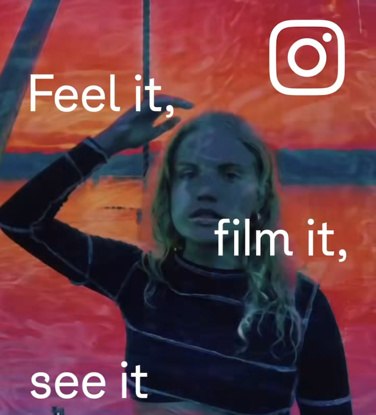
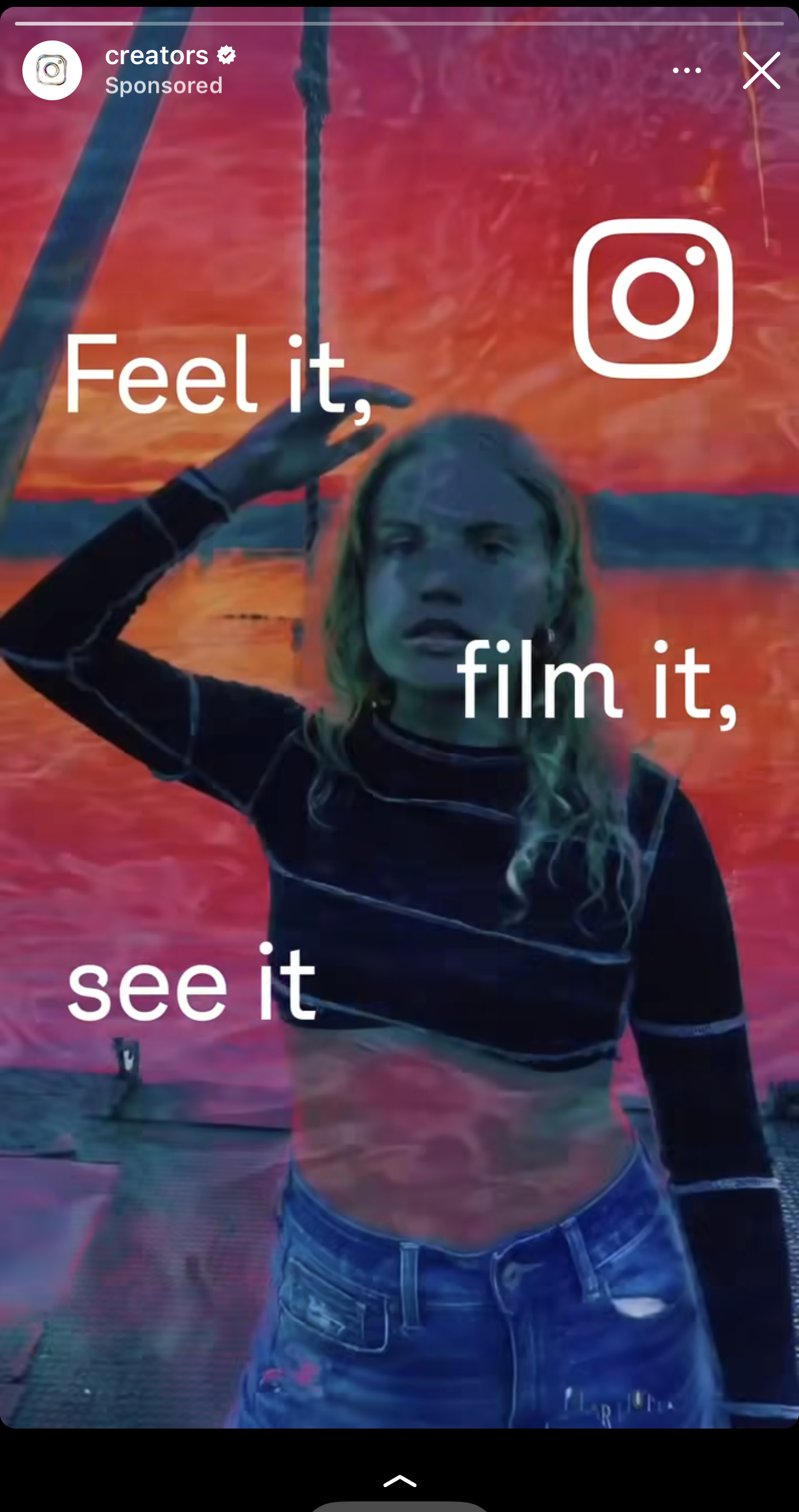
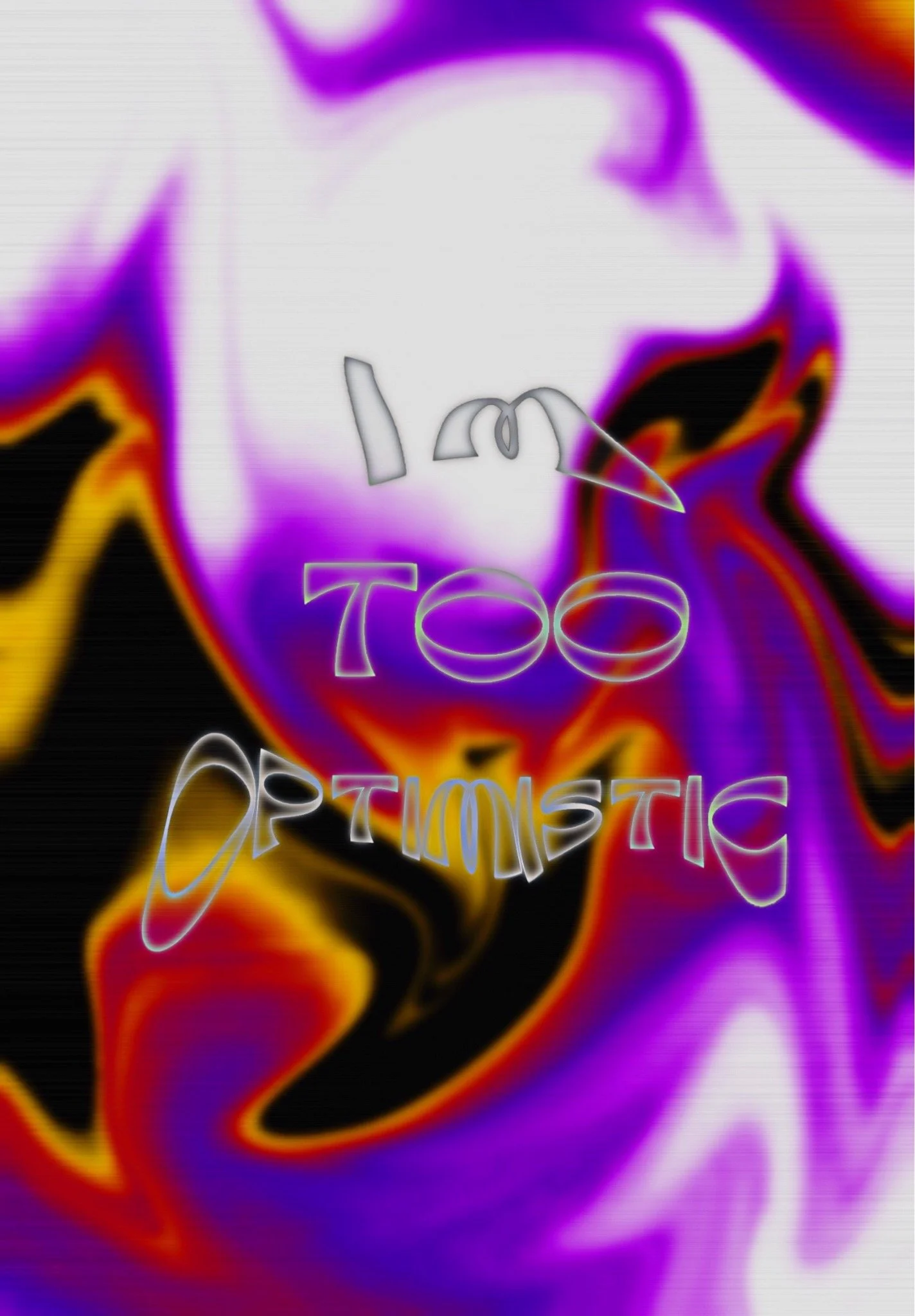
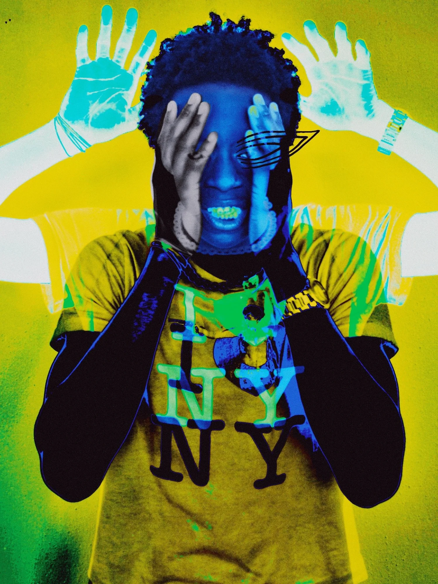
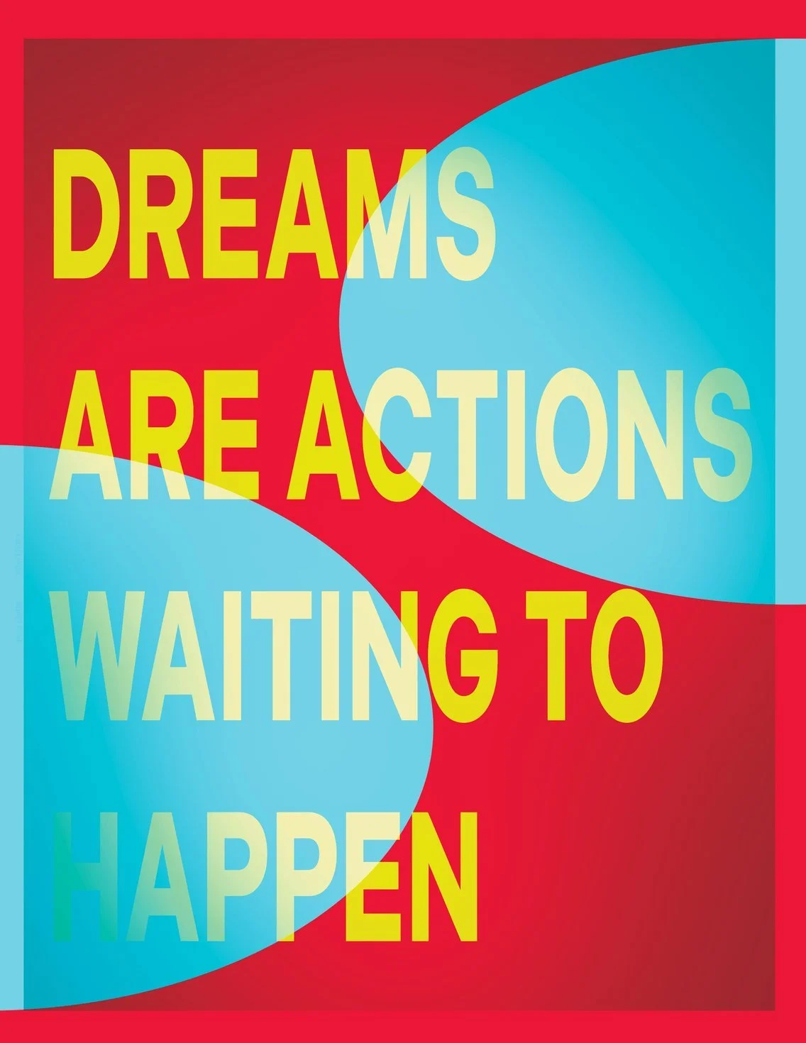
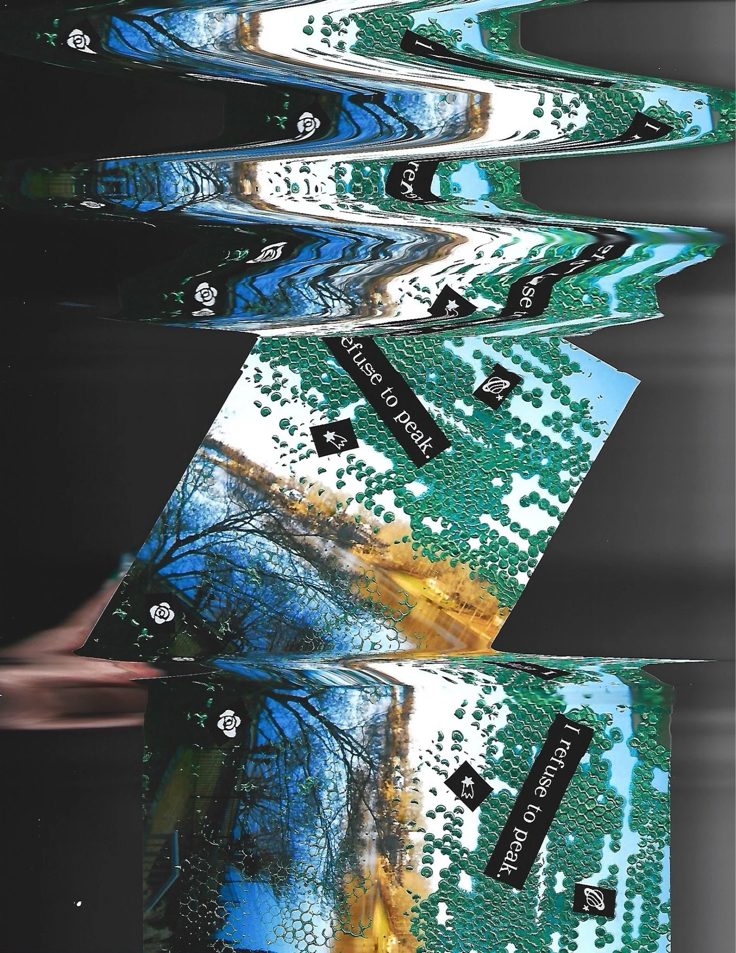
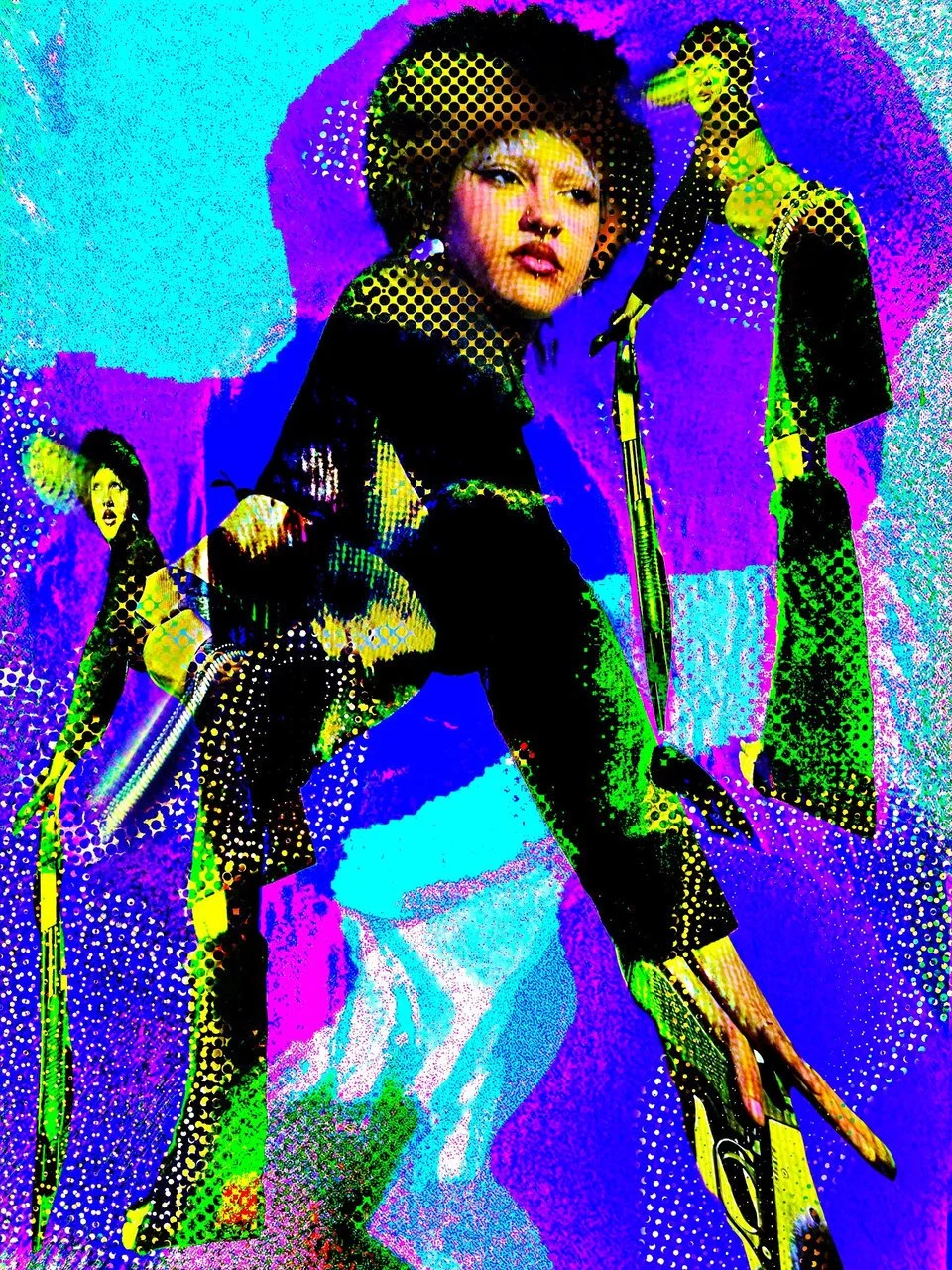
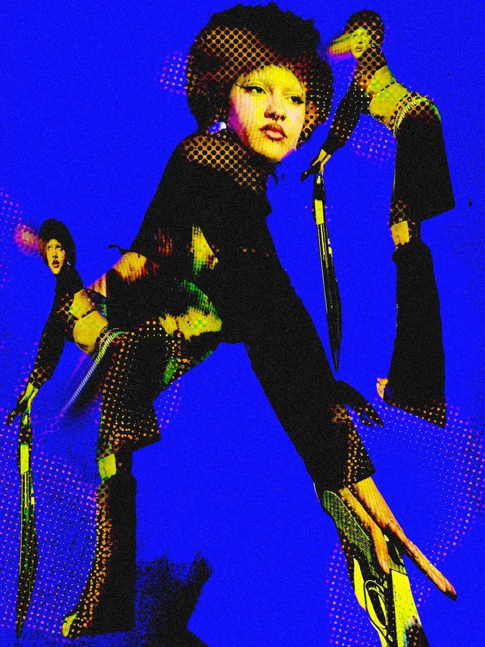
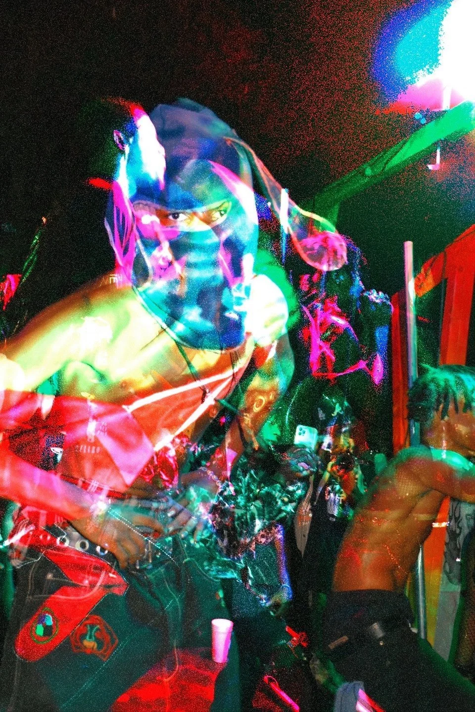
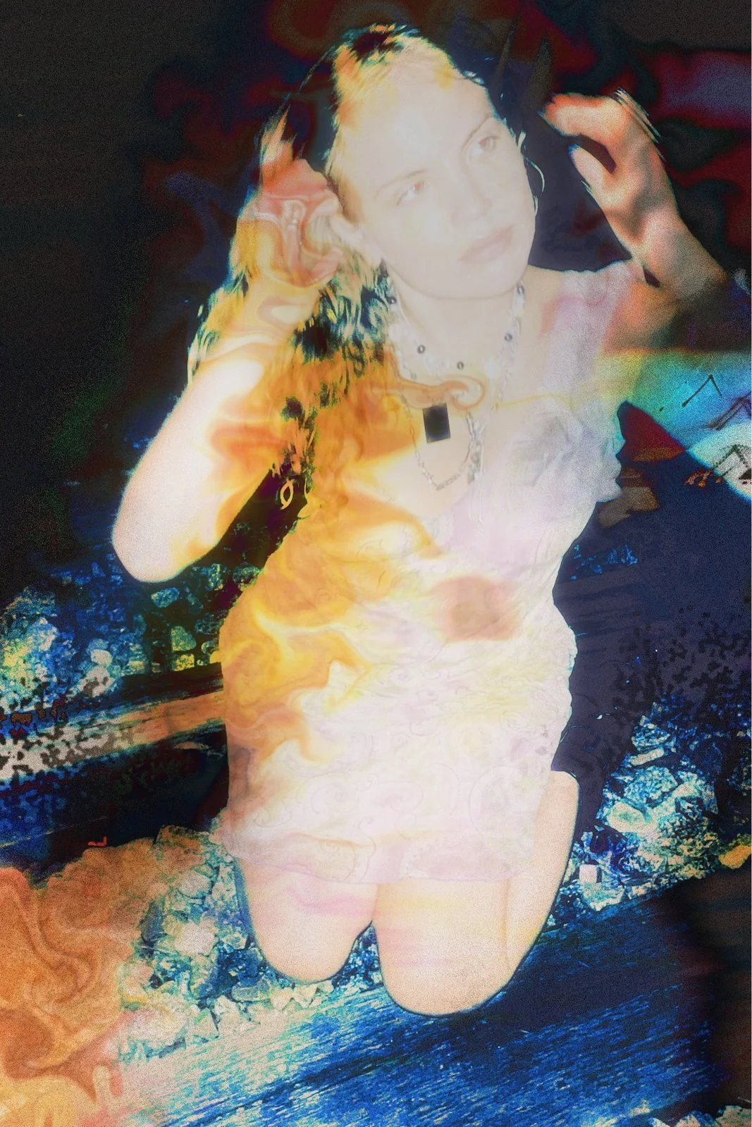
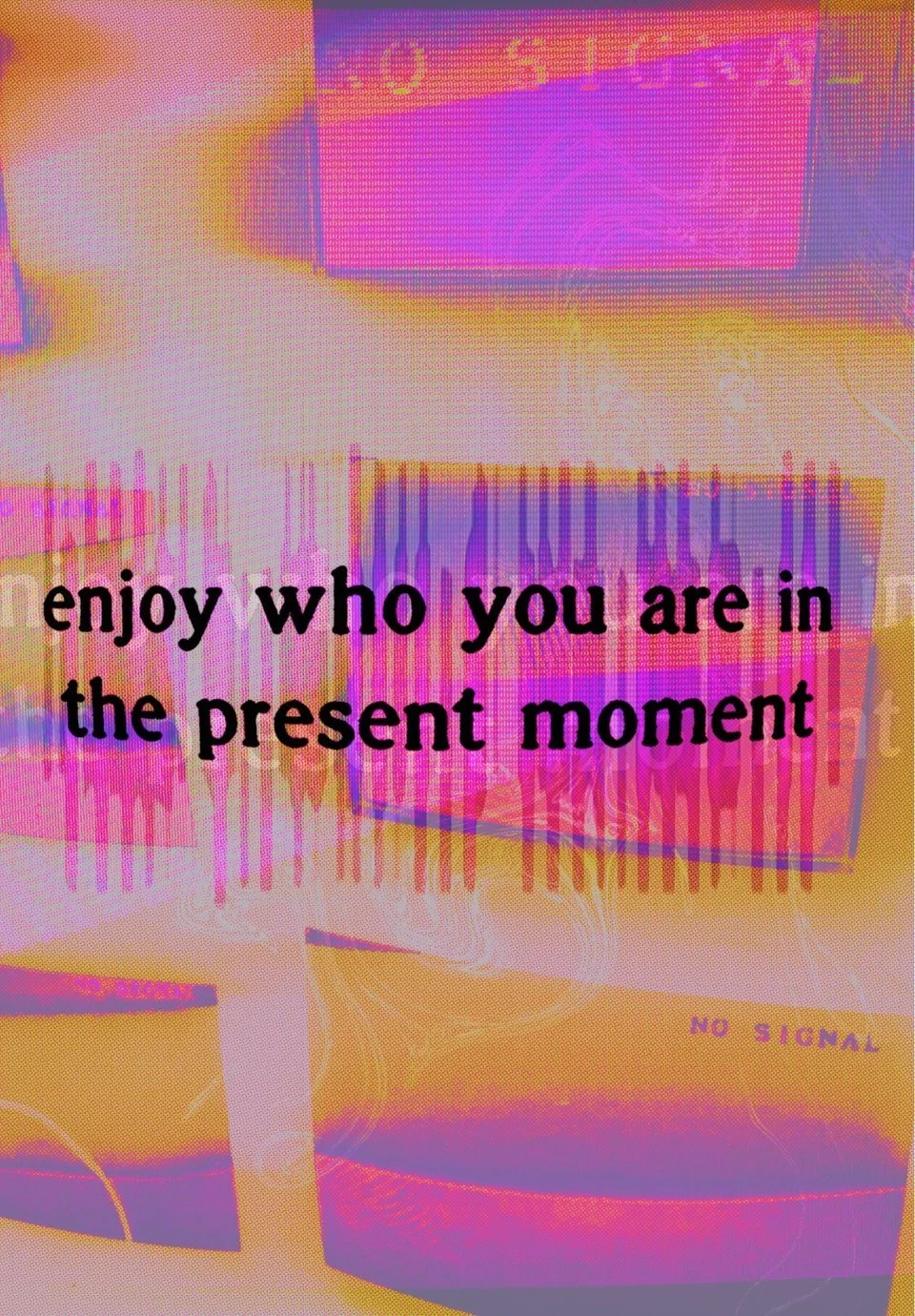
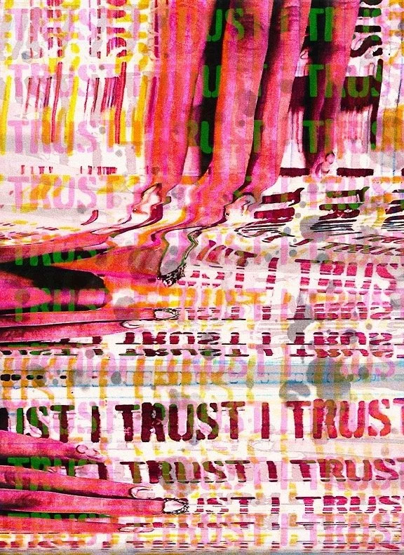
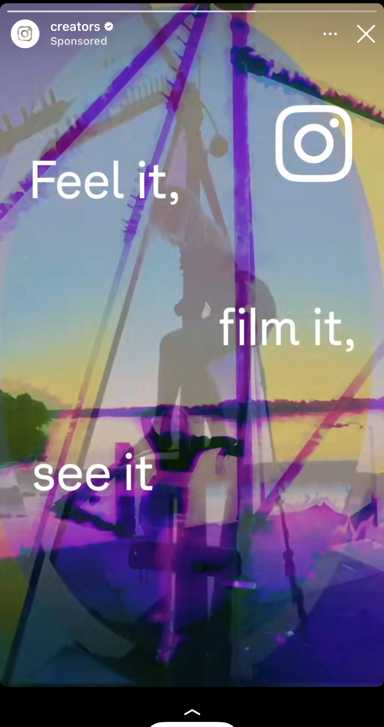 Feel it, film it, see it
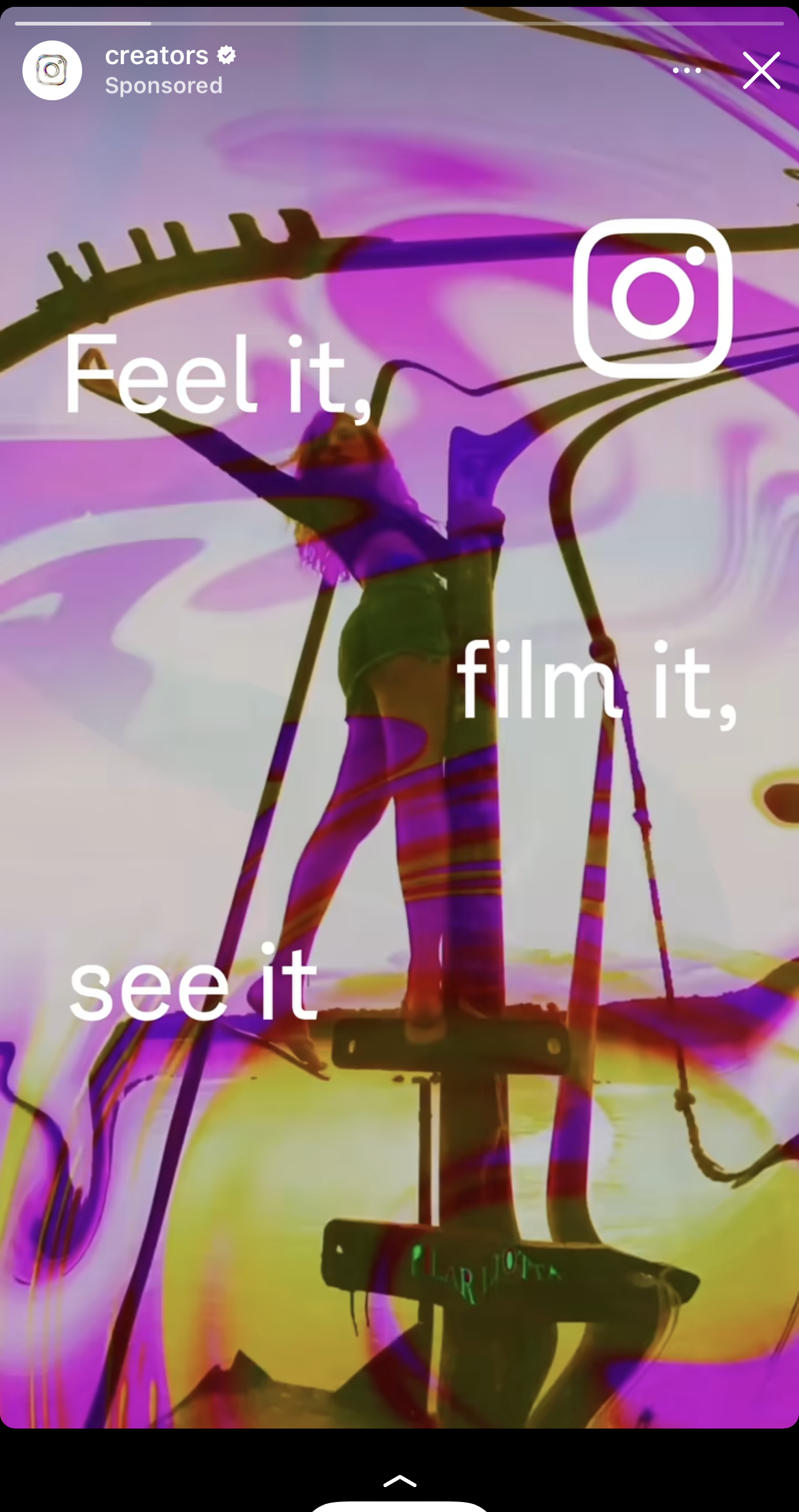
 Feel it, film it, see it
 Feel it, film it, see it
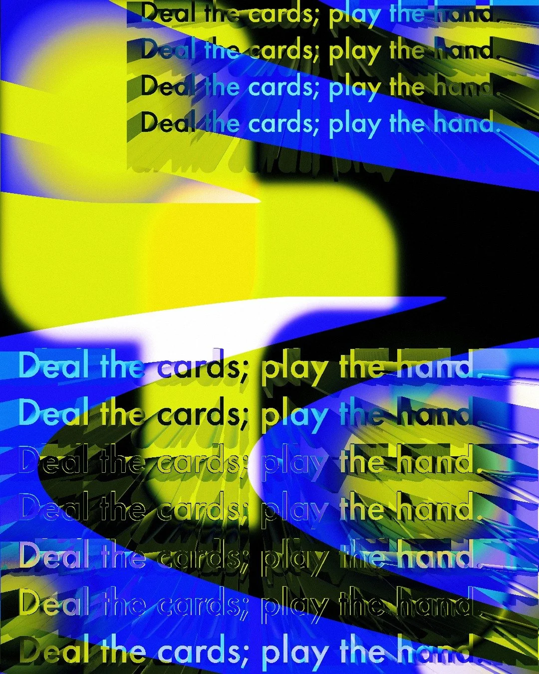
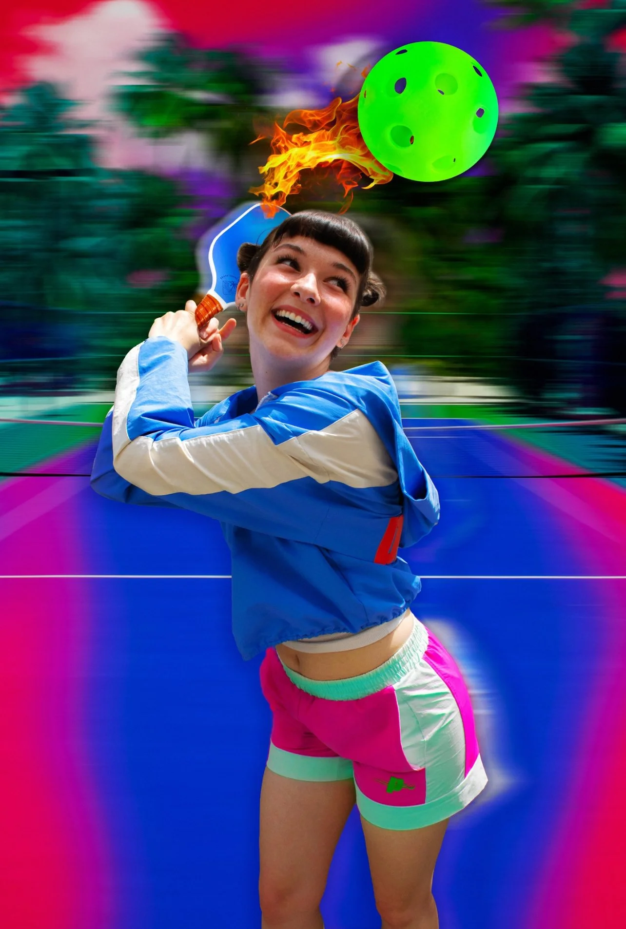
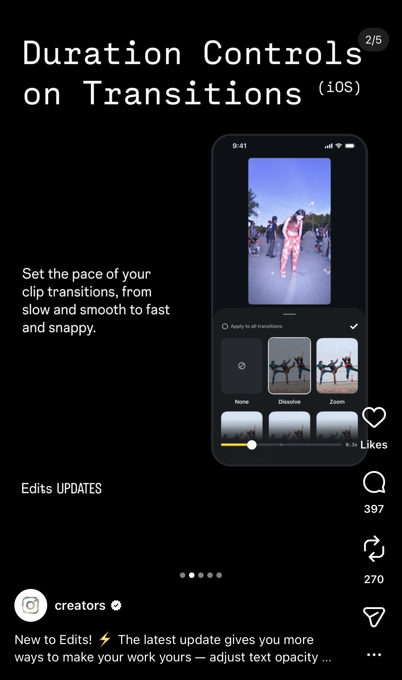 Edits — Duration Controls on Transitions
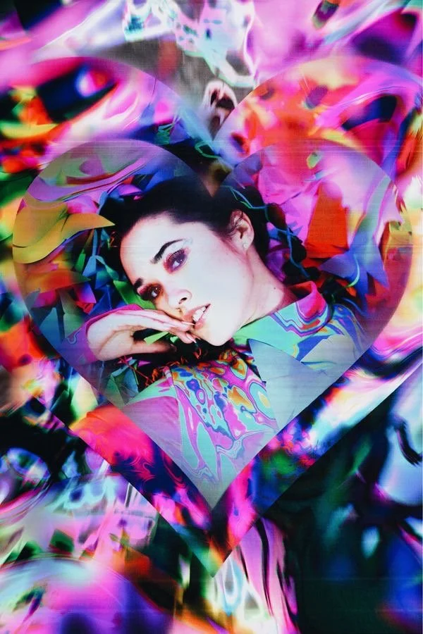
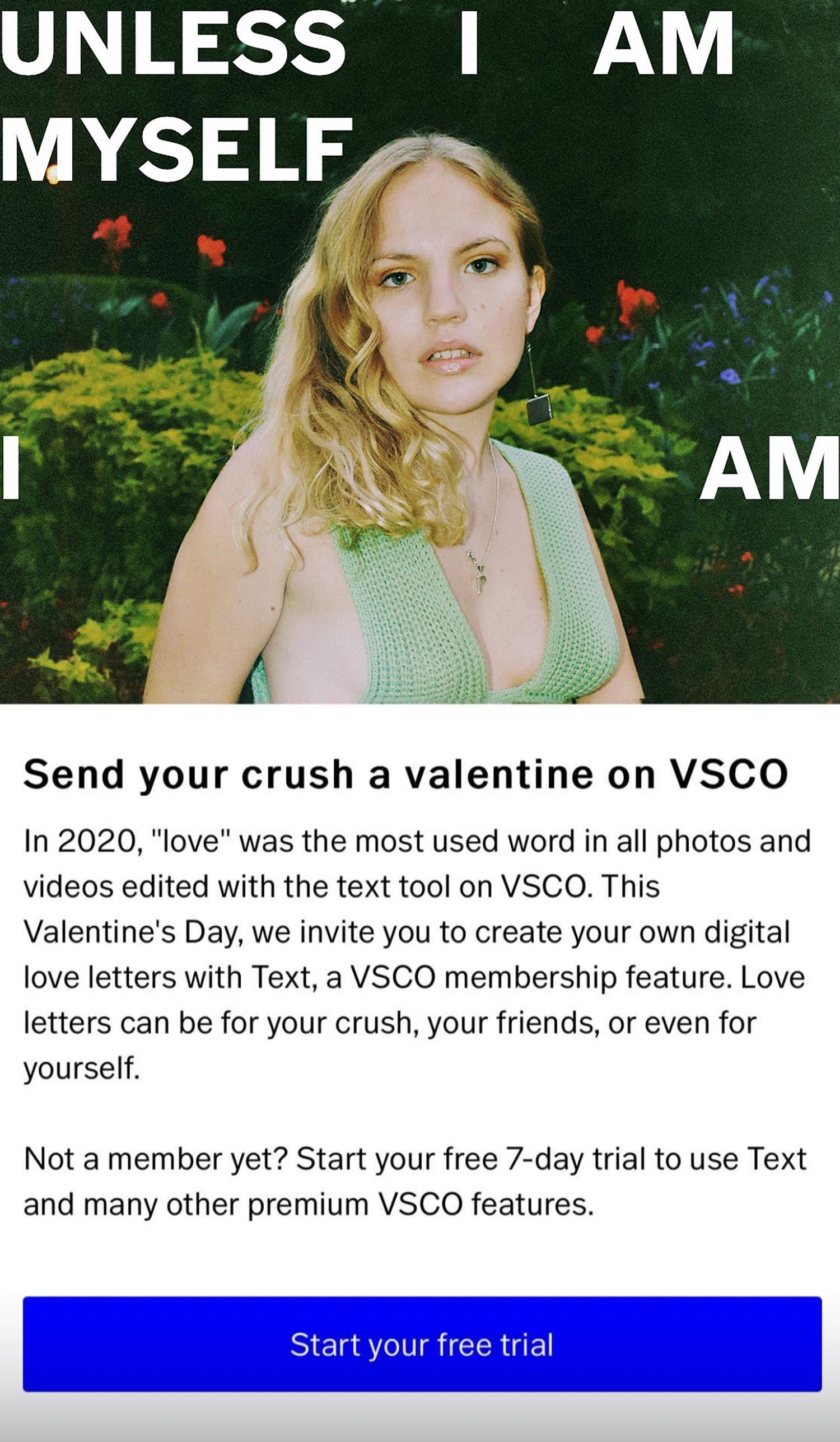 Valentine's Day feature01
 02
02 03
03 04
04 05
05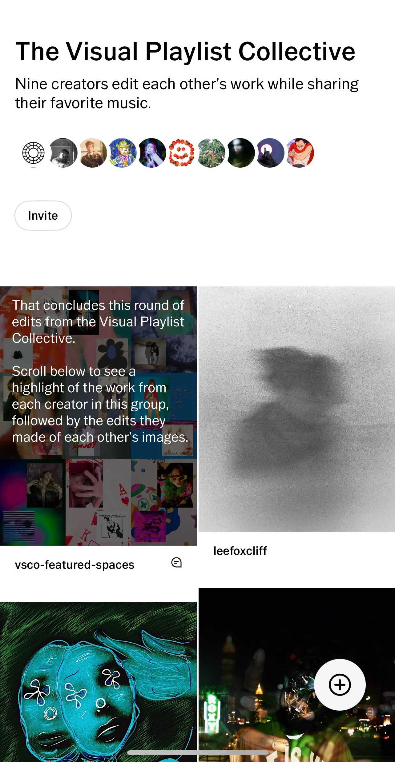 06
06
 Holding mate
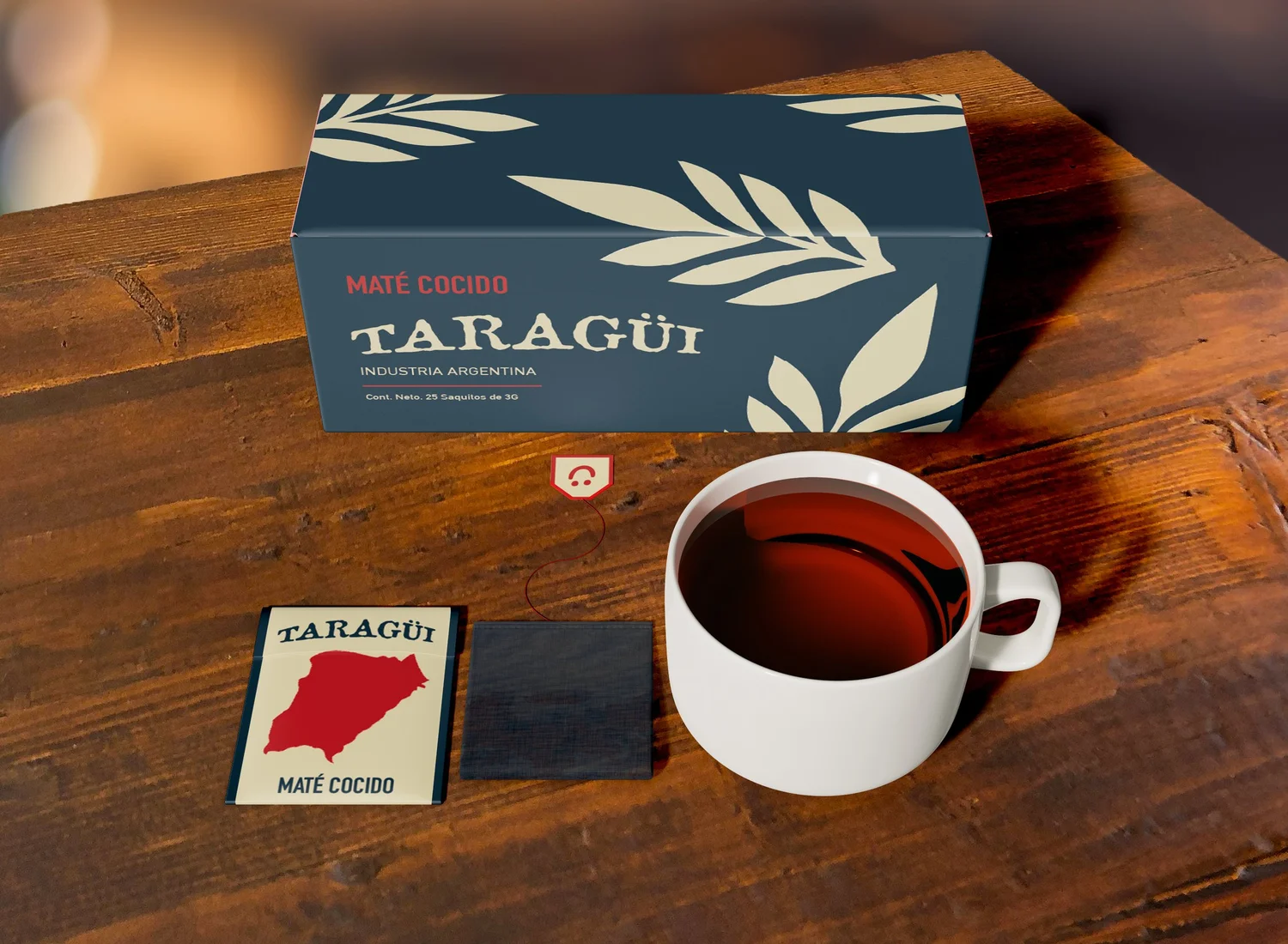 Mate cocido
 New packaging
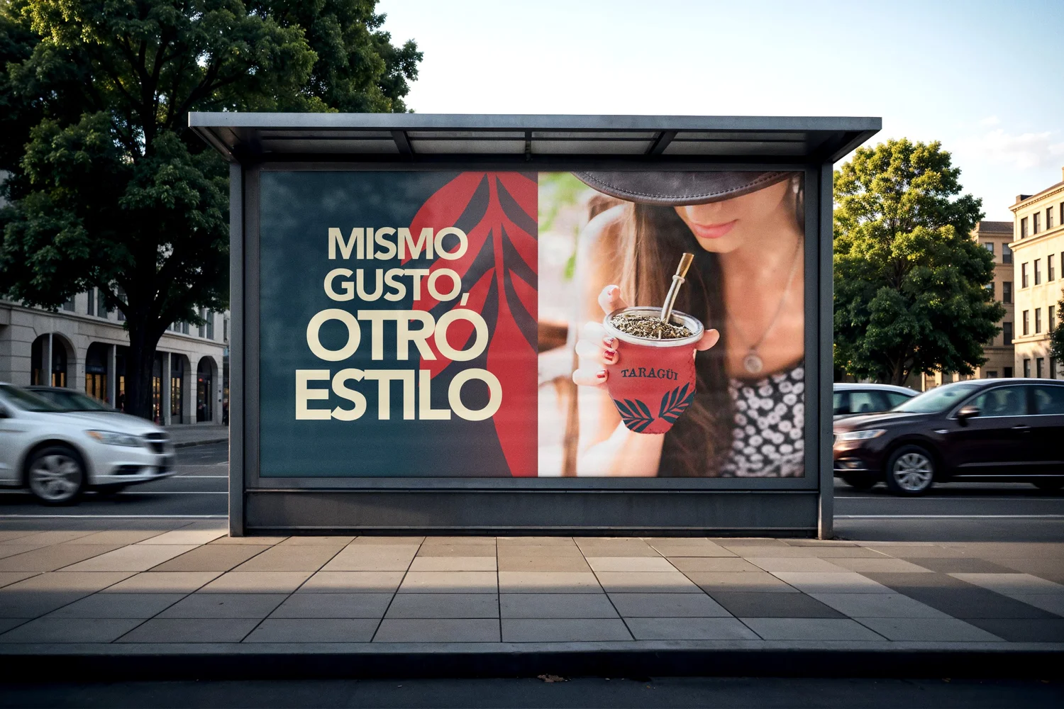 Campaign
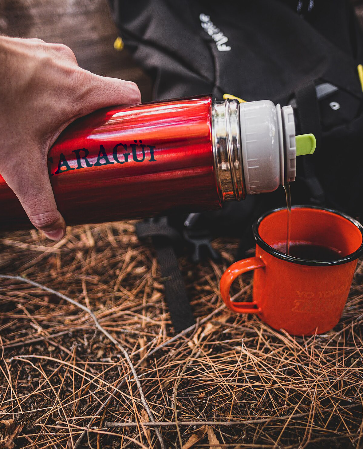 Termo
Termo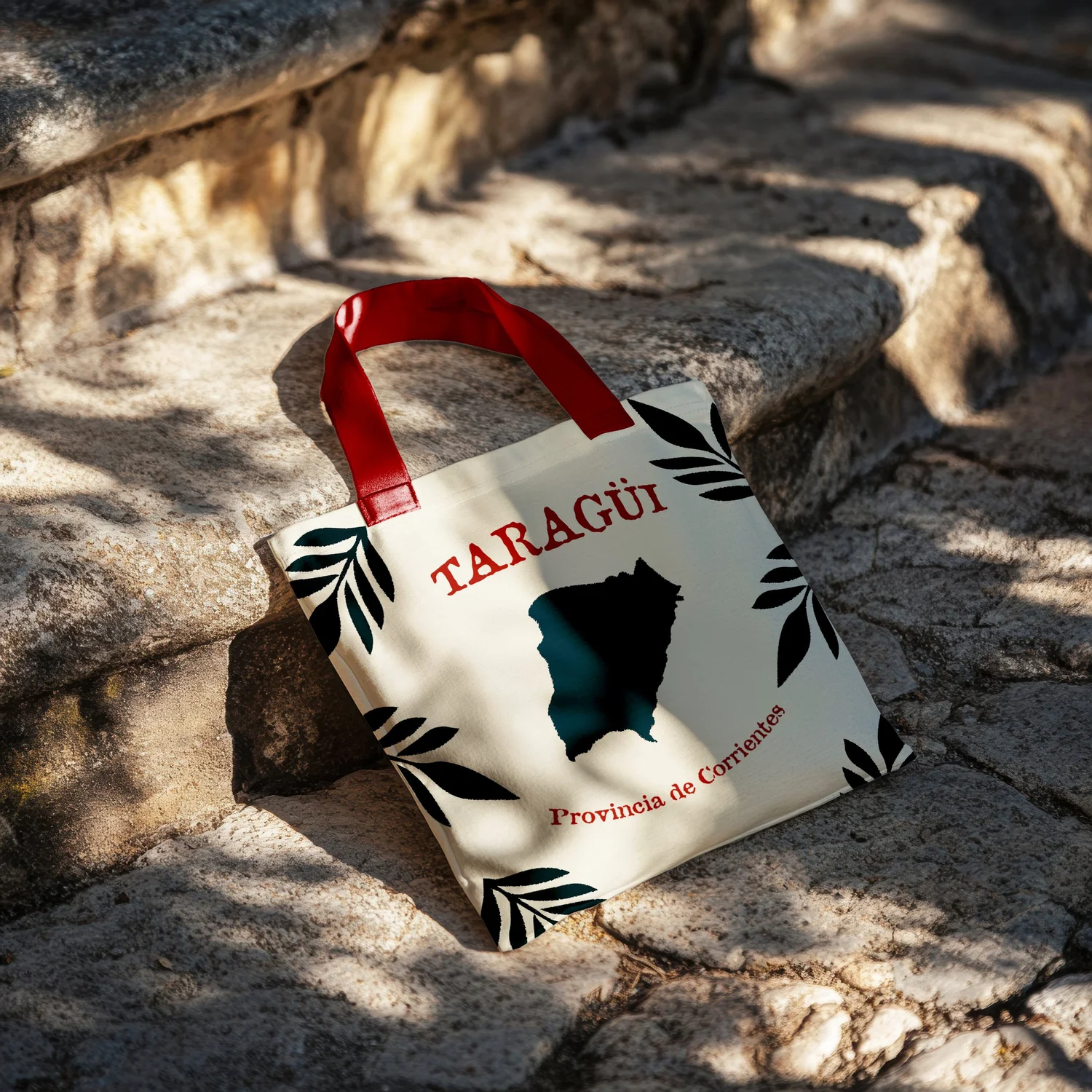 Tote
Tote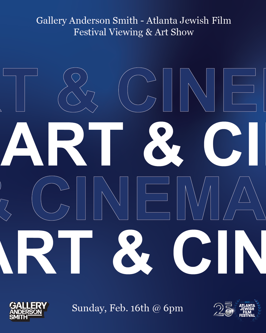 Film festival
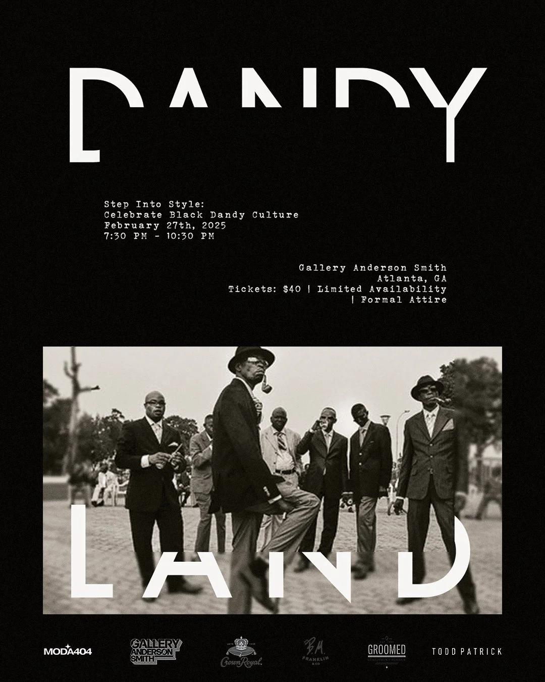 Dandy w/ grain
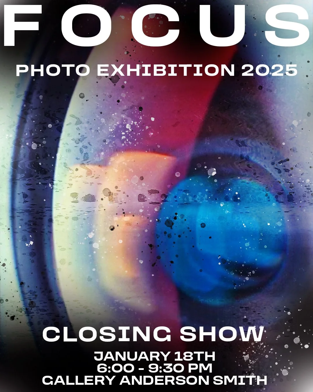 Focus exhibition
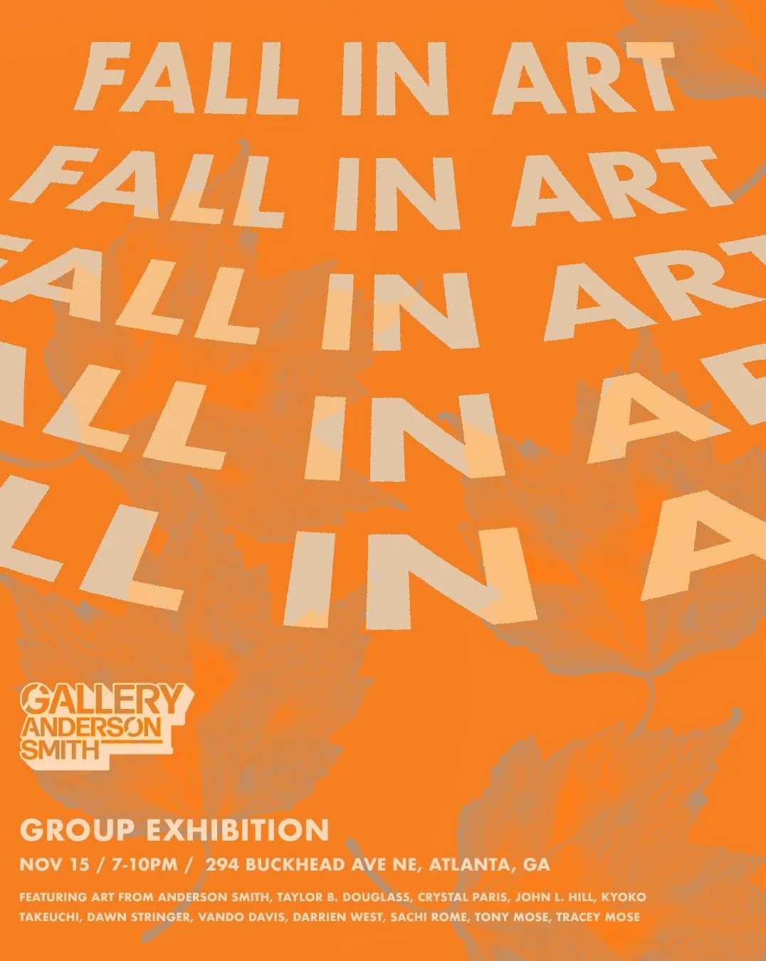 Event design
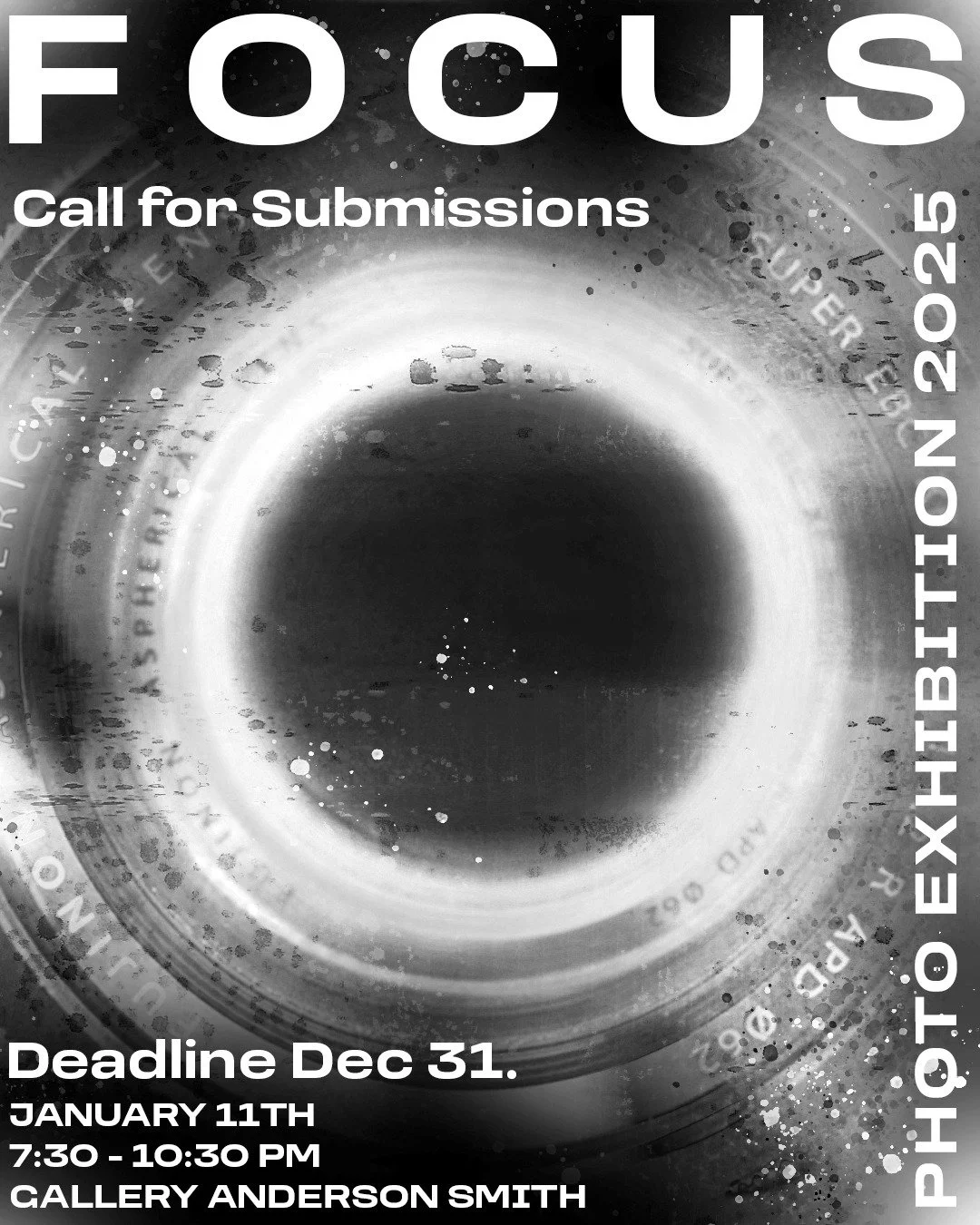 Promo
Promo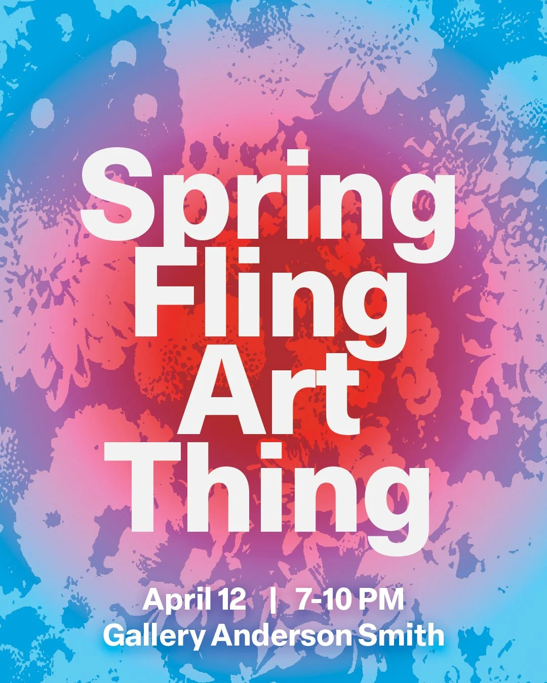 Spring Fling

 Cover
Cover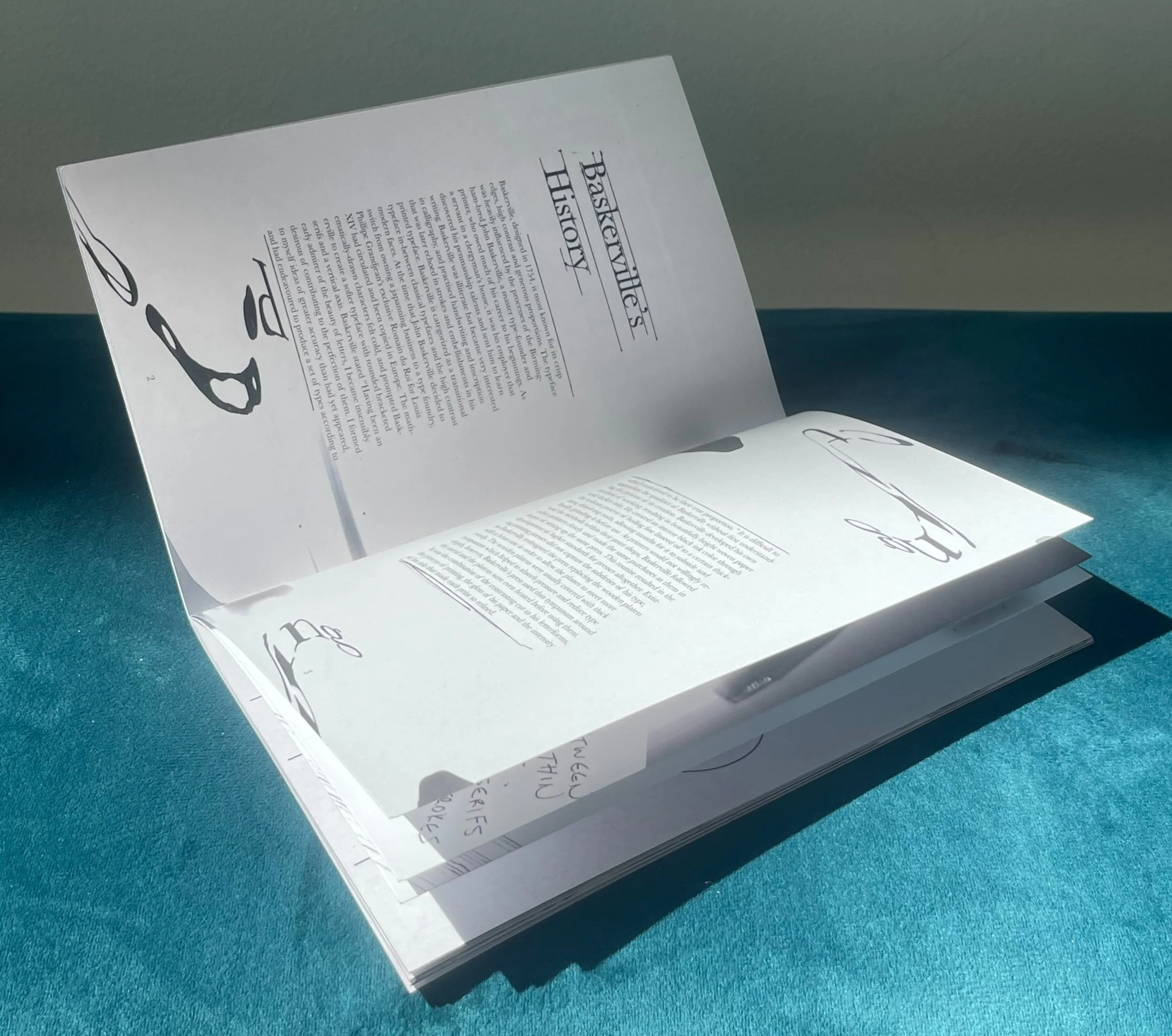 Spread
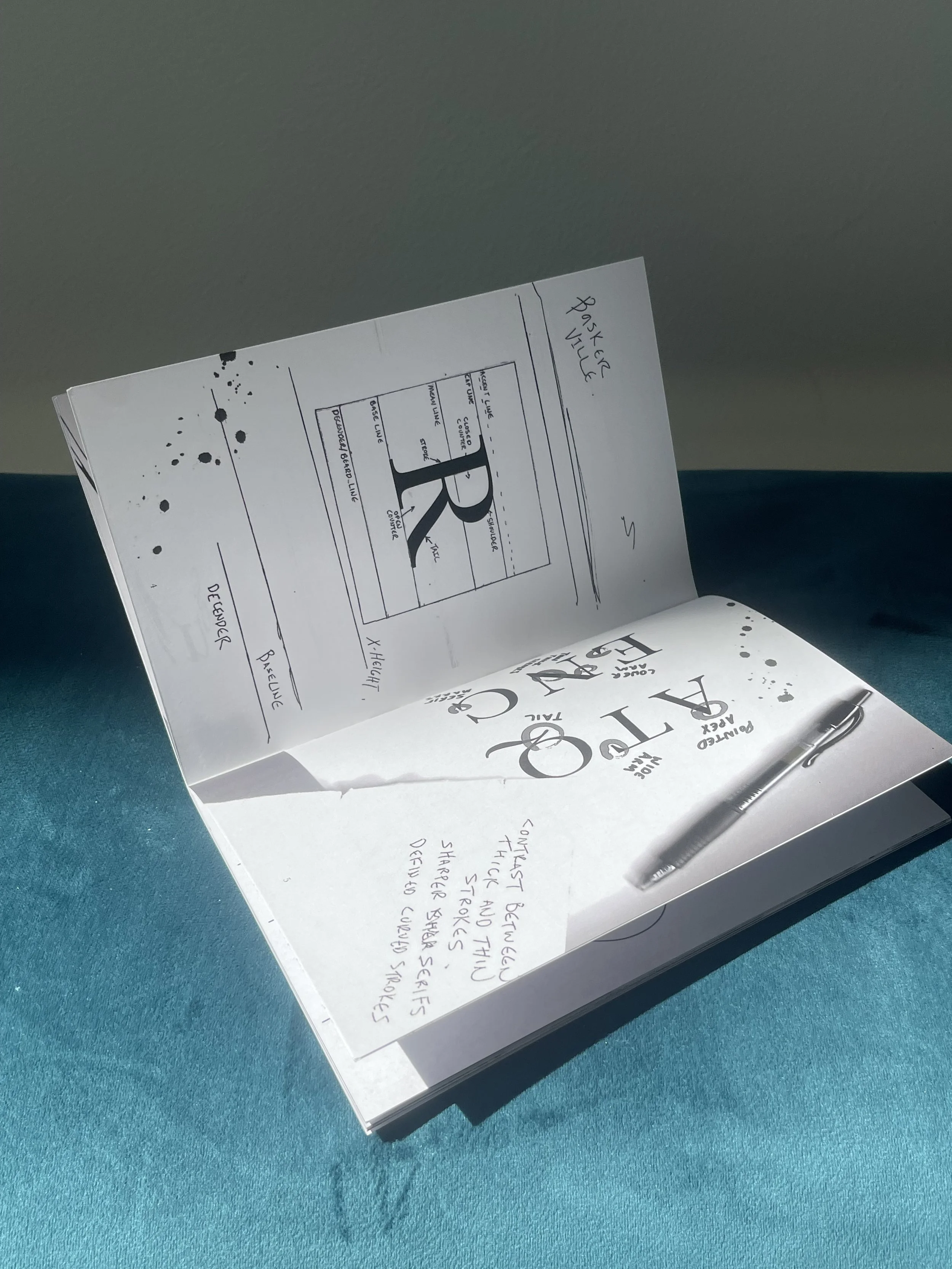 Detail
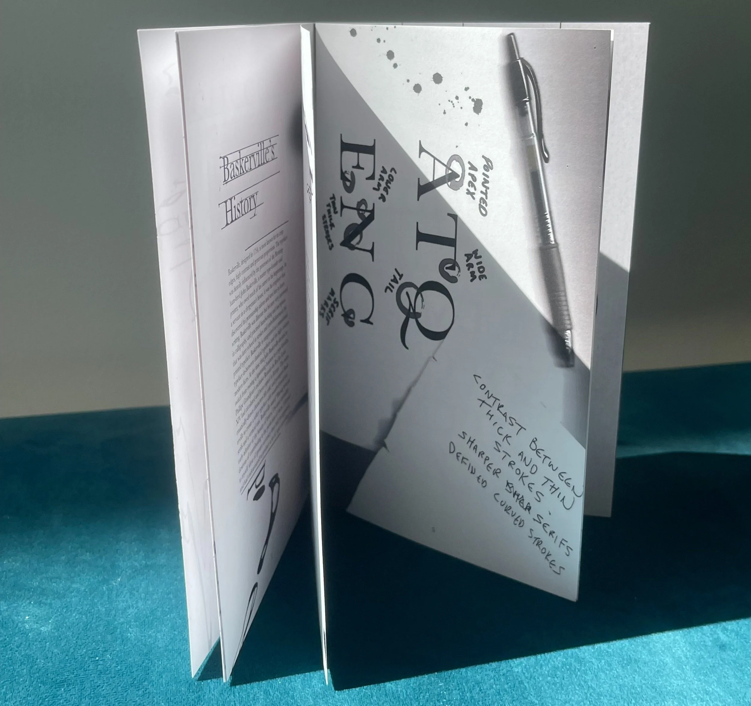 Pages
Pages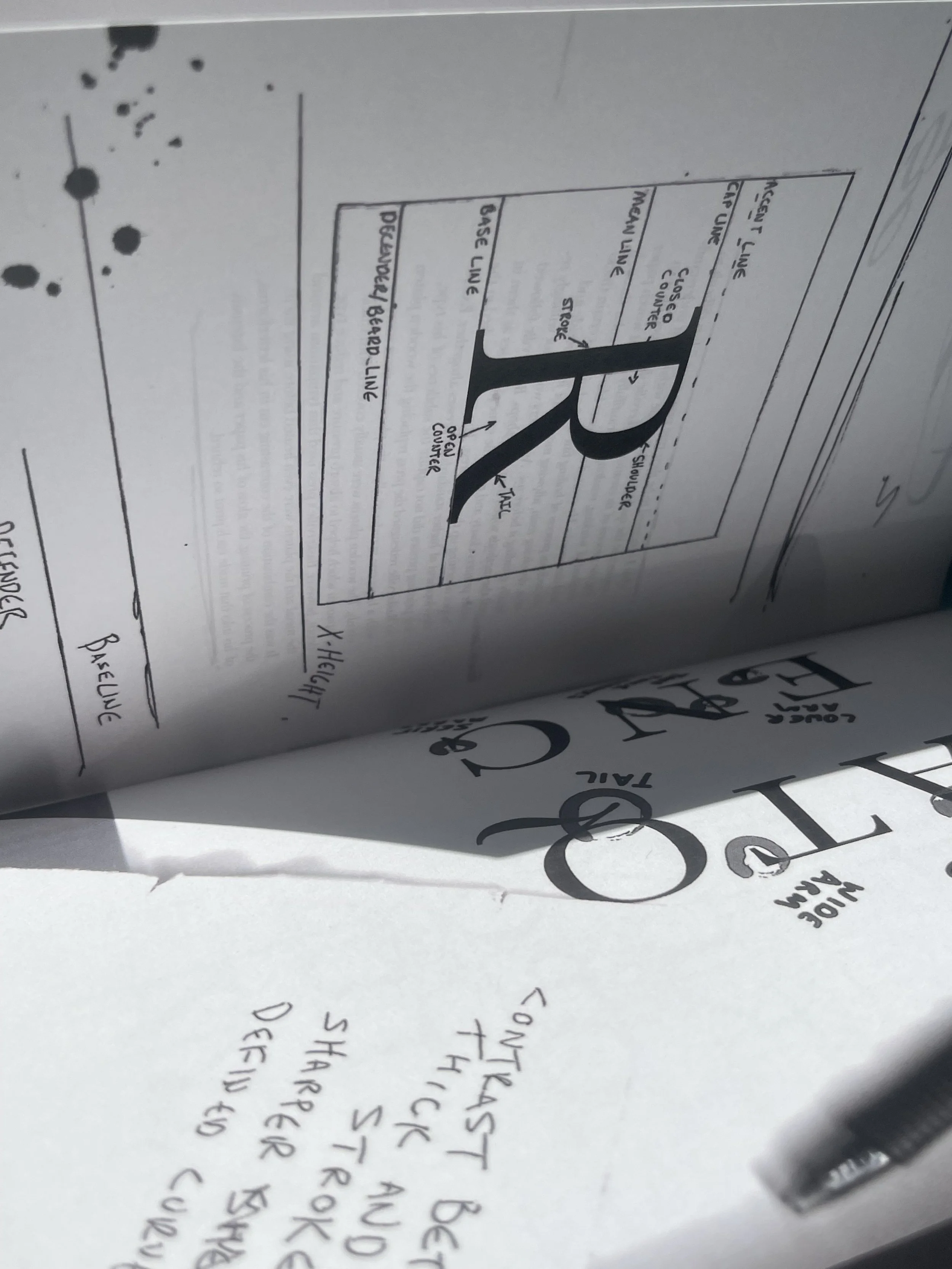 Spread
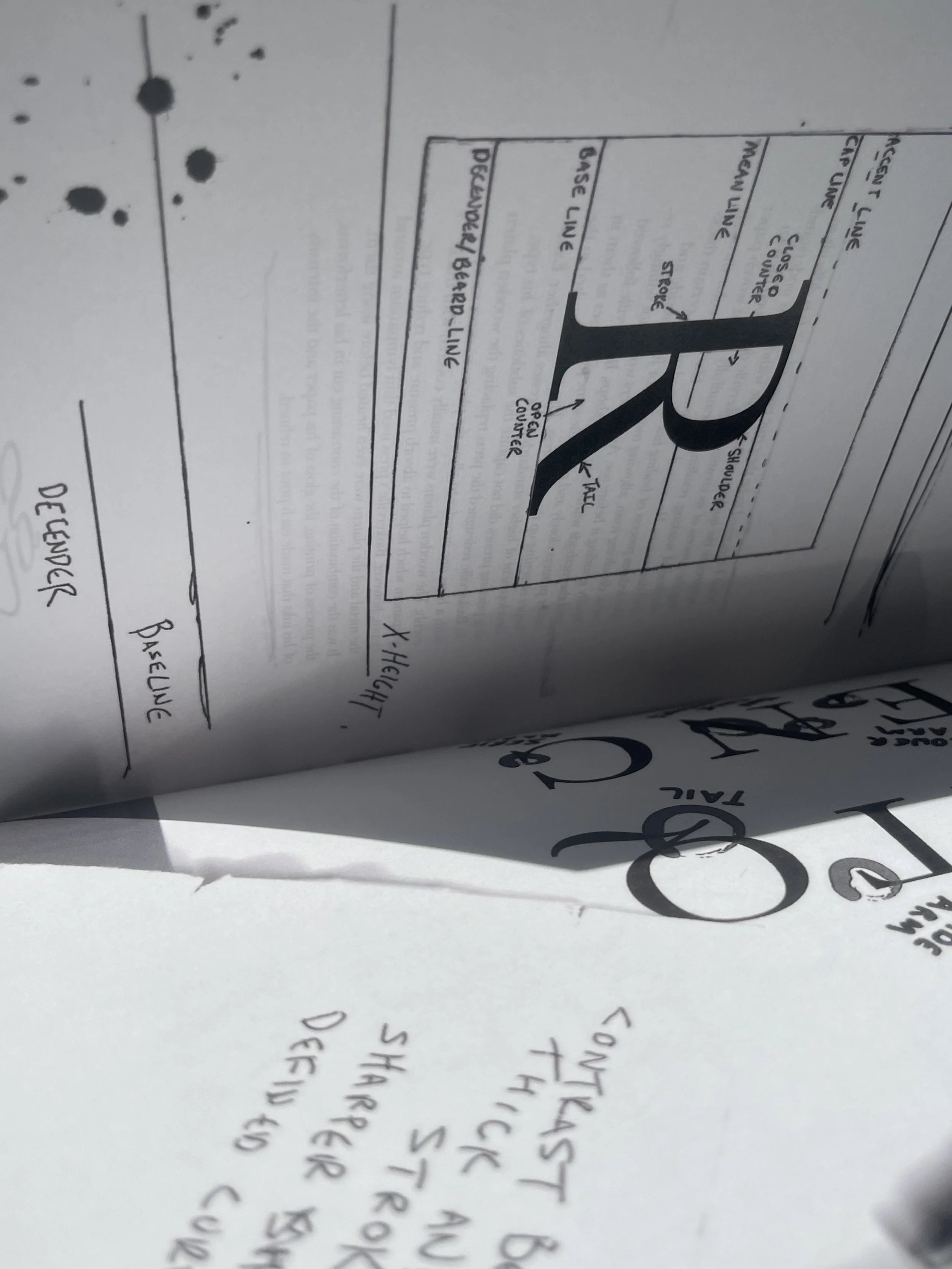 Typography
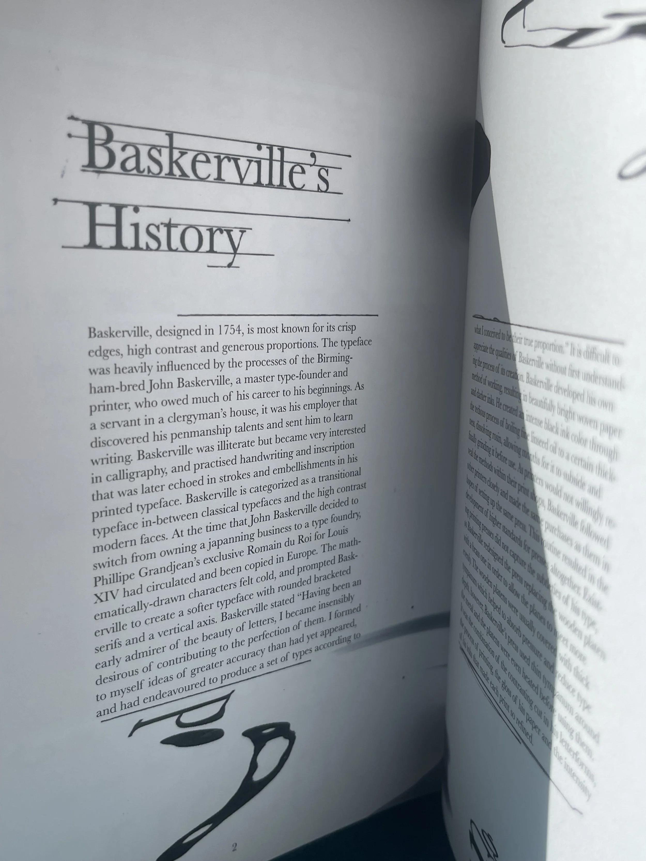 Detail
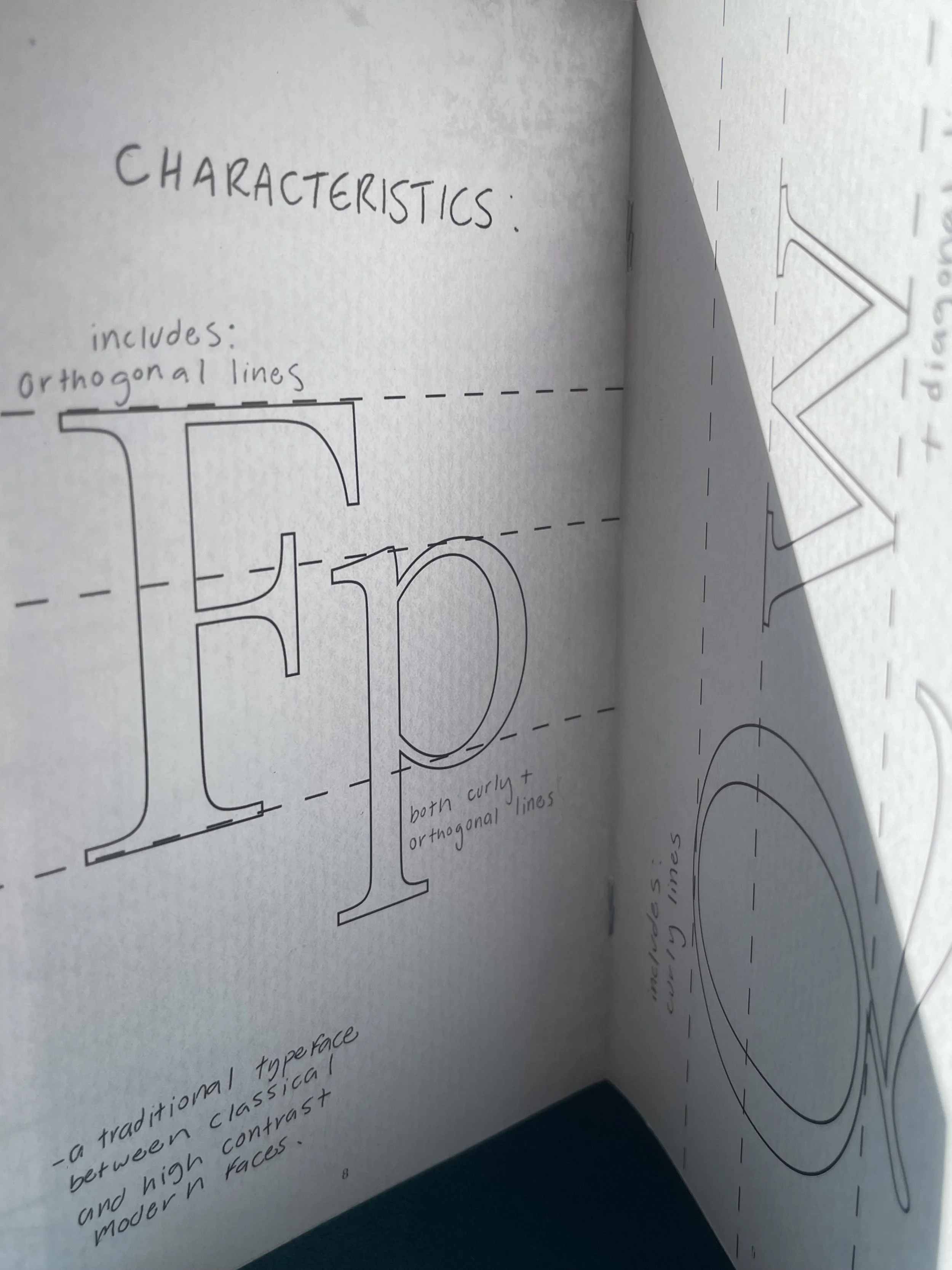 Layout
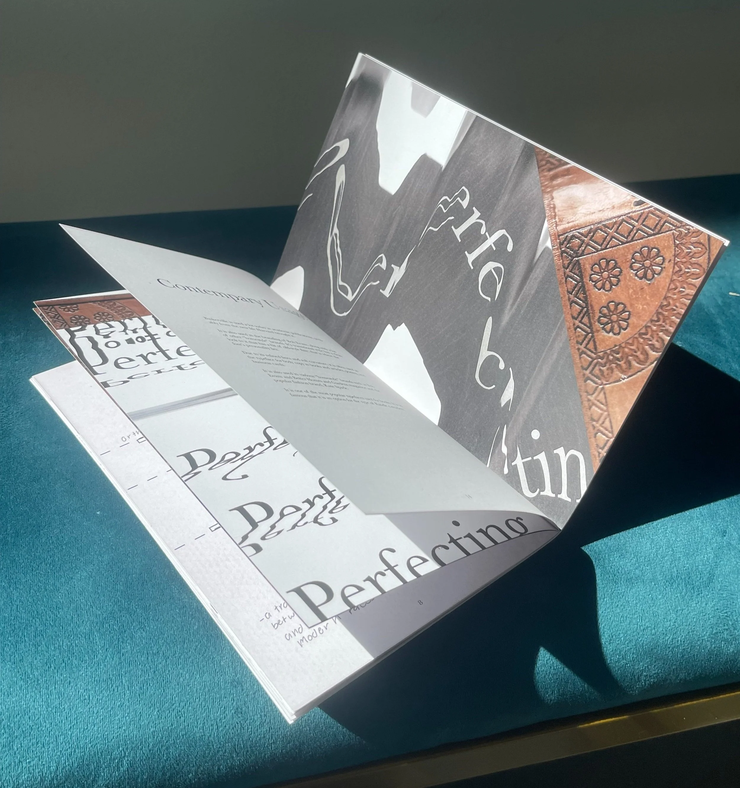 Pages
Pages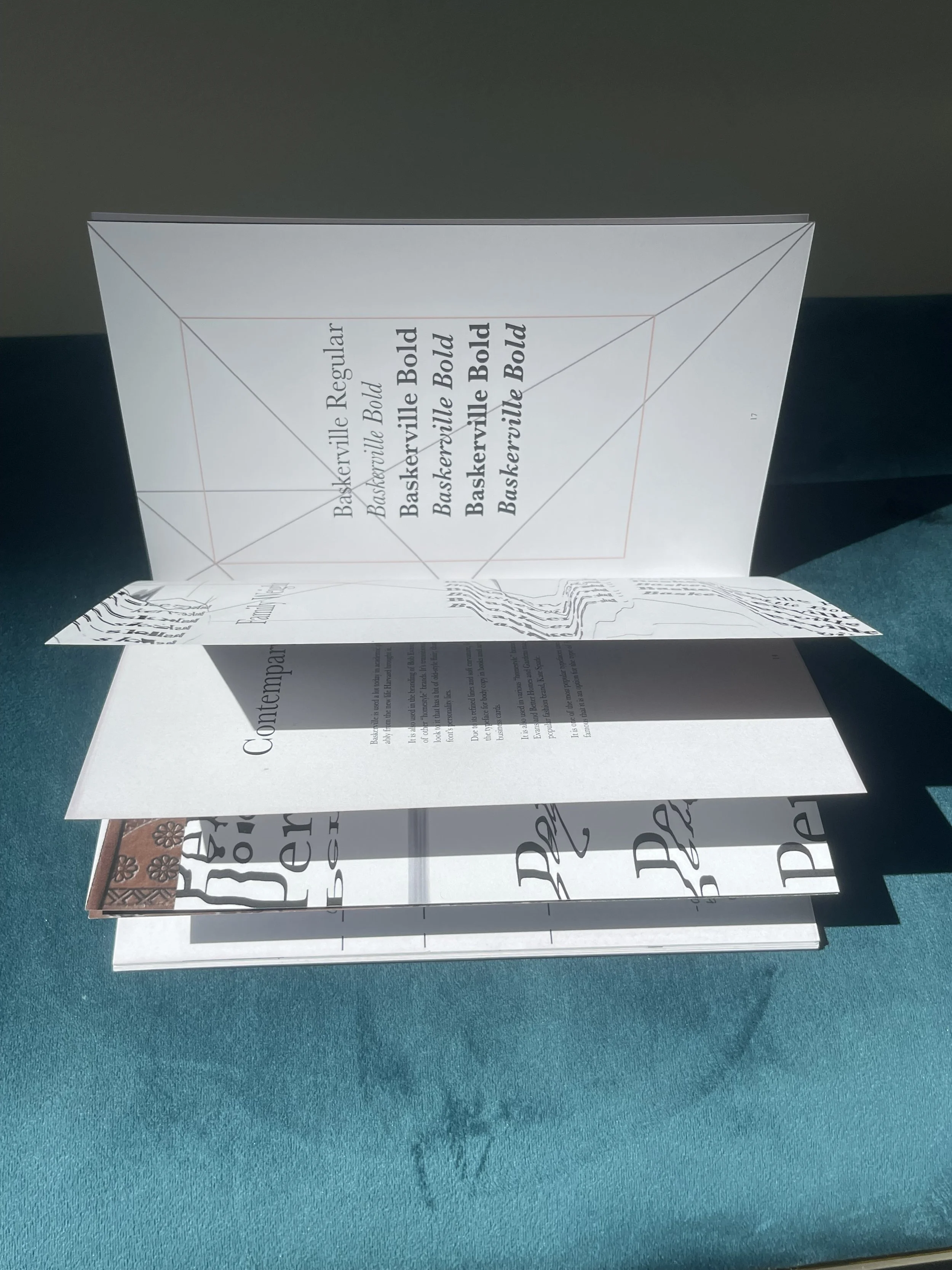 Spread
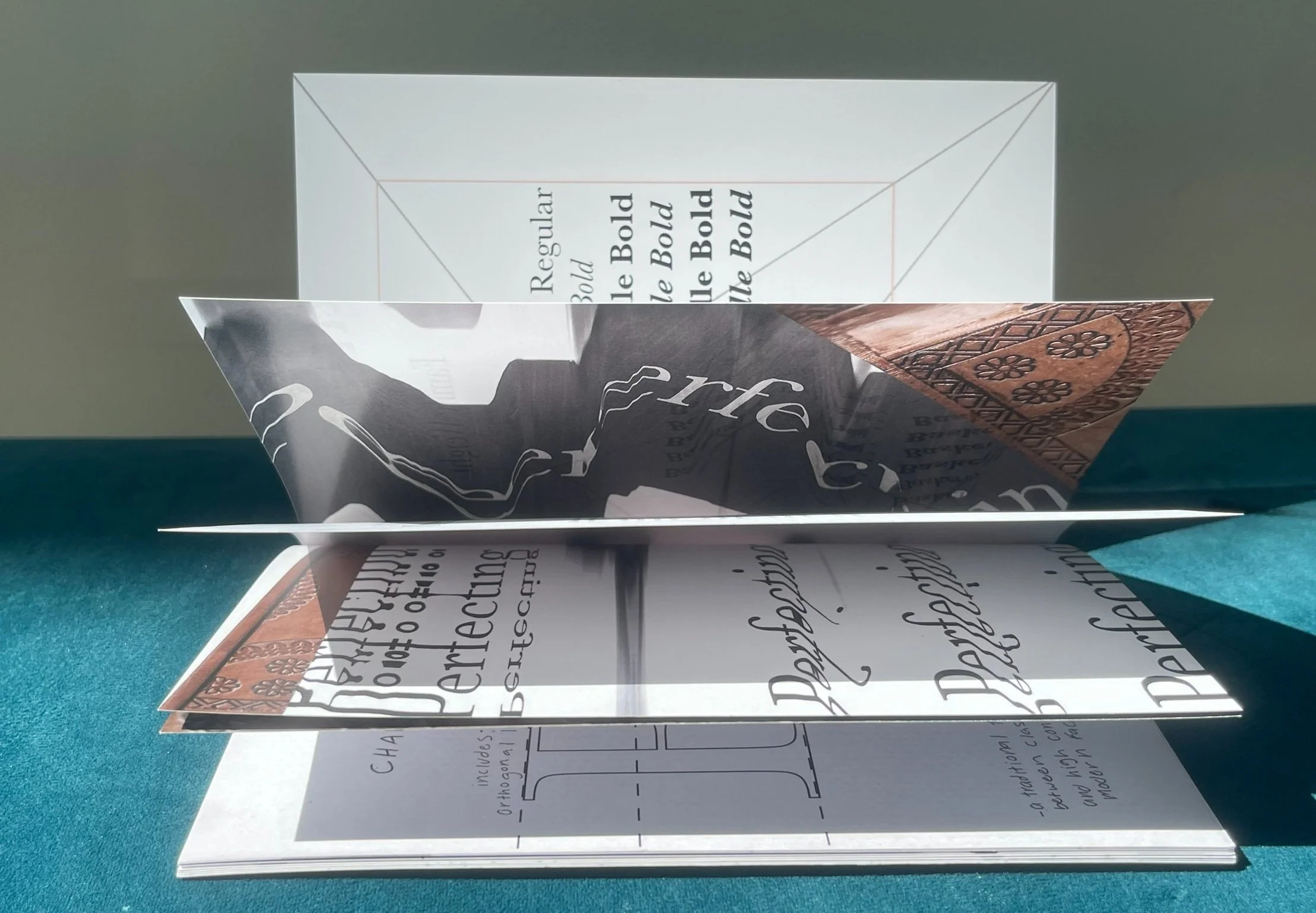 Detail
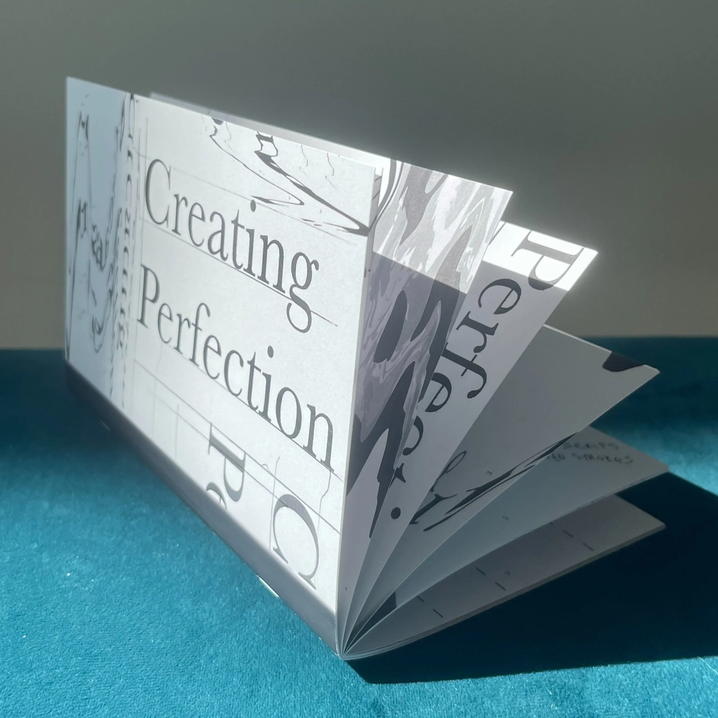 Pages
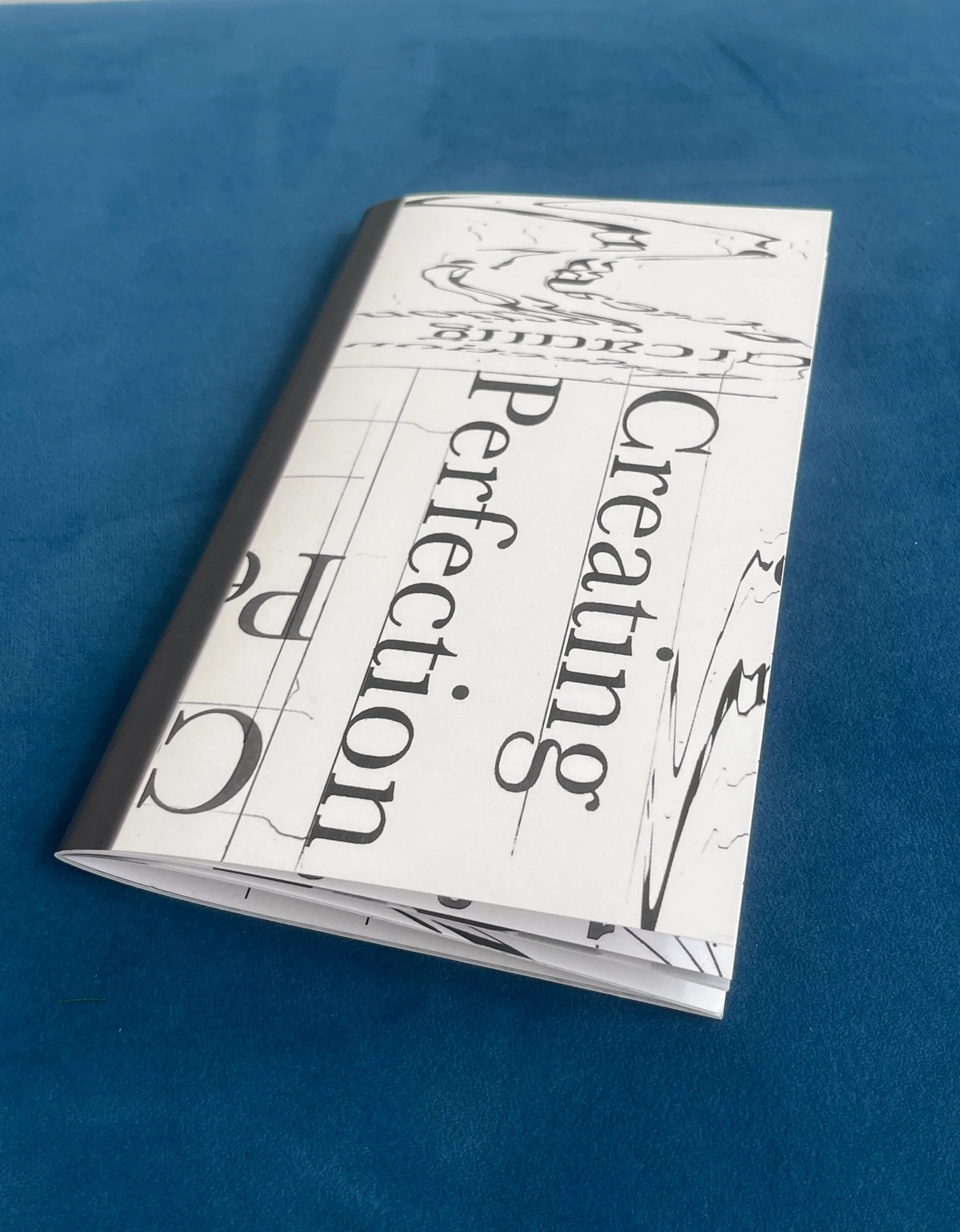
Pages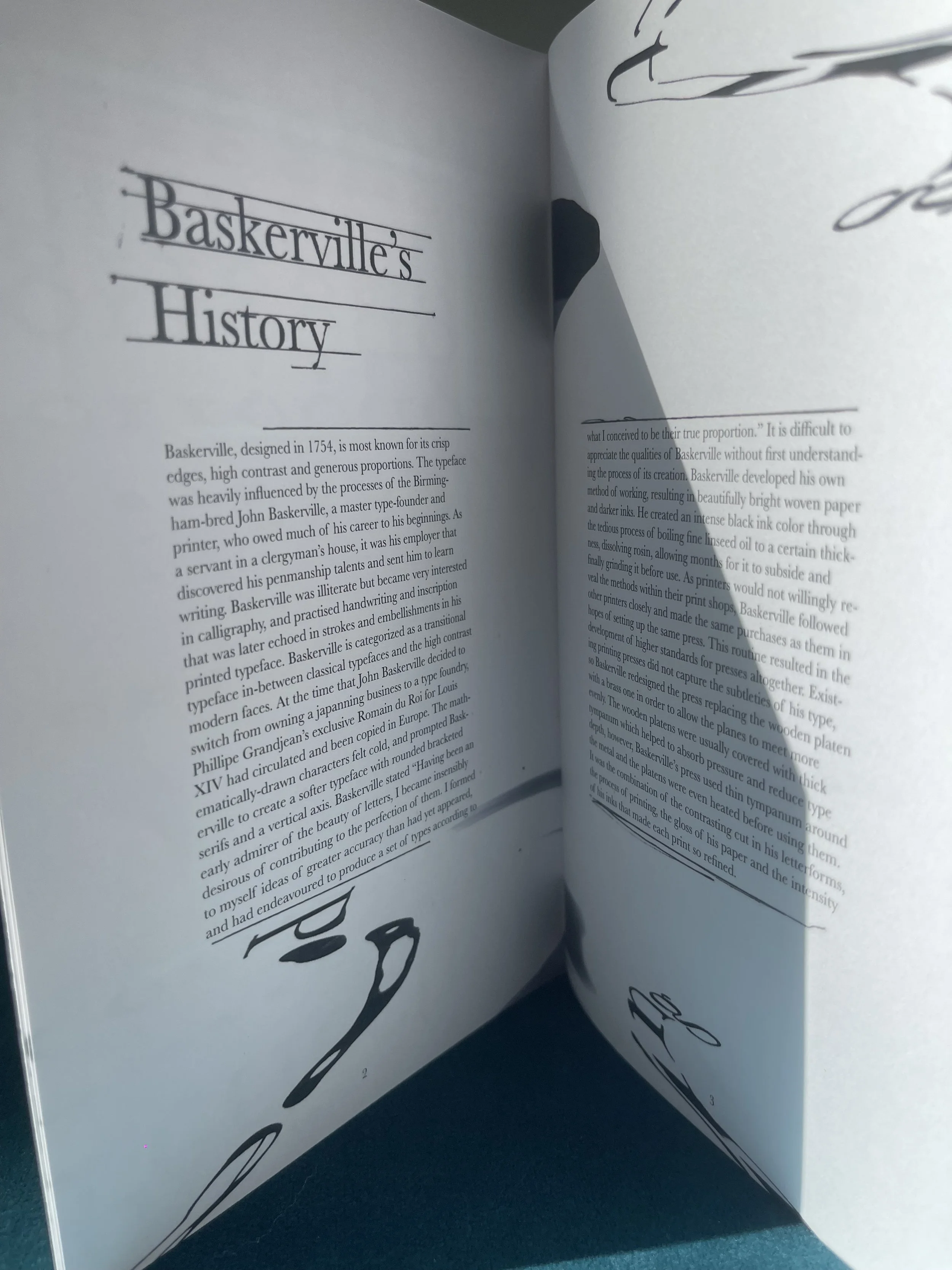 Baskerville's History
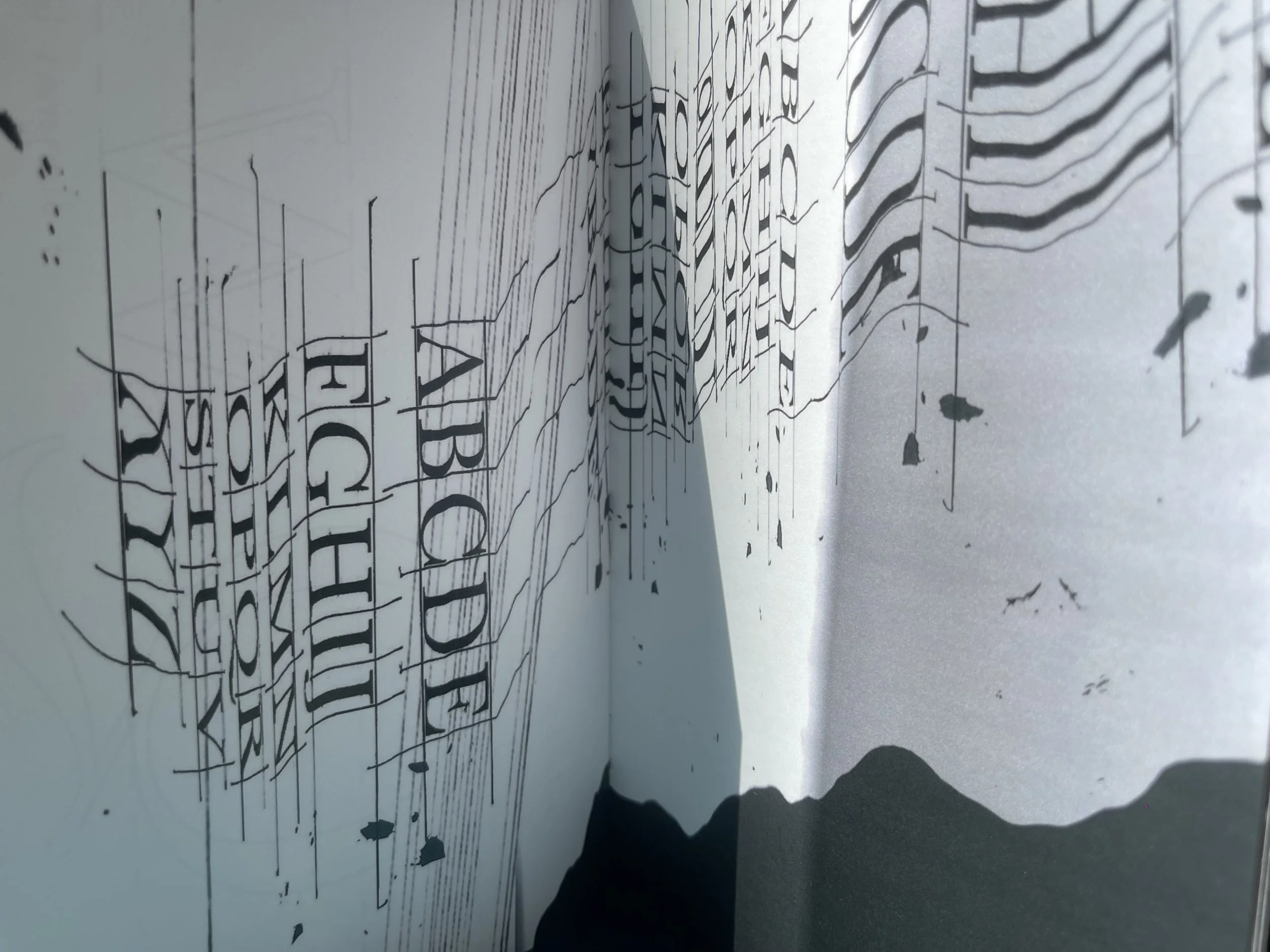 Spread


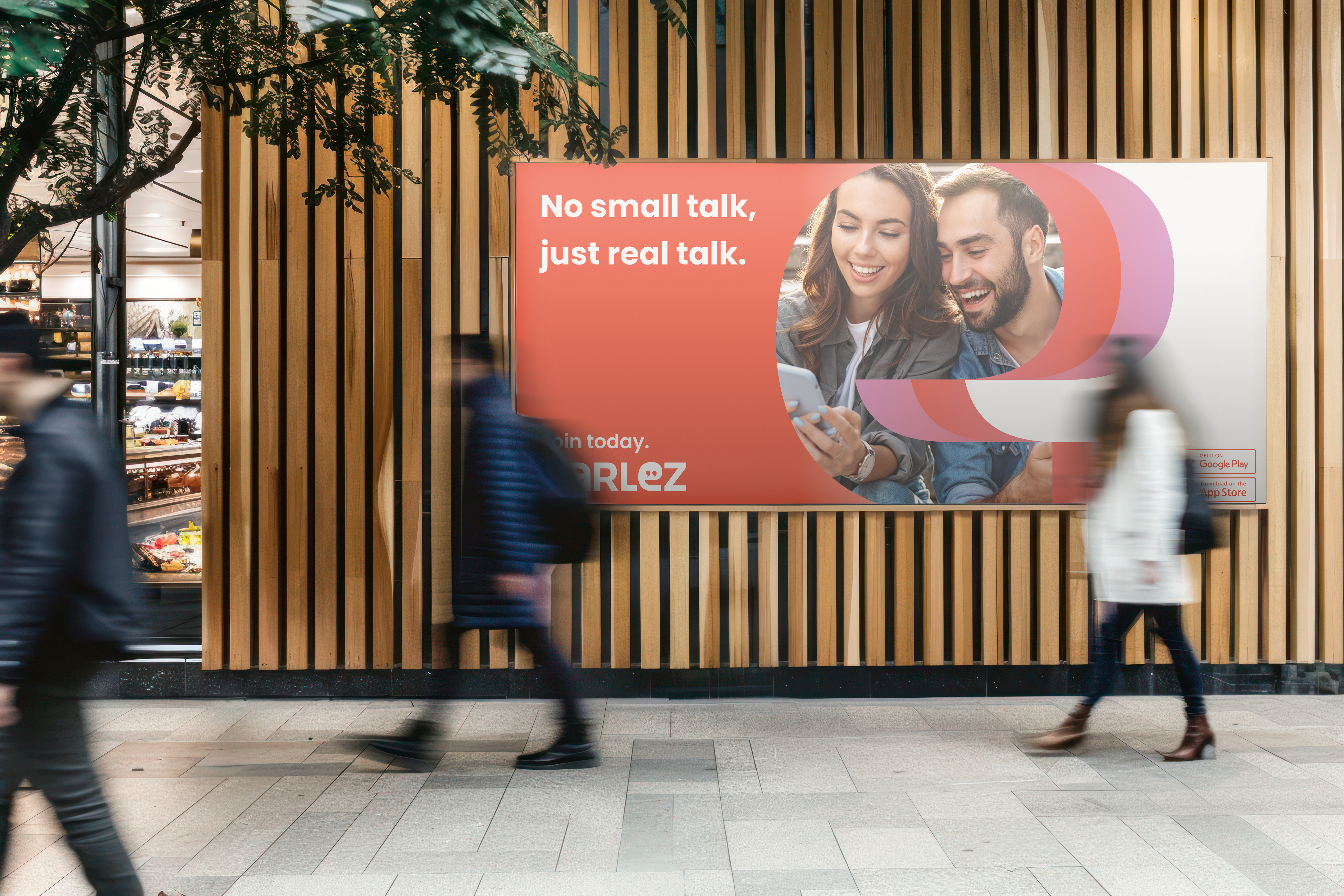 Parlez ad
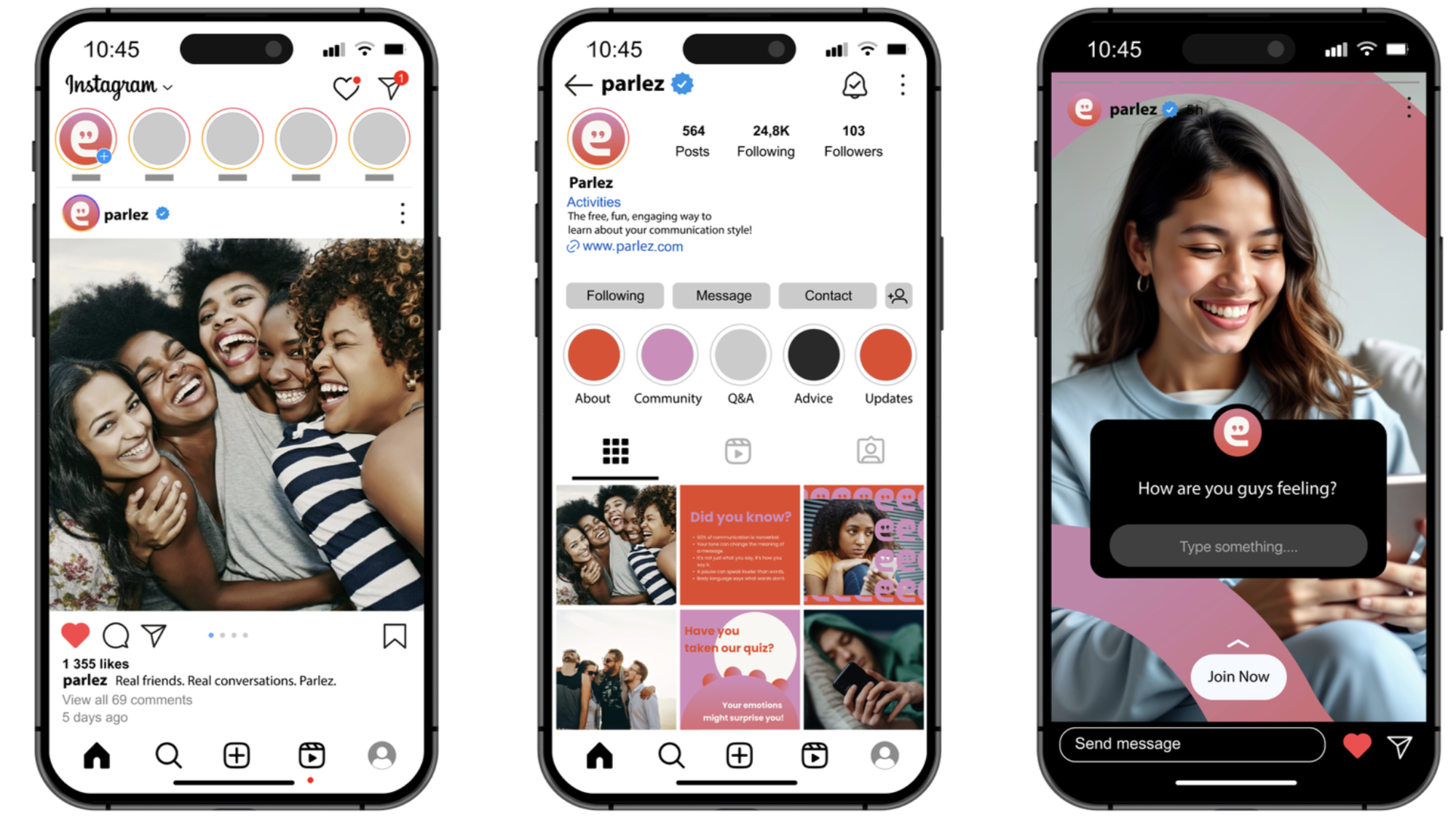 Parlez phone mockupFilm poster — This is not a Commercial
 Editorial project
 Print film
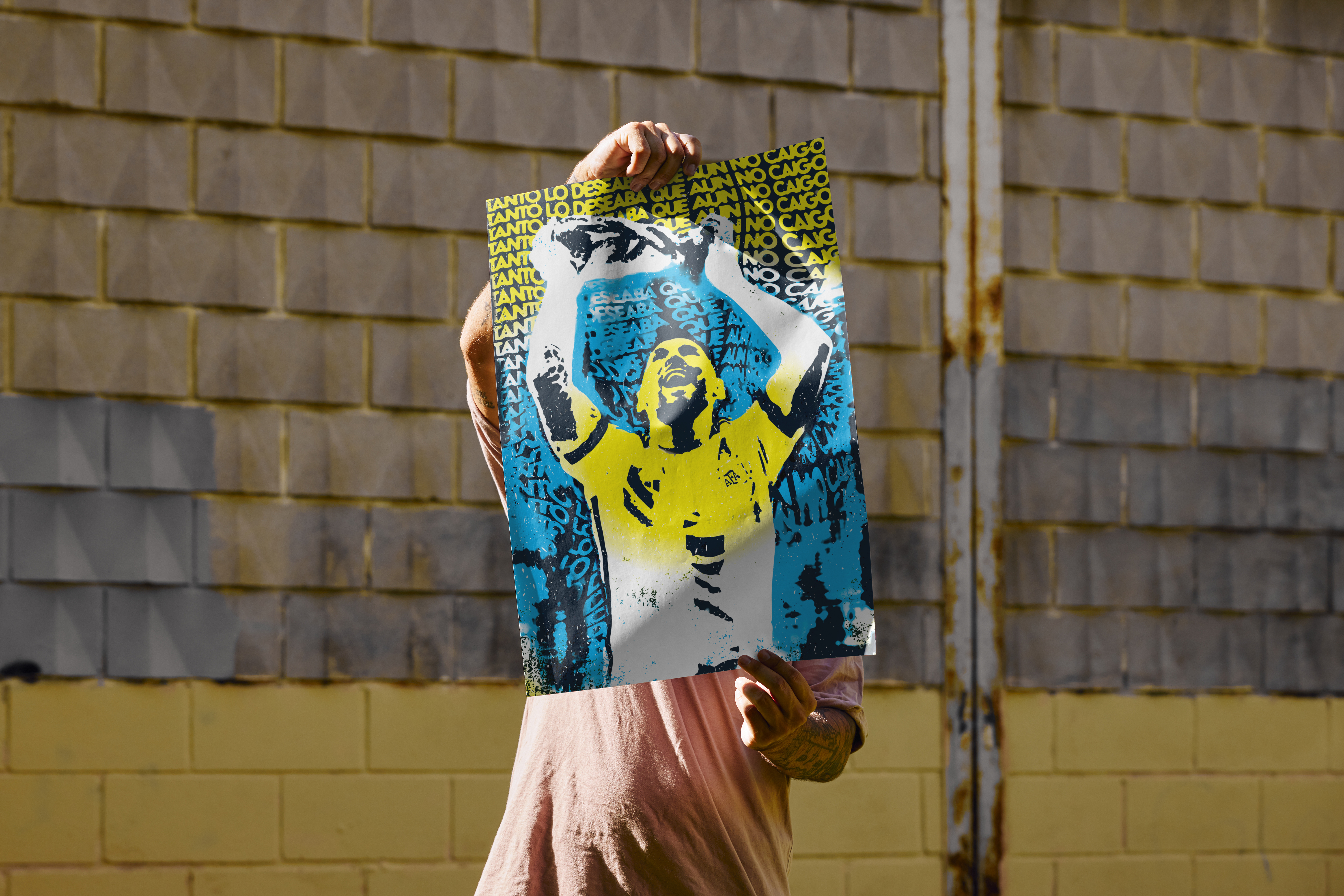 Messi
Messi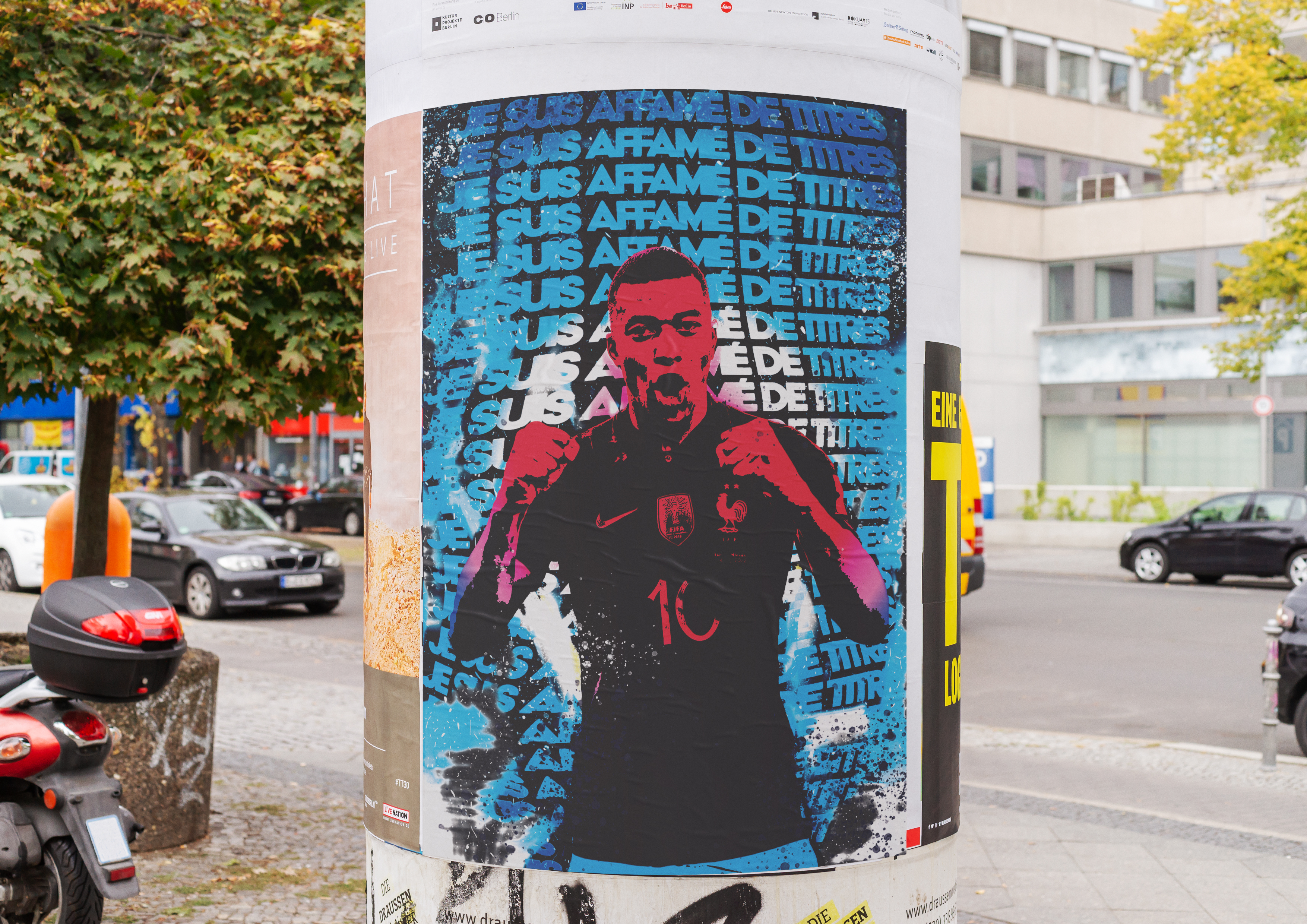 Mbappé
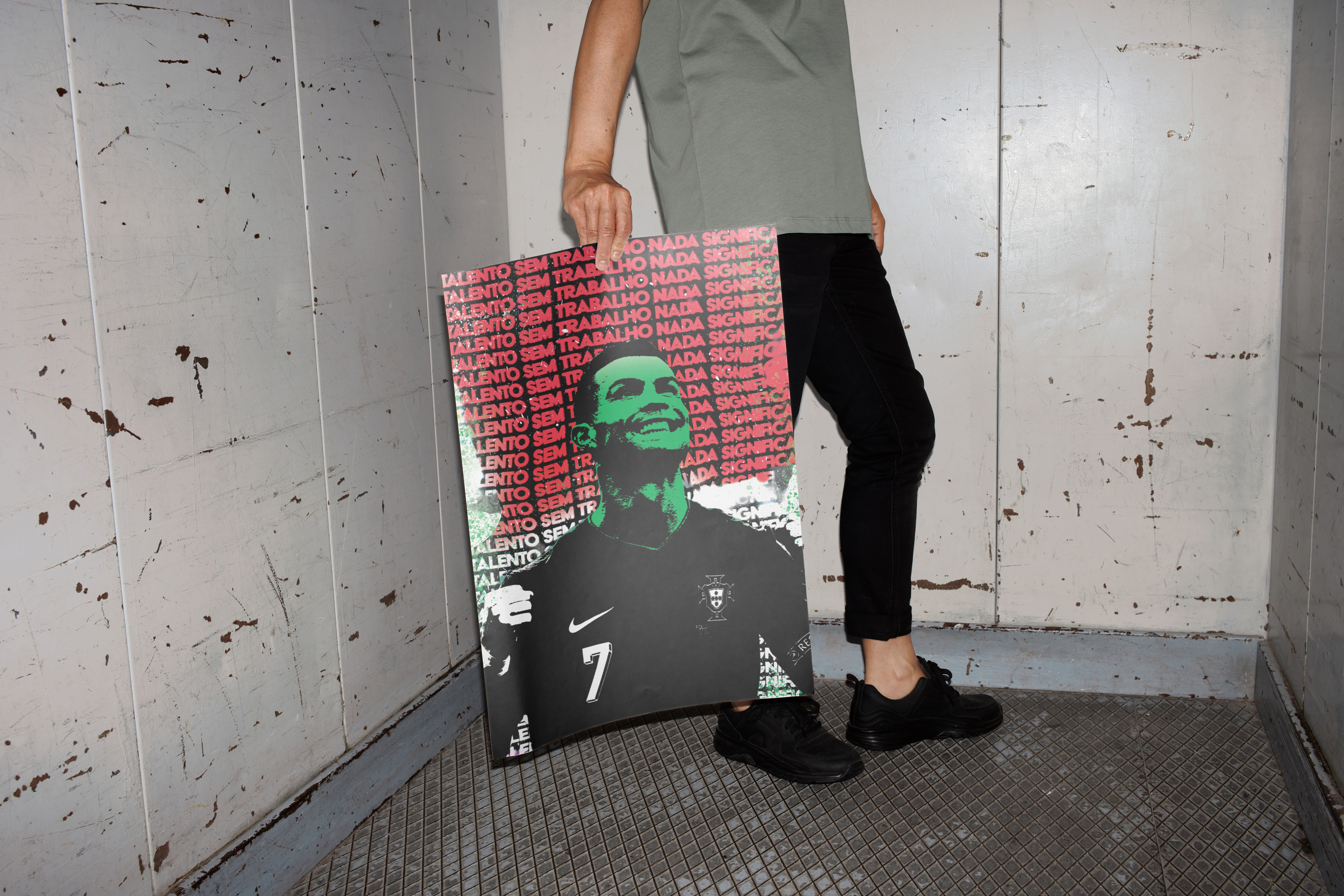 Ronaldo
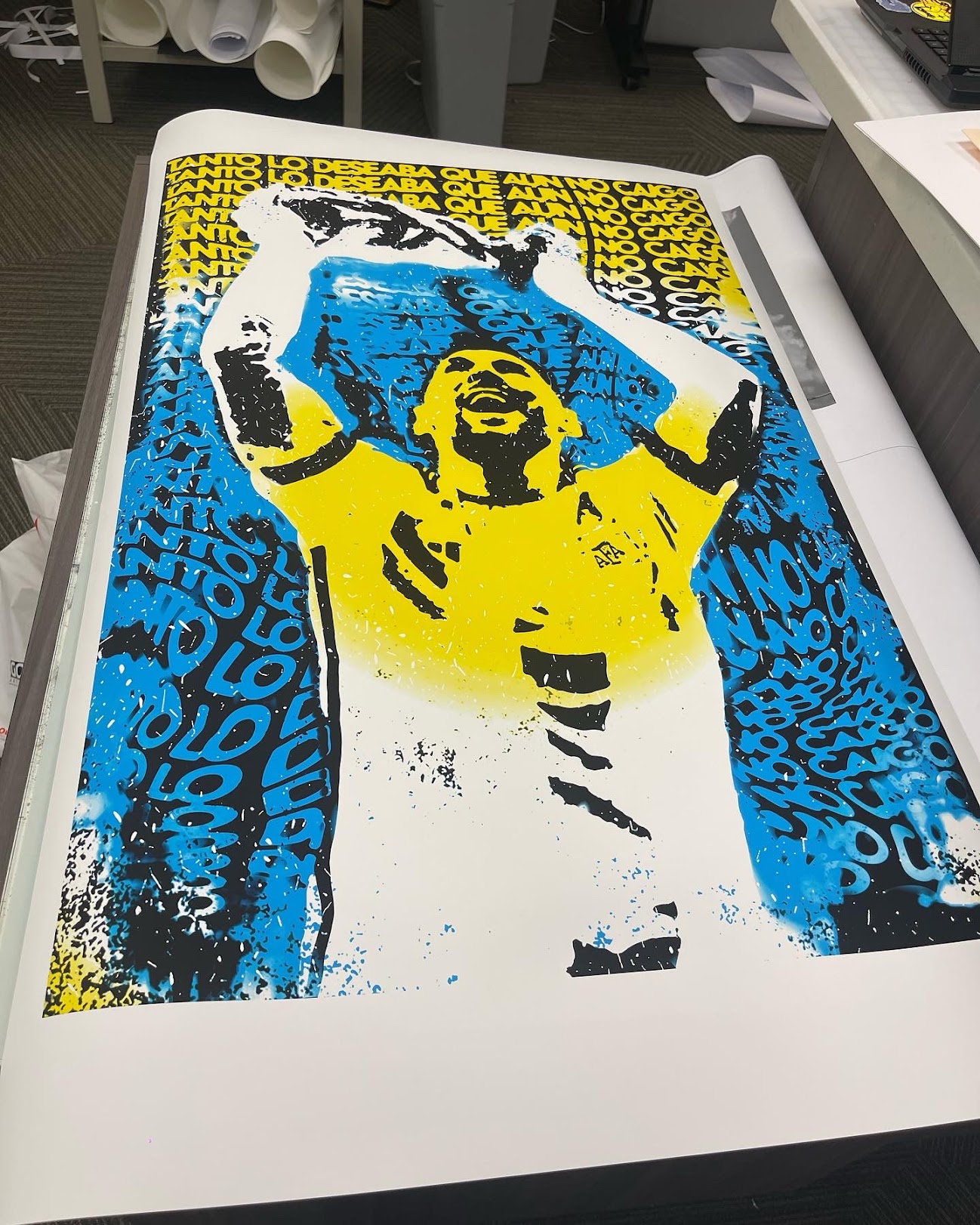 Messi — printed
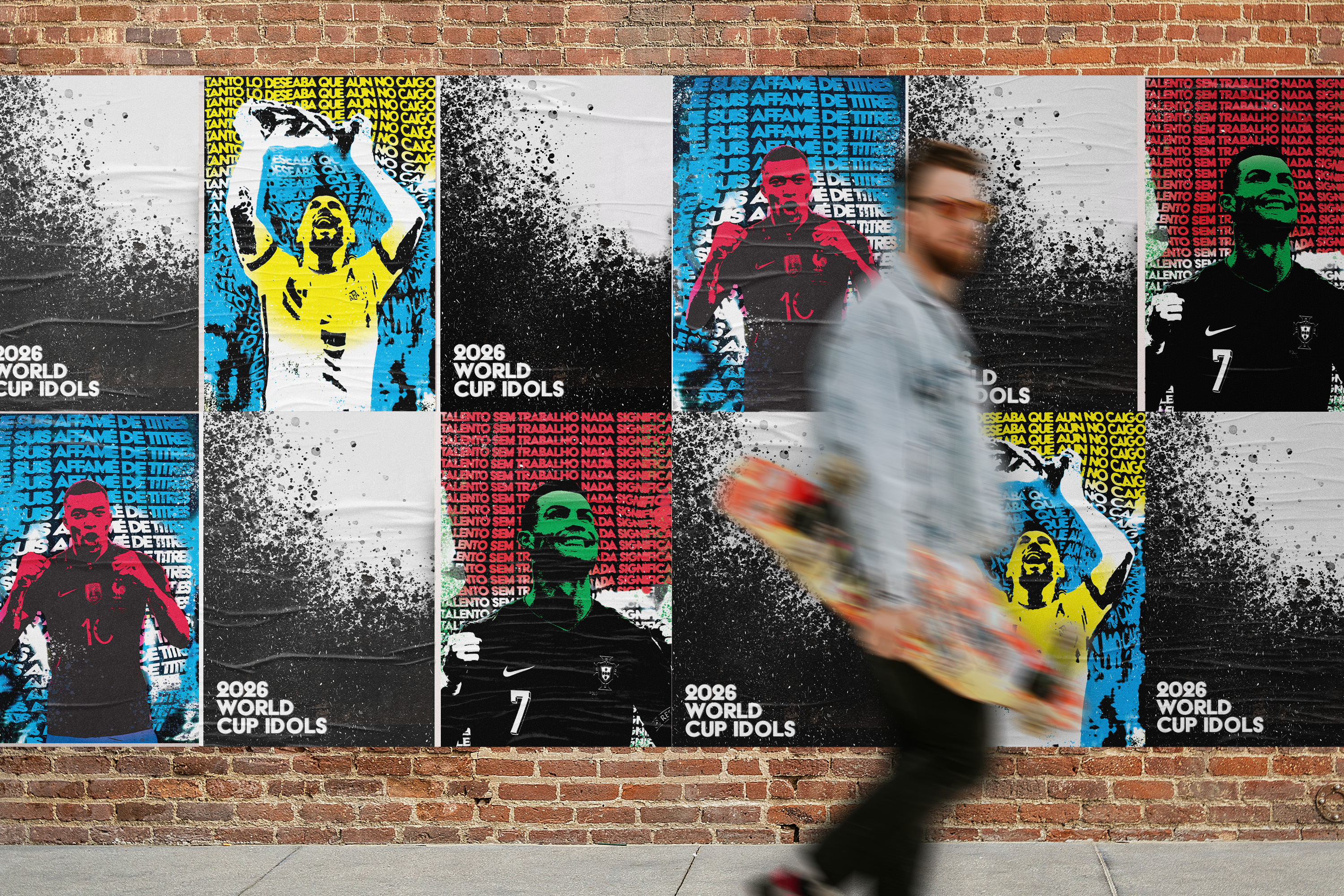 Idols series
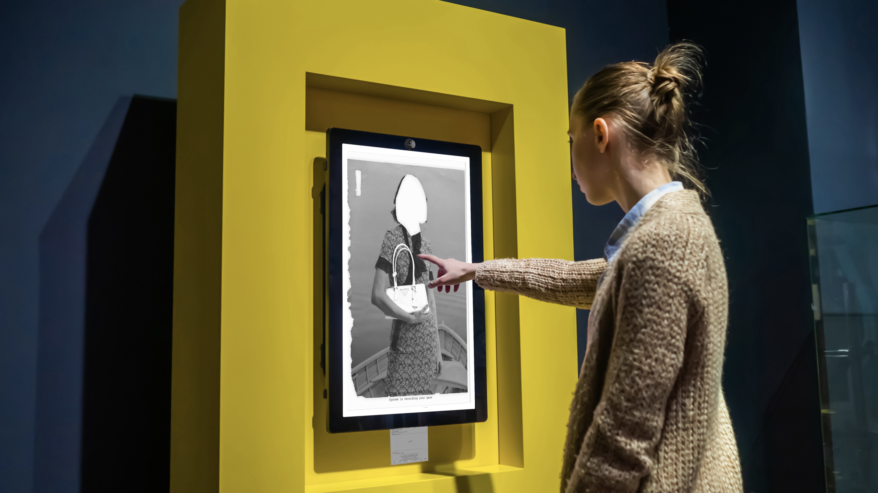
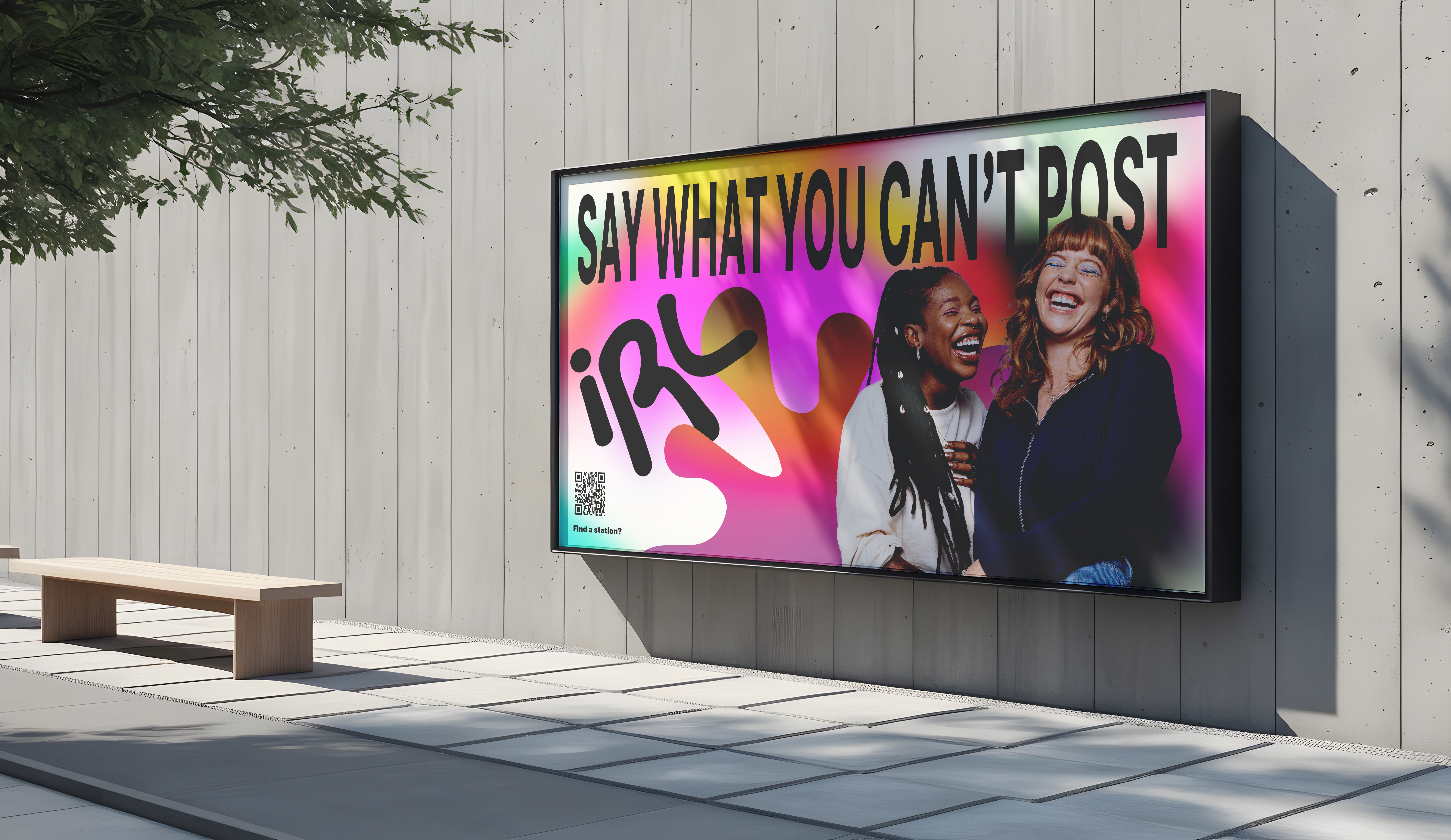 IRL Station
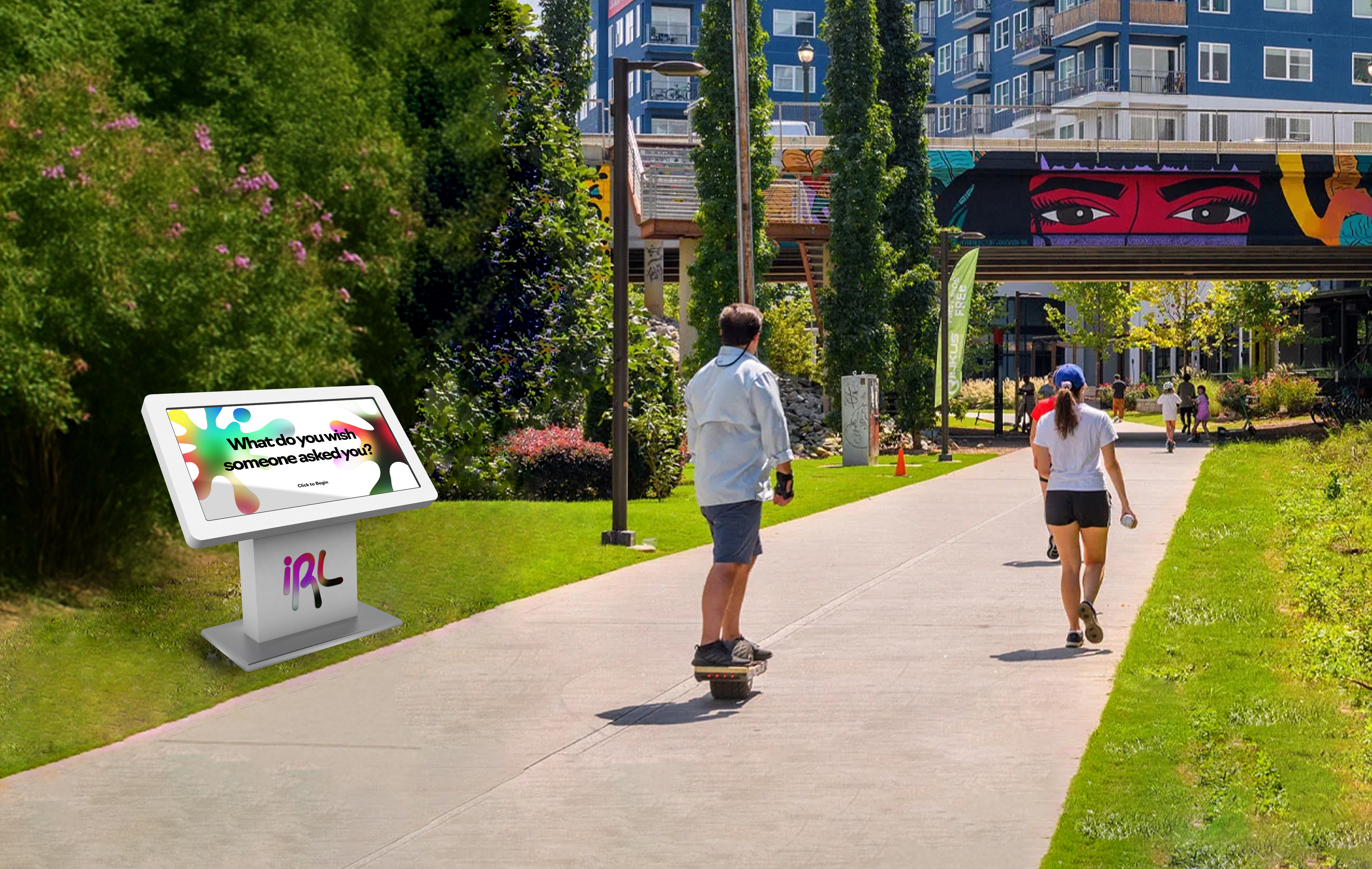 IRL Station 2
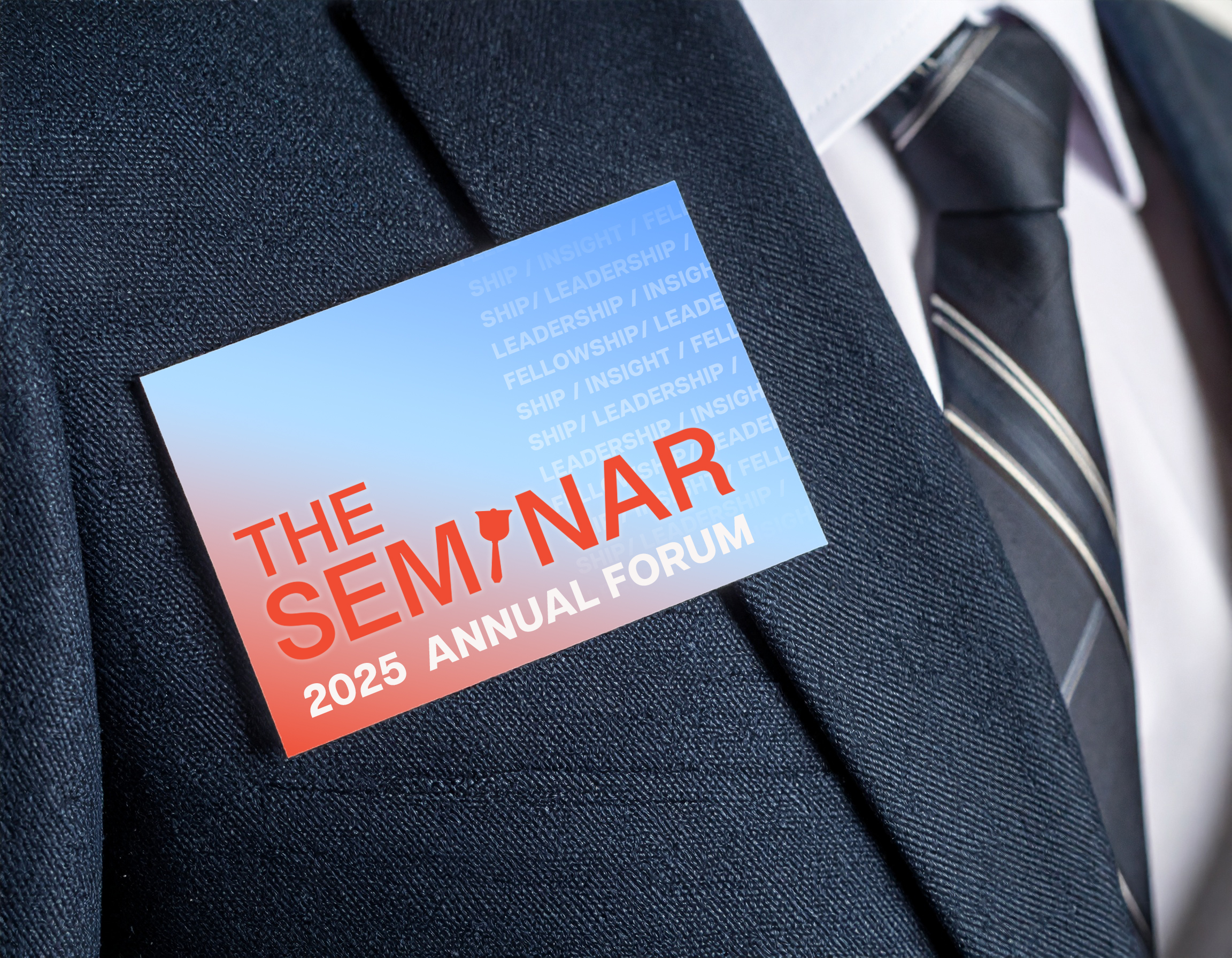 Name tag
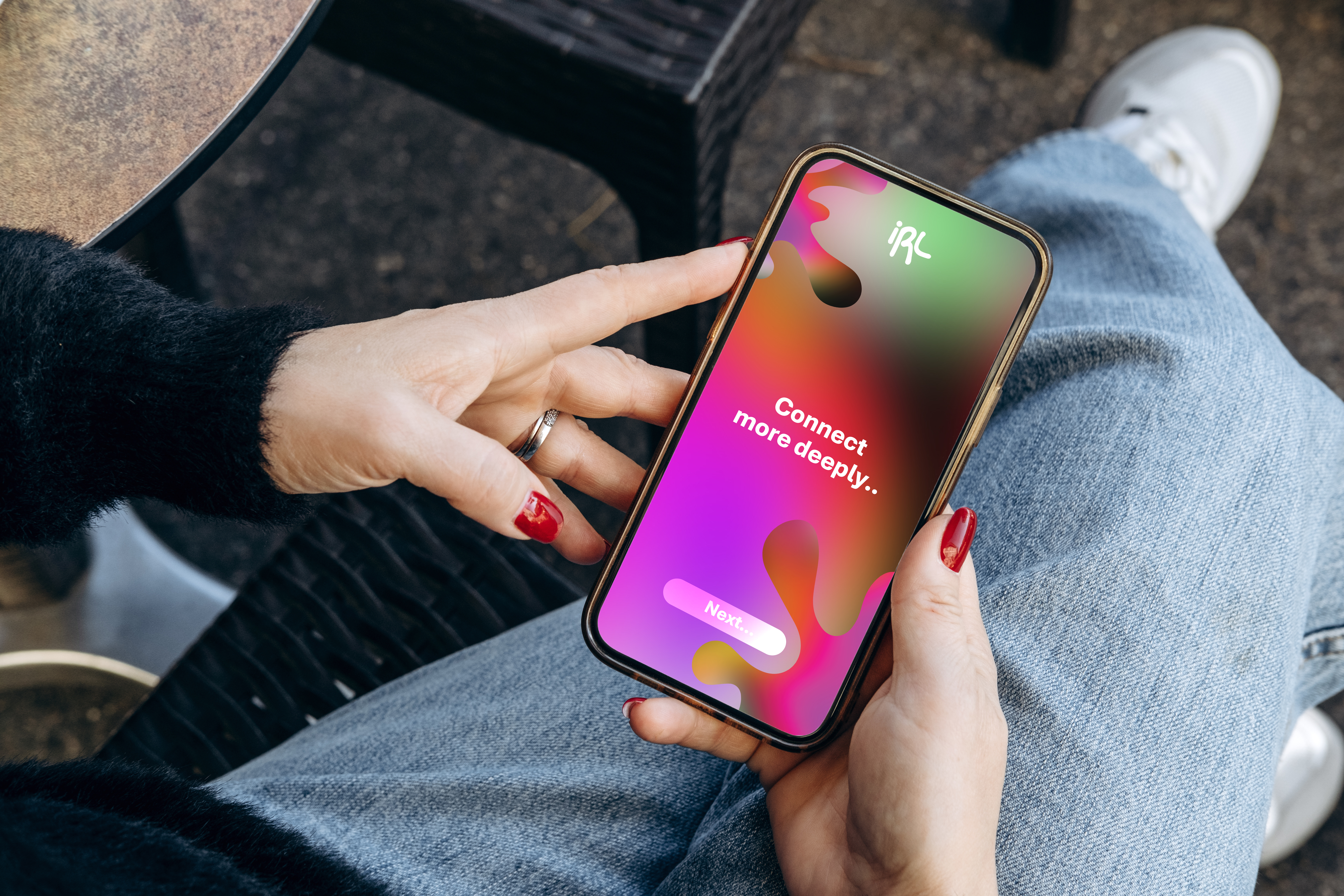 App design
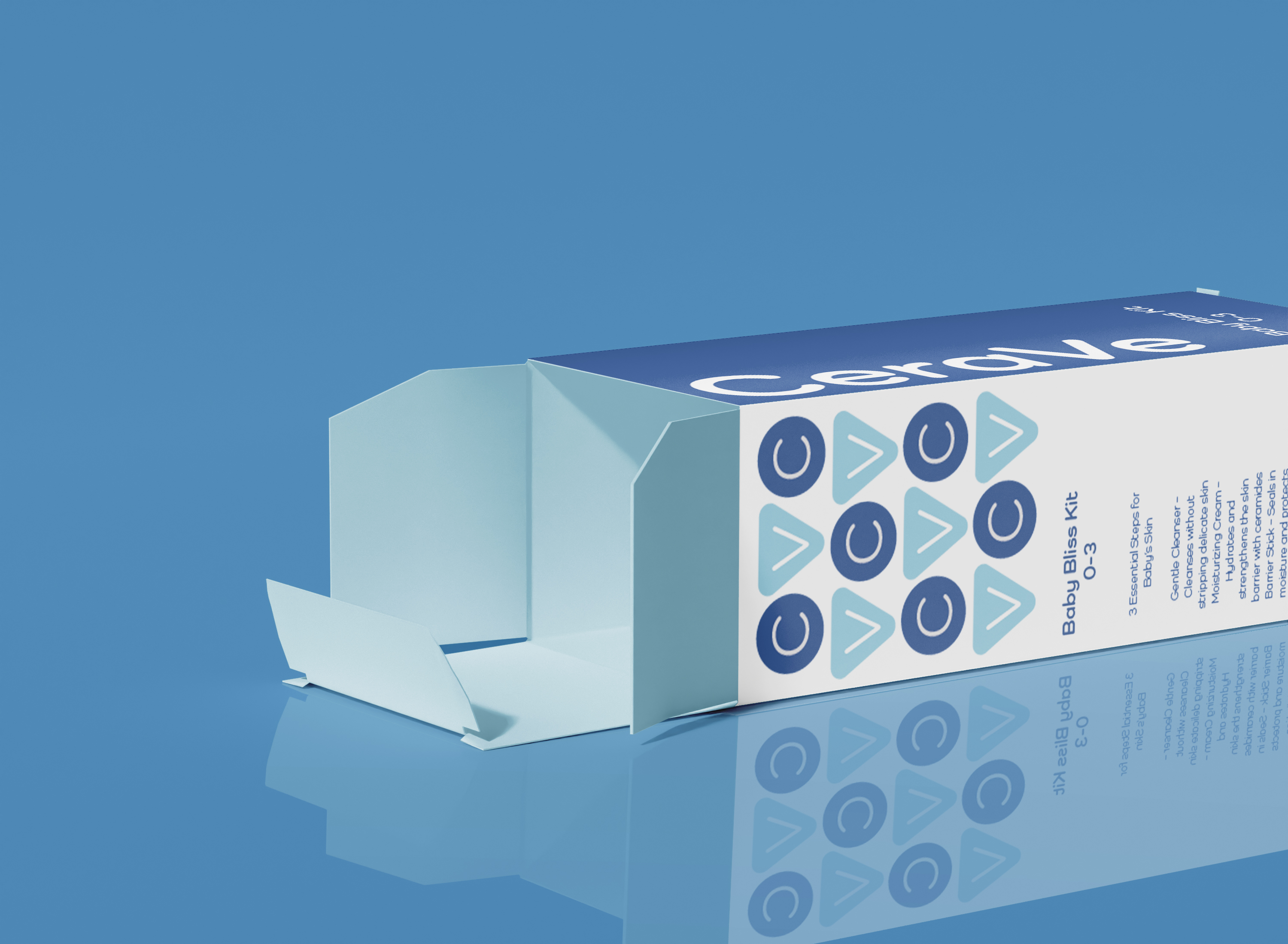 CeraVe box
 CeraVe mockup
 Artboard 42
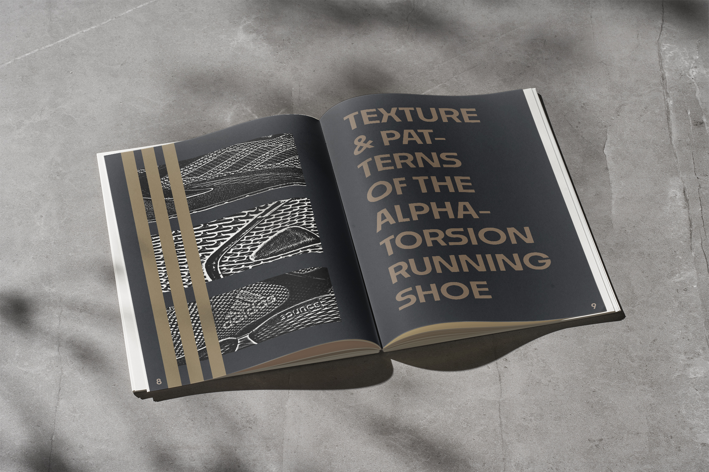 Adidas mockups
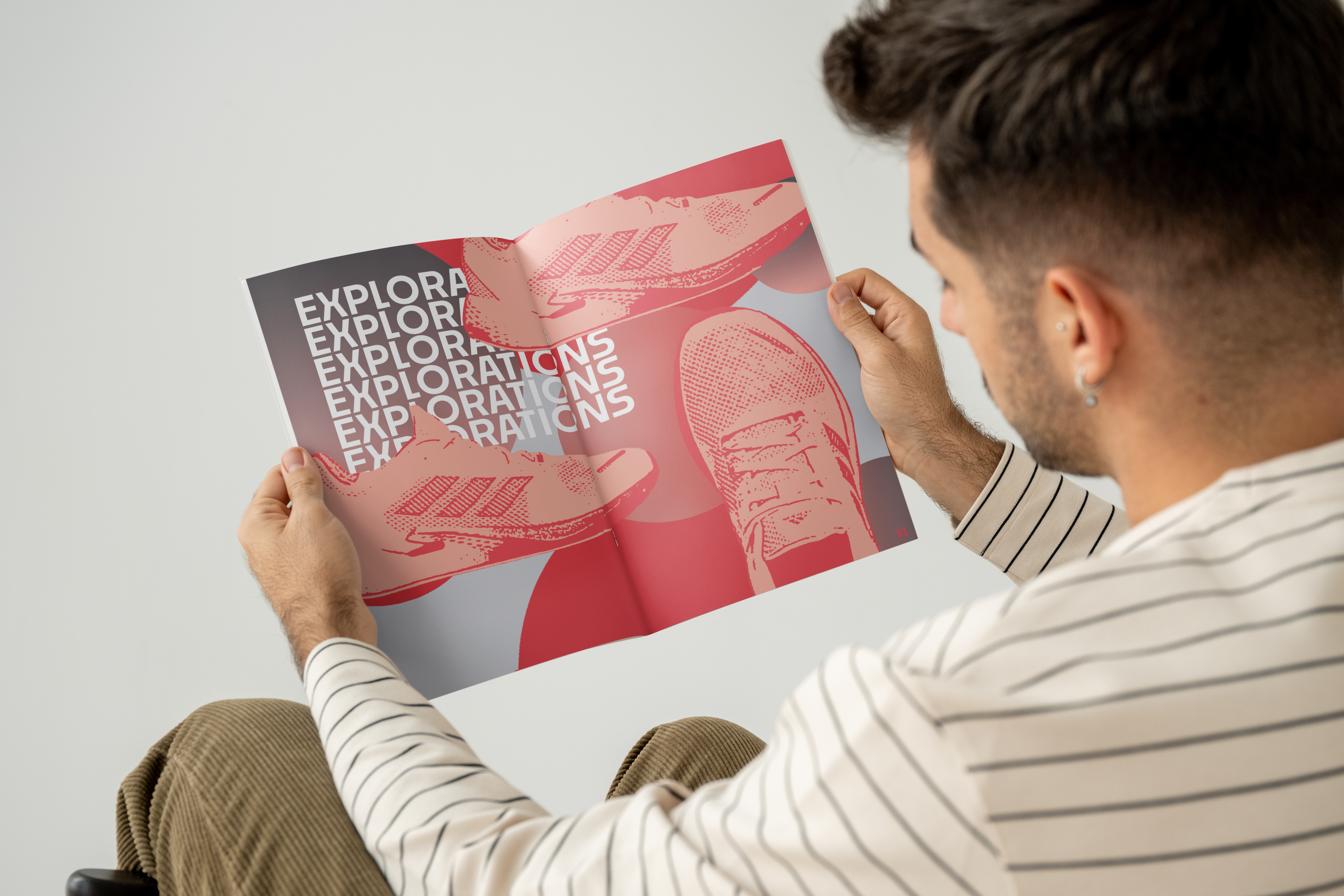 Adidas mockup 3
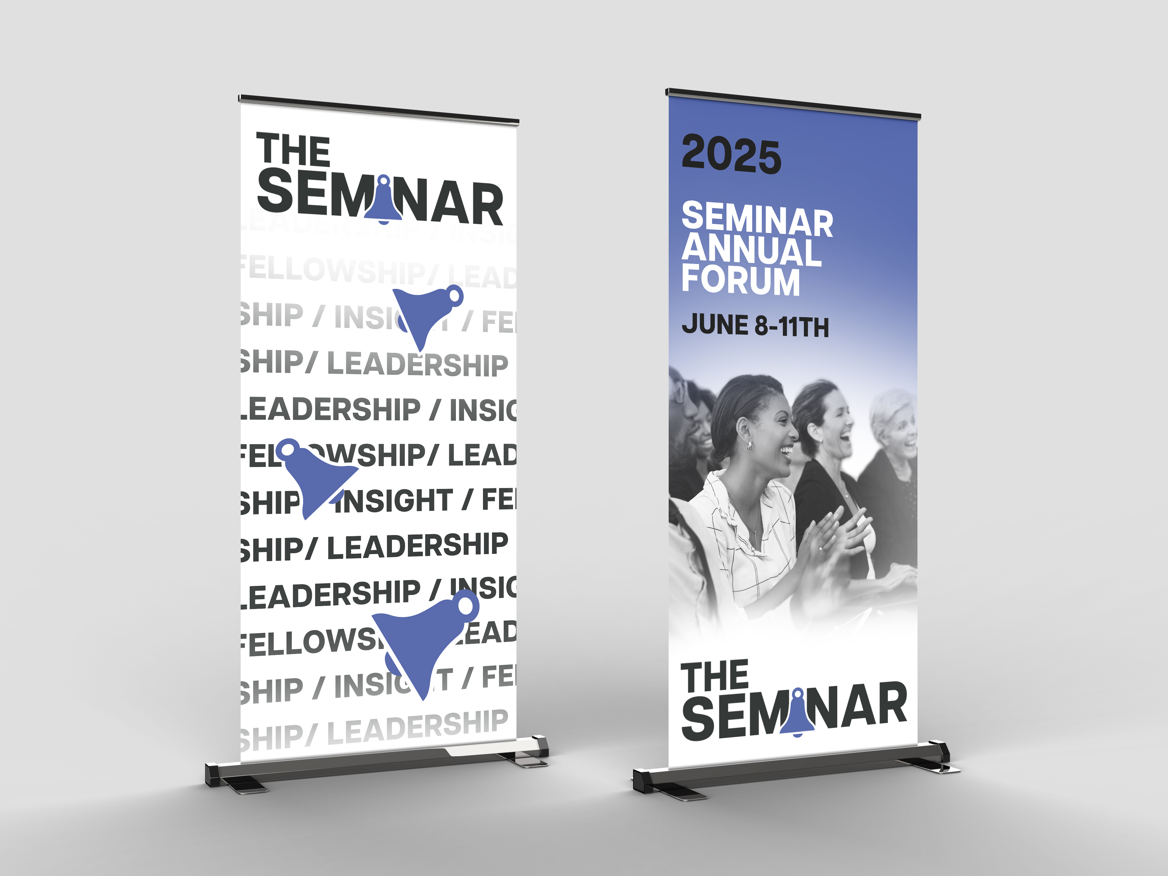 Seminar mockup
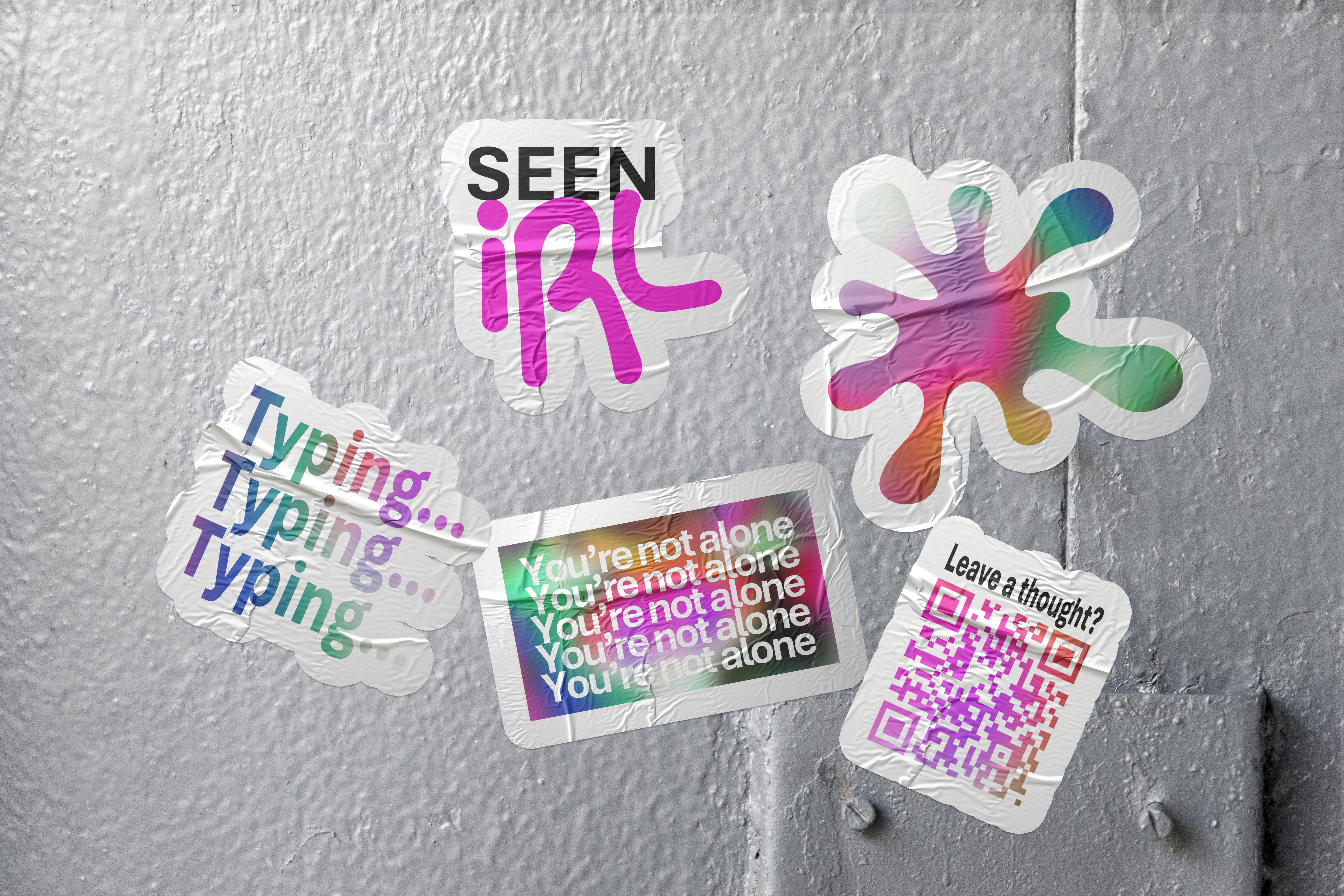 Stickers
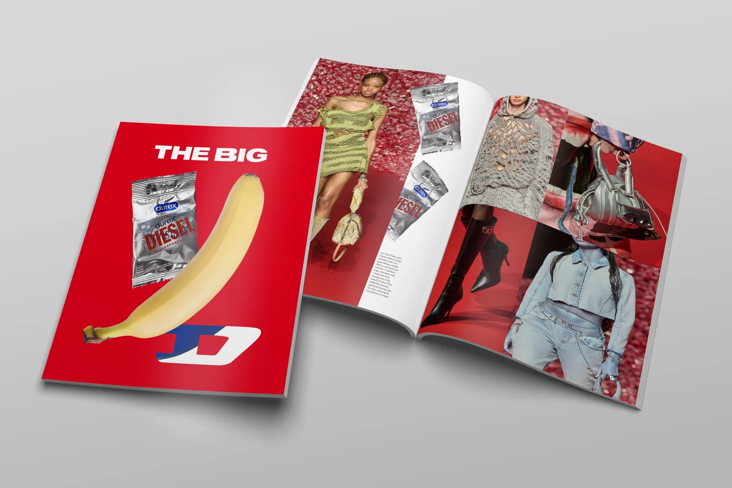
 Front & back
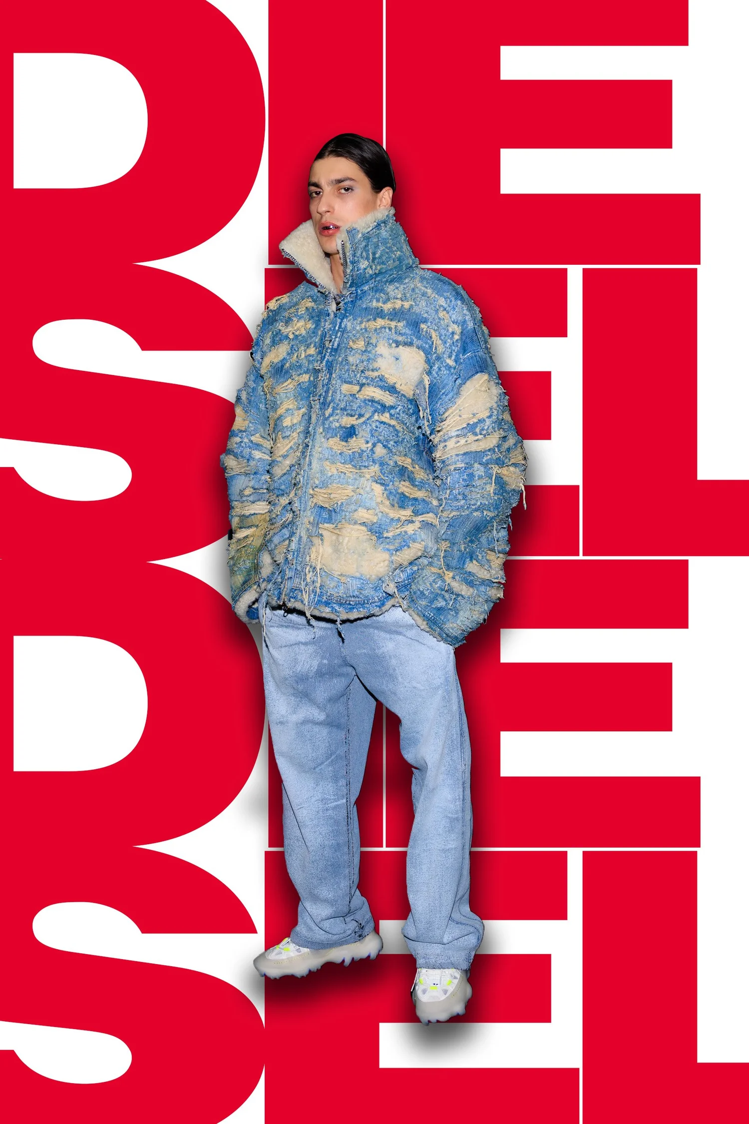 Spread
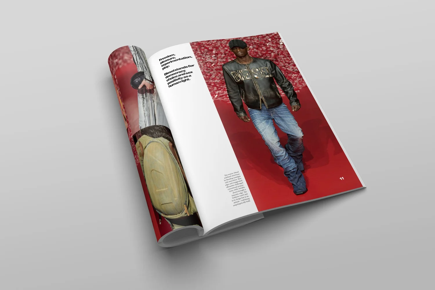 Spread 3
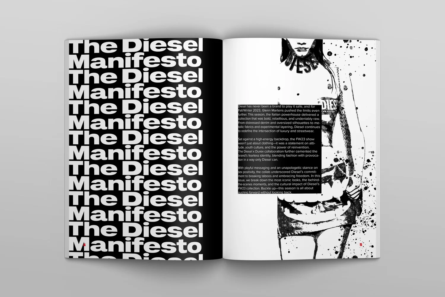 B&W spread
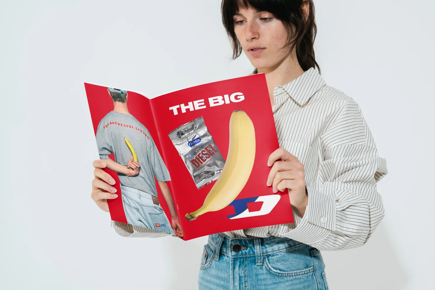 Editorial
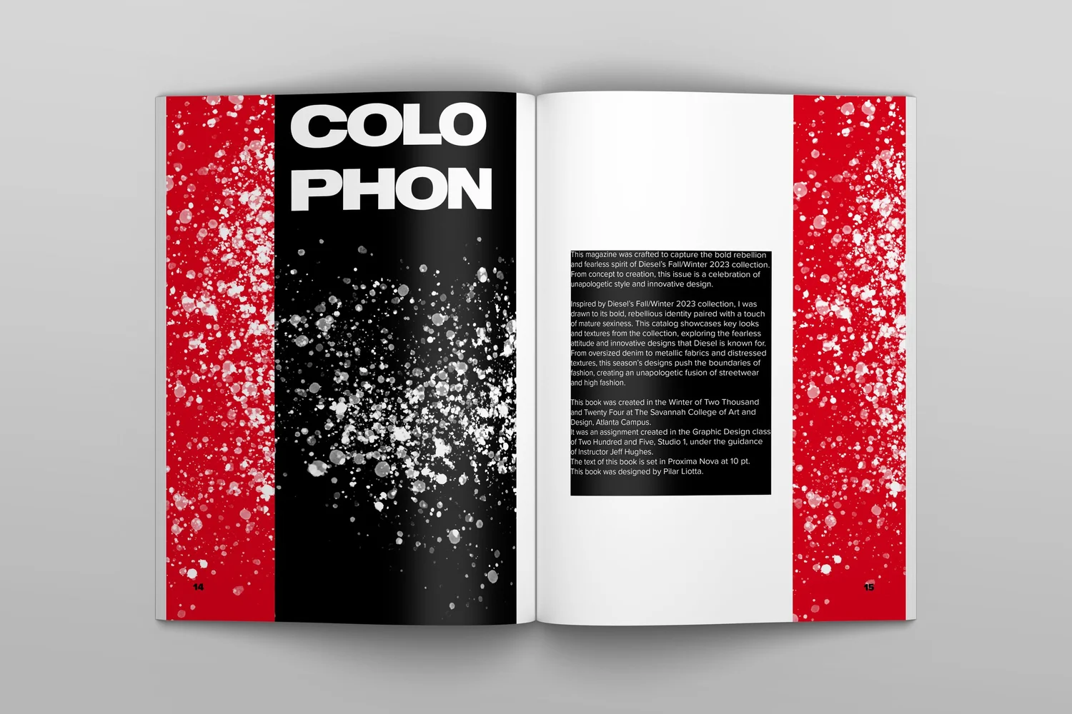 Colophon
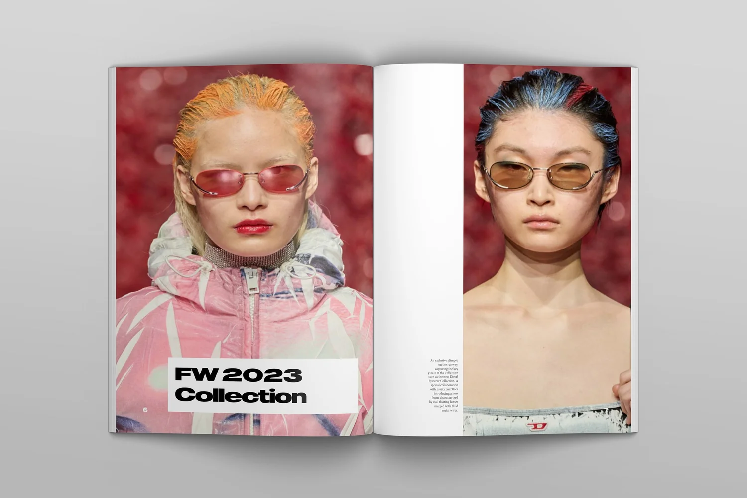 Collection
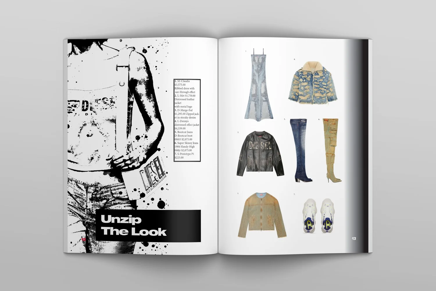 Campaign
 Cover spread
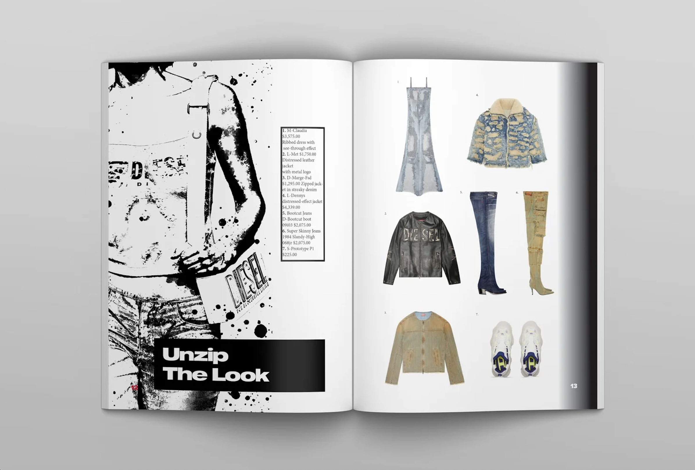 Spread
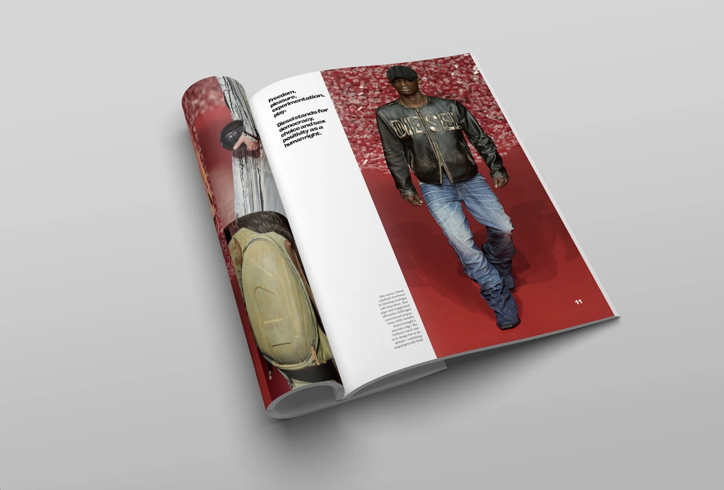 Spread
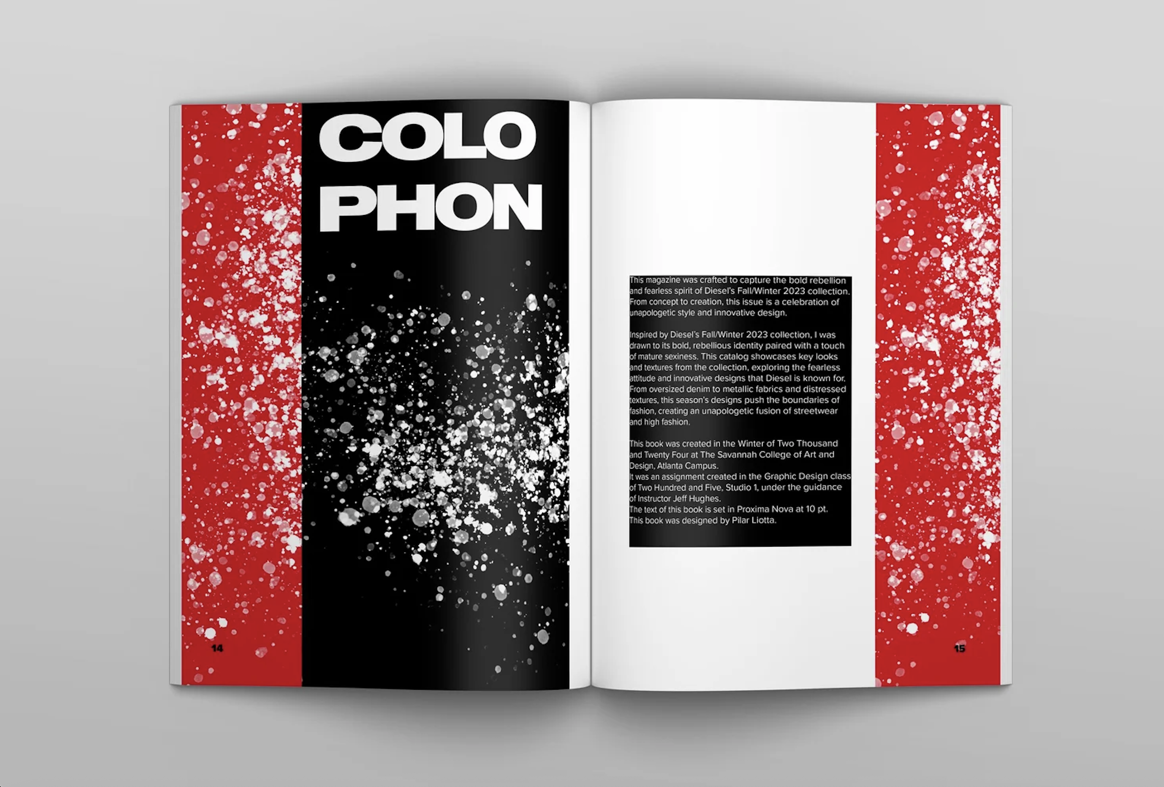 Spread
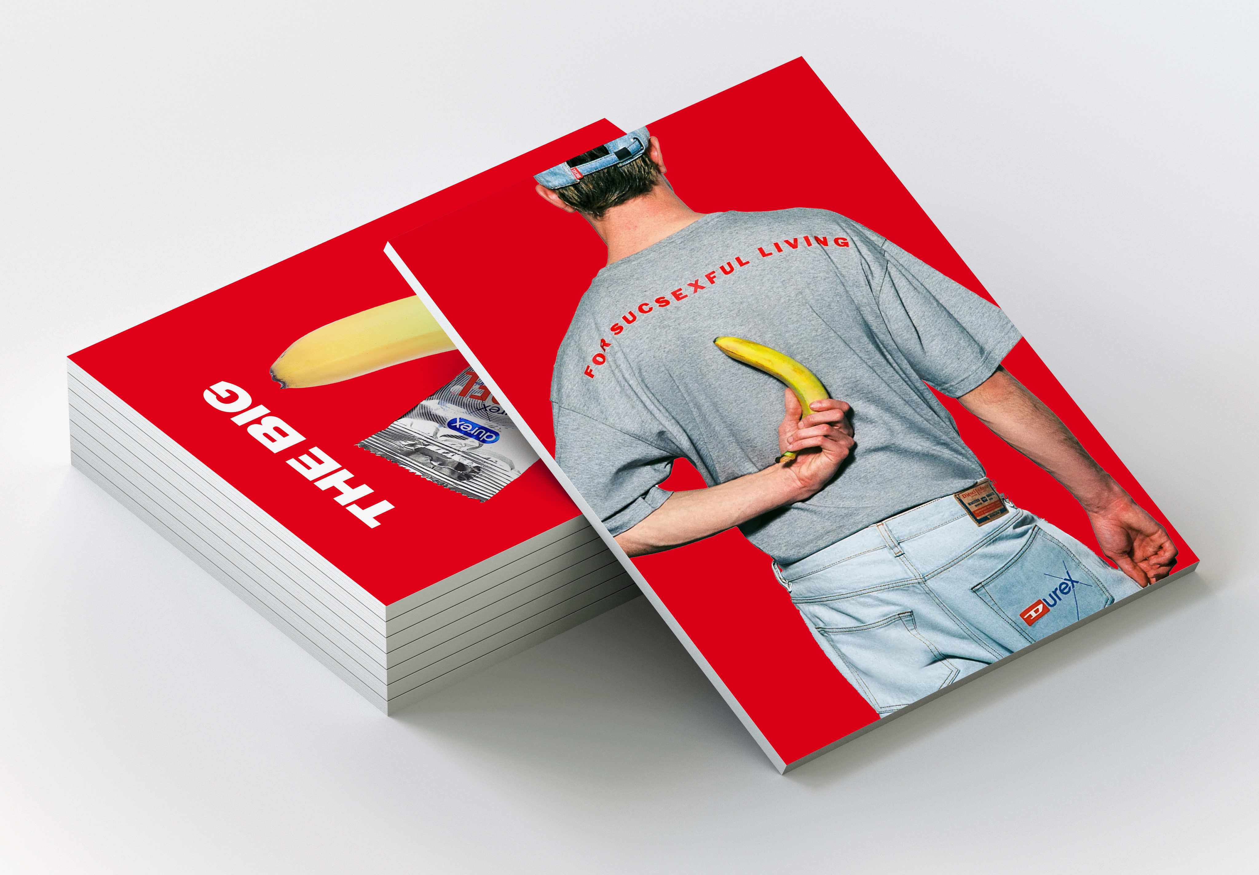
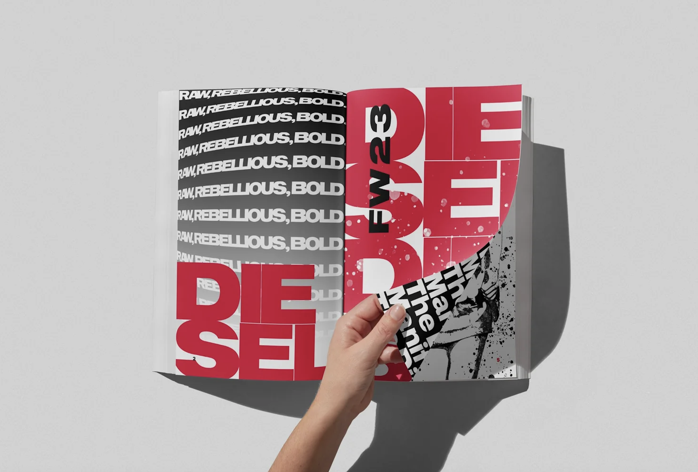 SpreadMagazine mockup
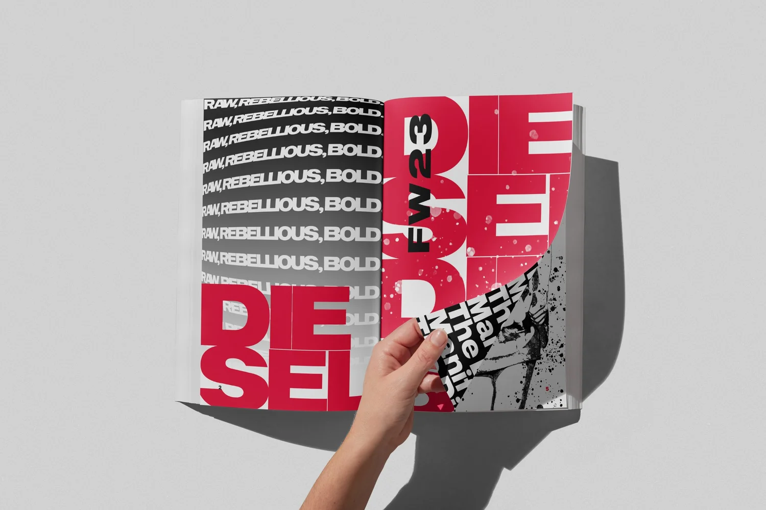 Mockup 2
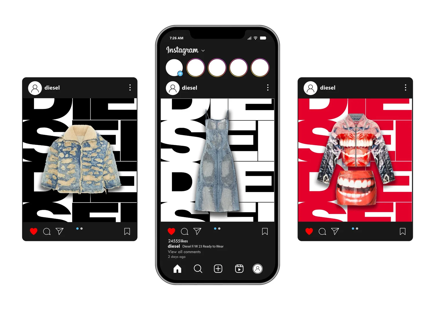 Instagram
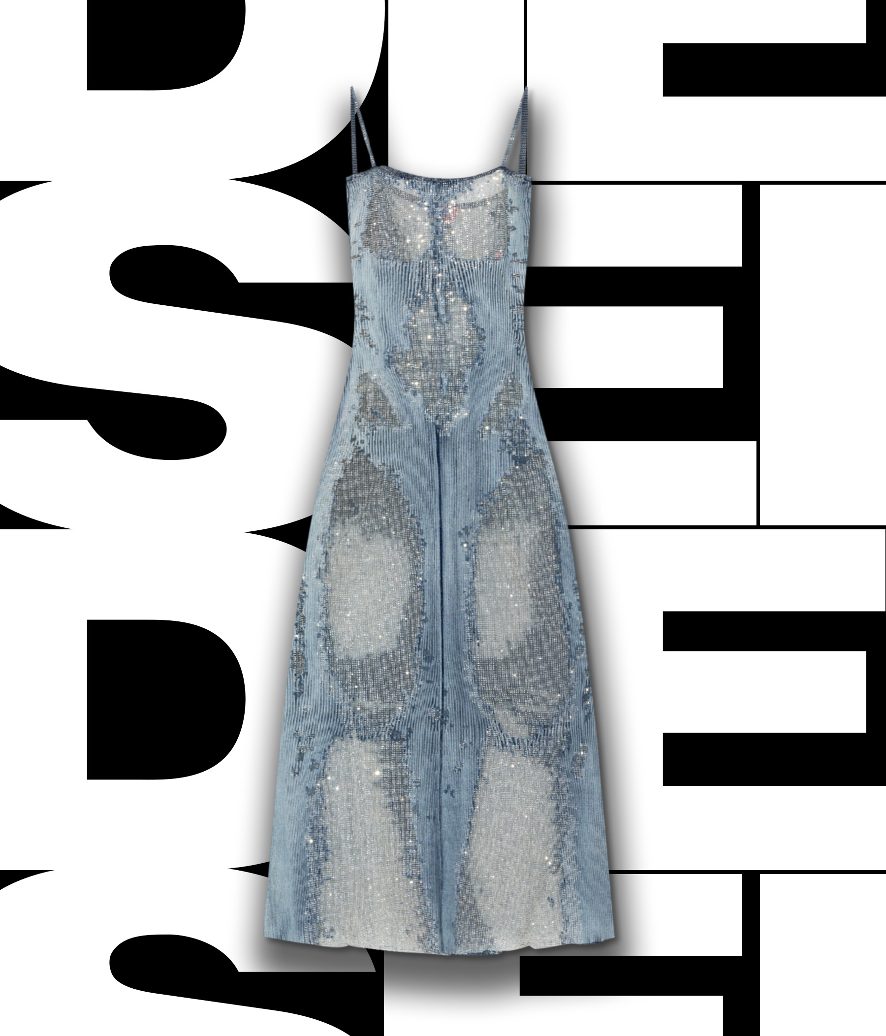 Instagram 2