
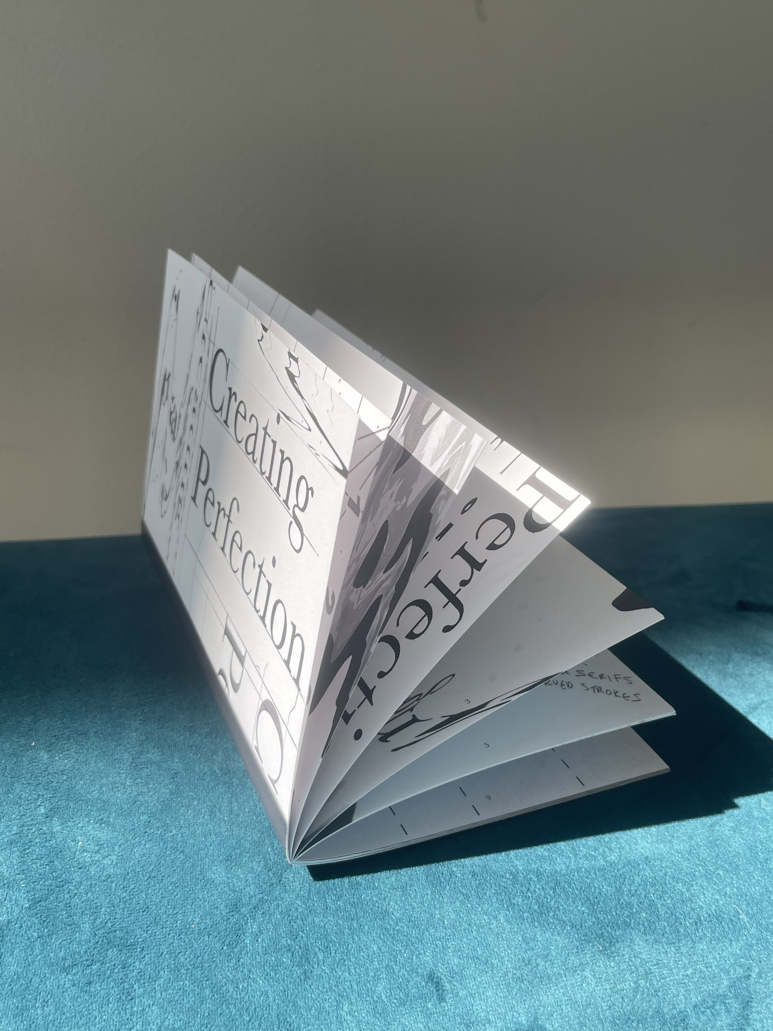
Baskerville: BOOK ON TYPE
Baskerville: Creating Perfection
Class: Type 2, SCAD Atlanta
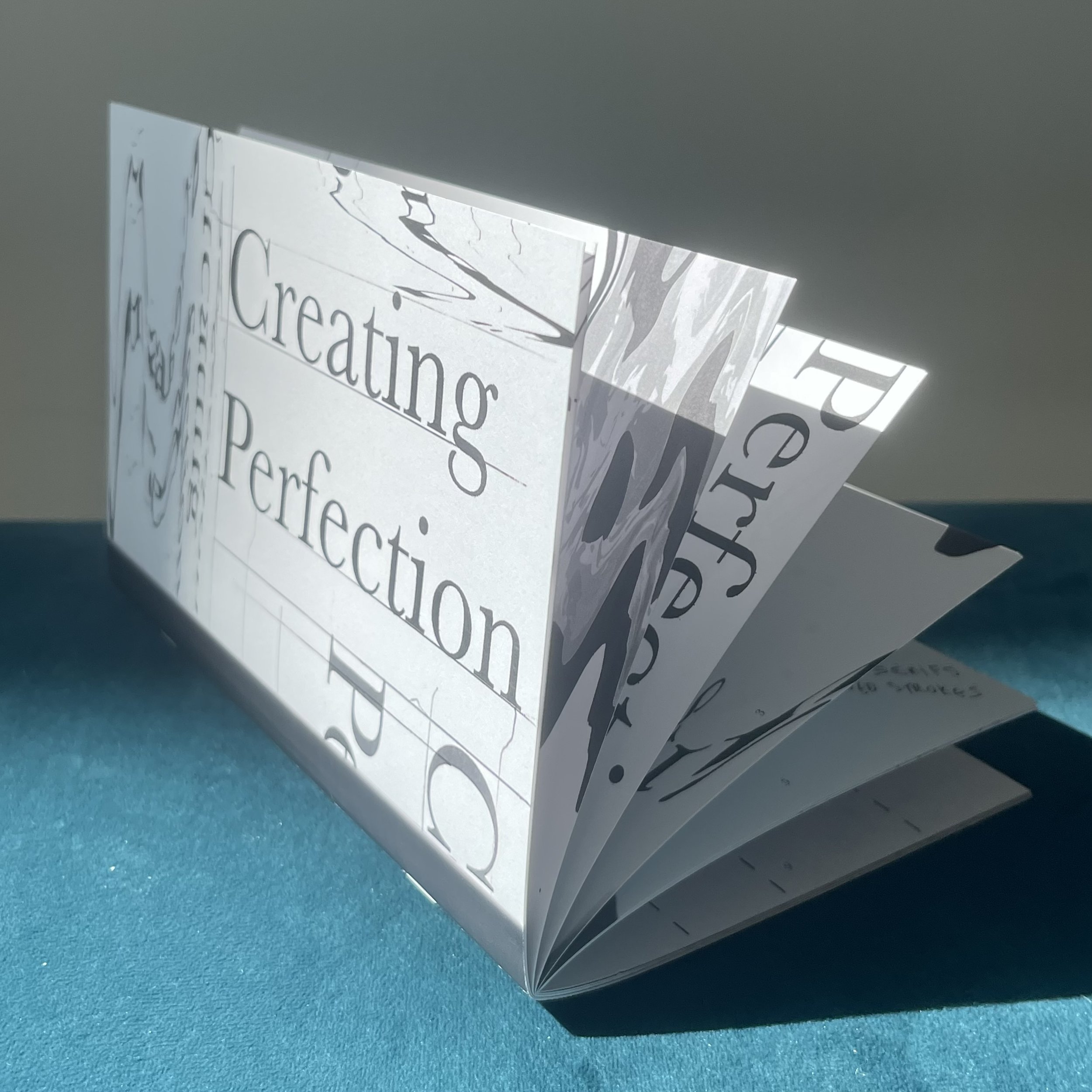
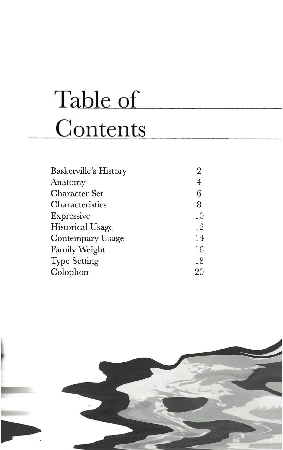
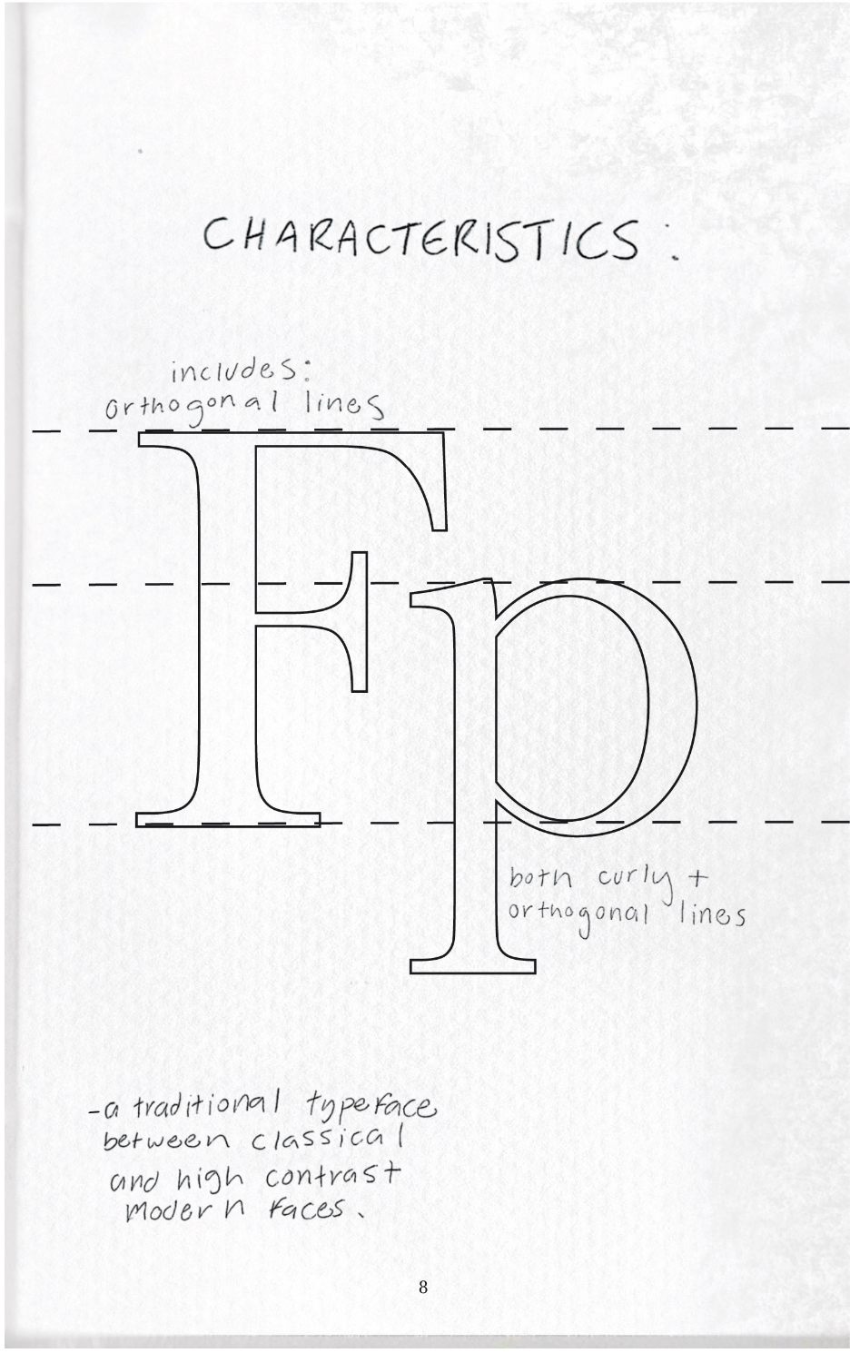
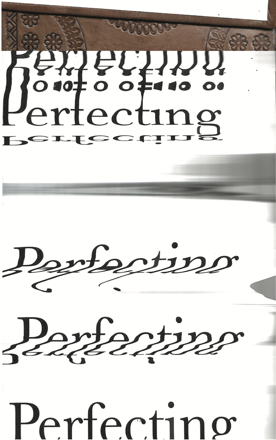
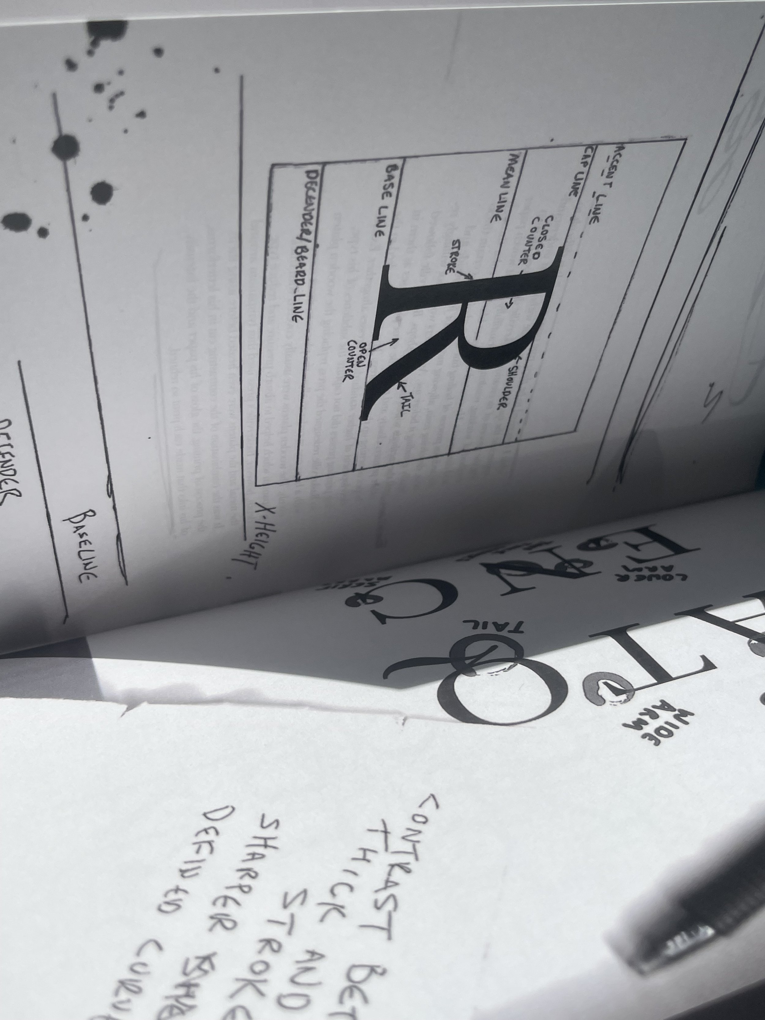
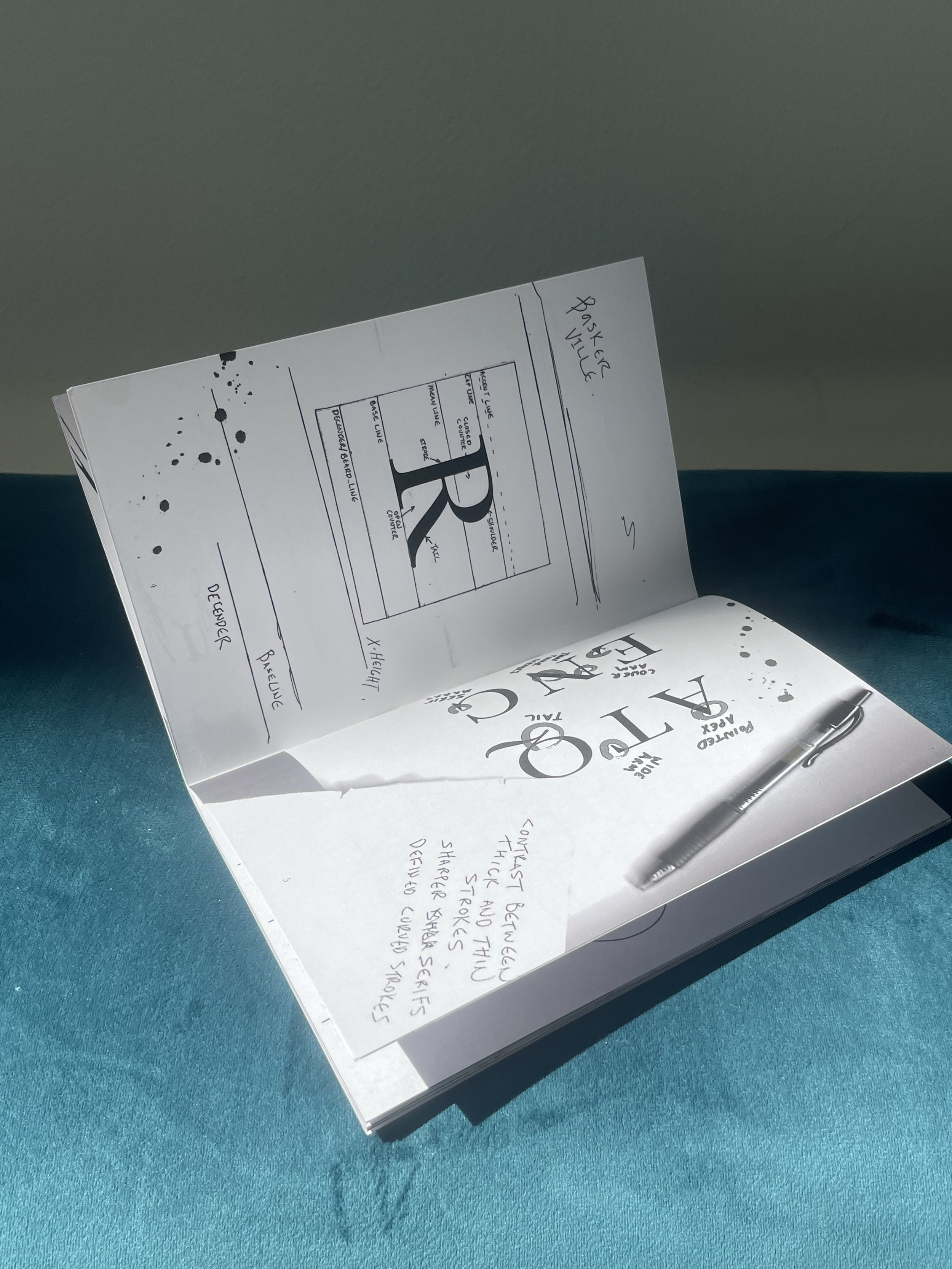
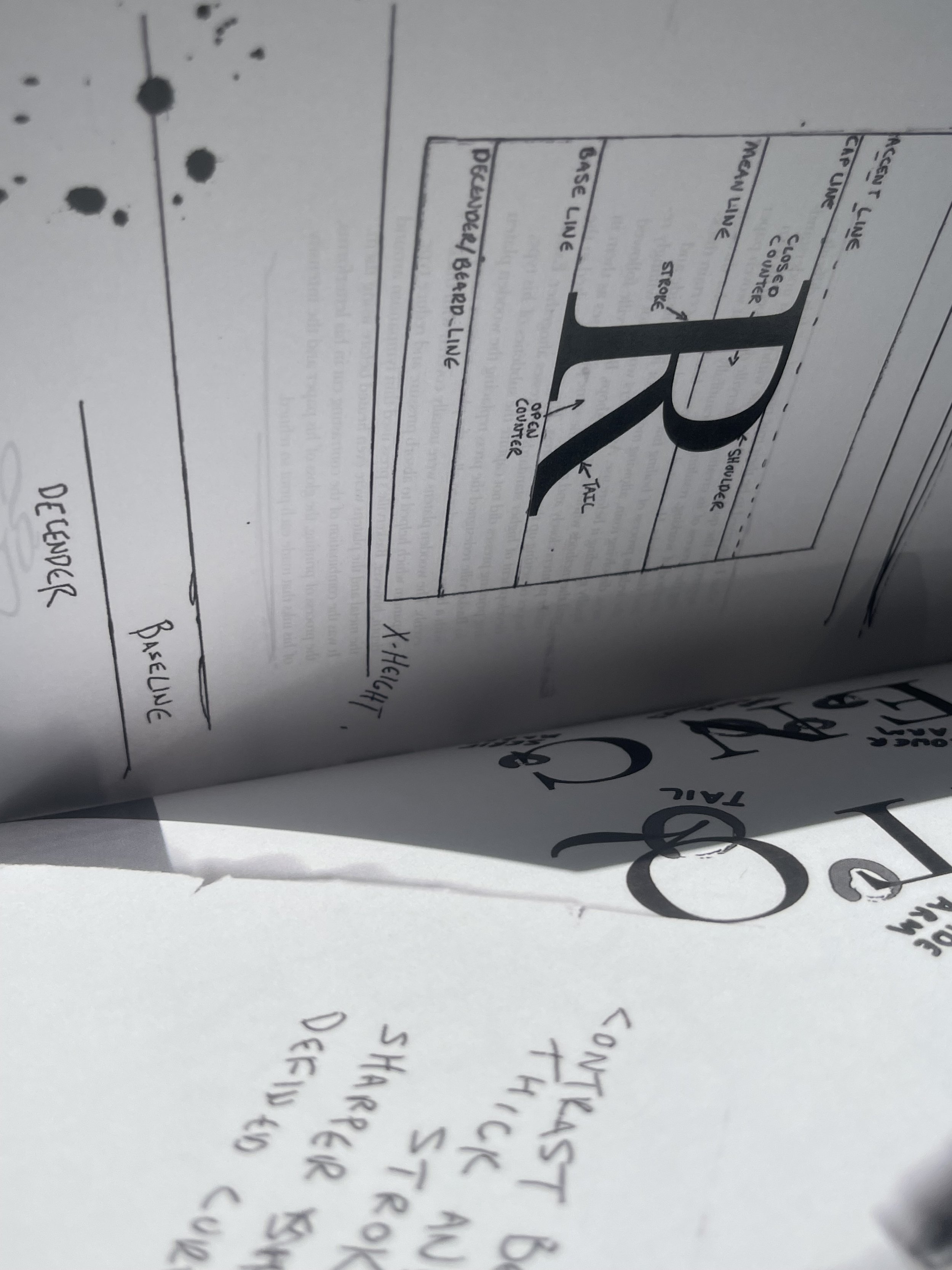
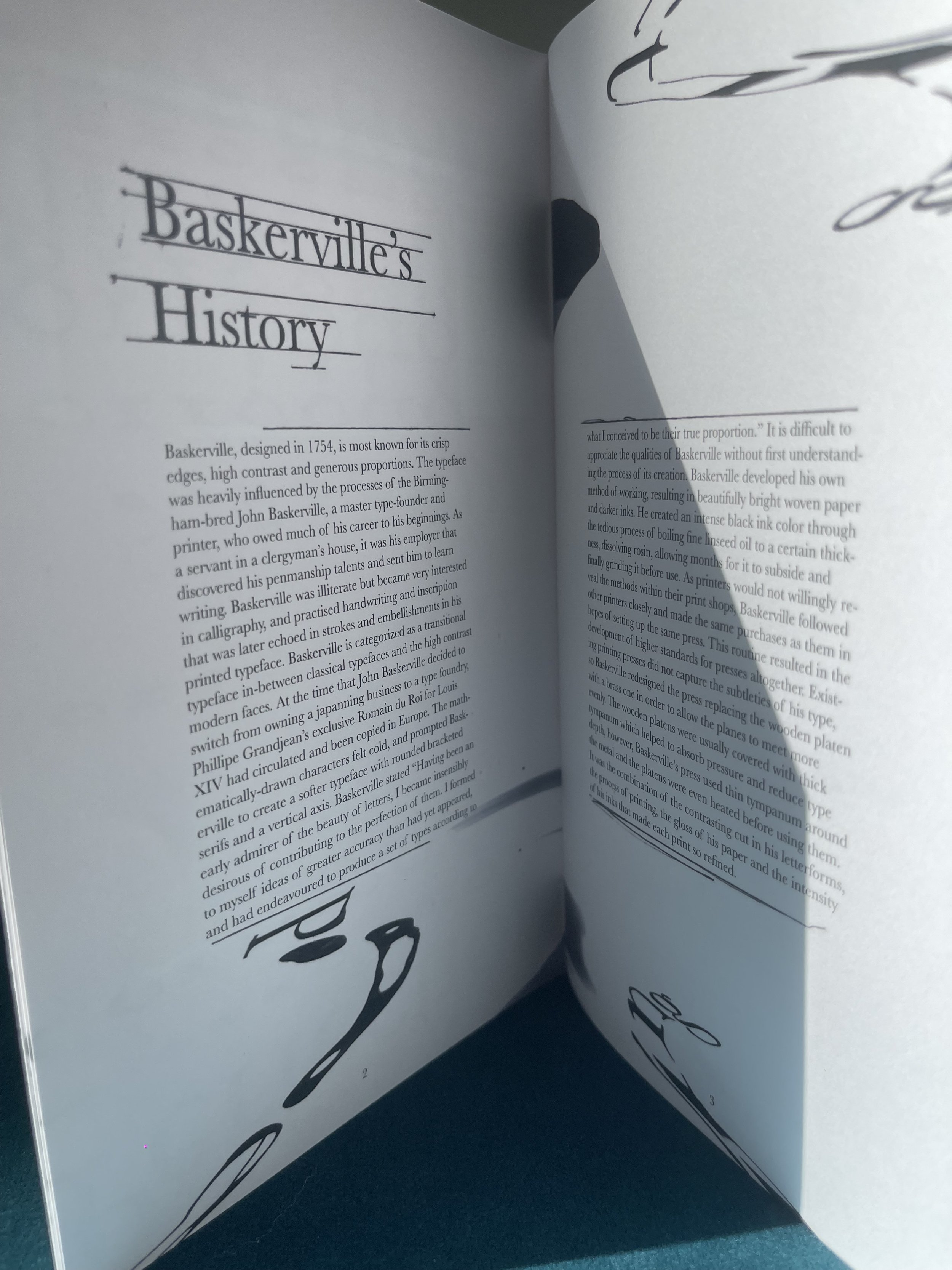
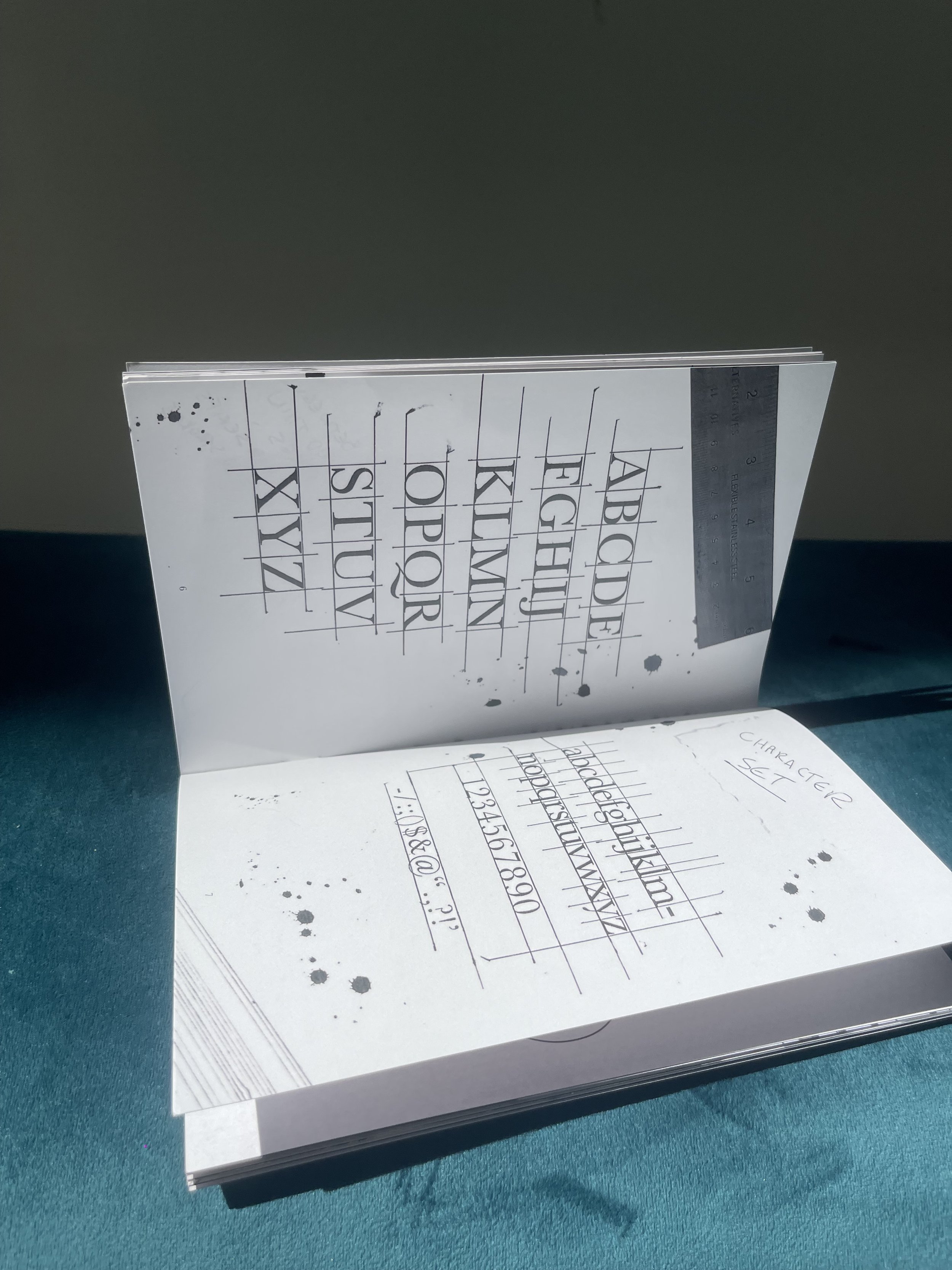
This book delves into the artistry and precision behind the Baskerville typeface, a symbol of elegance and meticulous craftsmanship. Inspired by John Baskerville's relentless pursuit of perfection, the project explores the journey of refining type—from initial sketches to the sharp, harmonious final product.
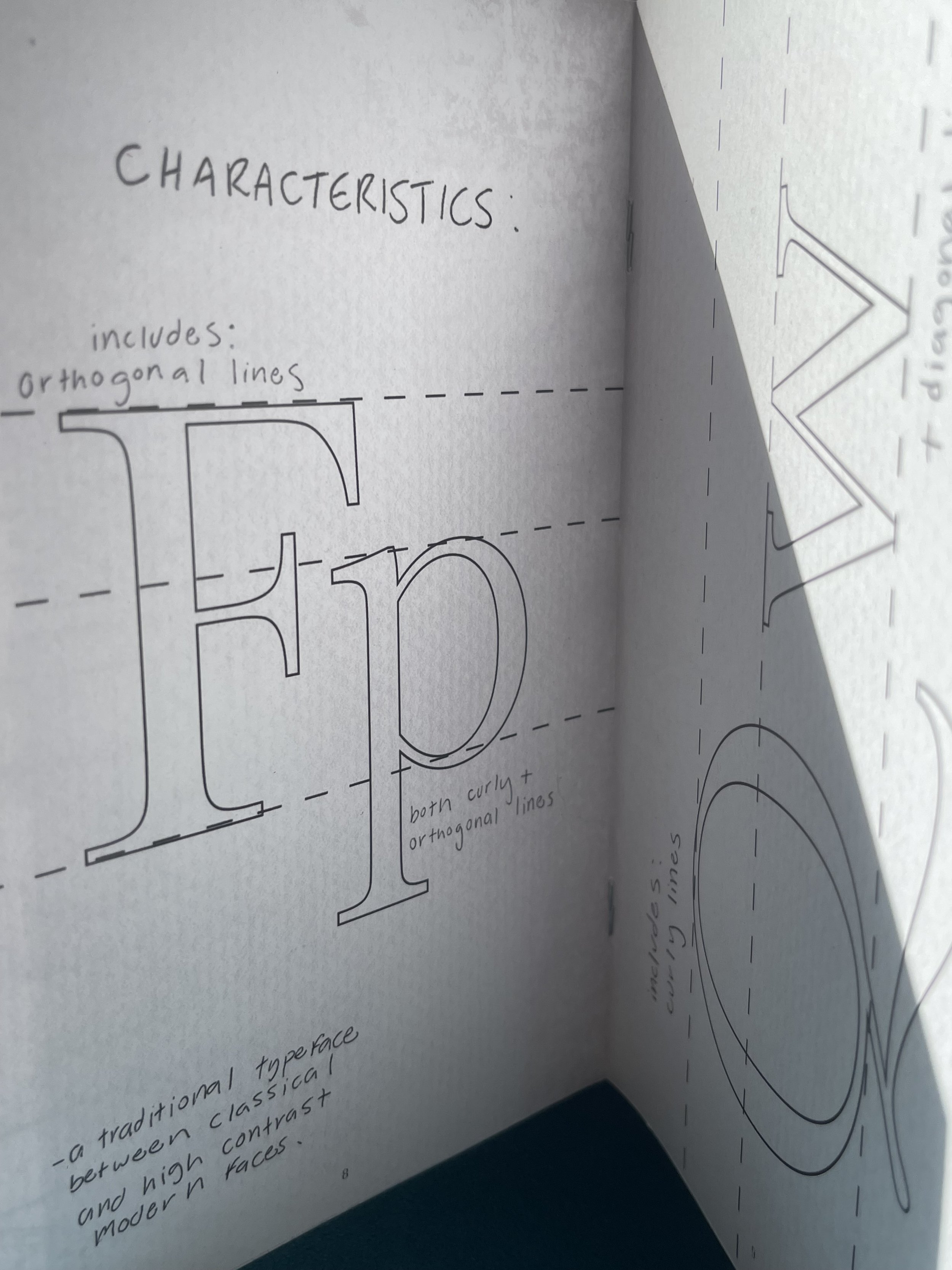
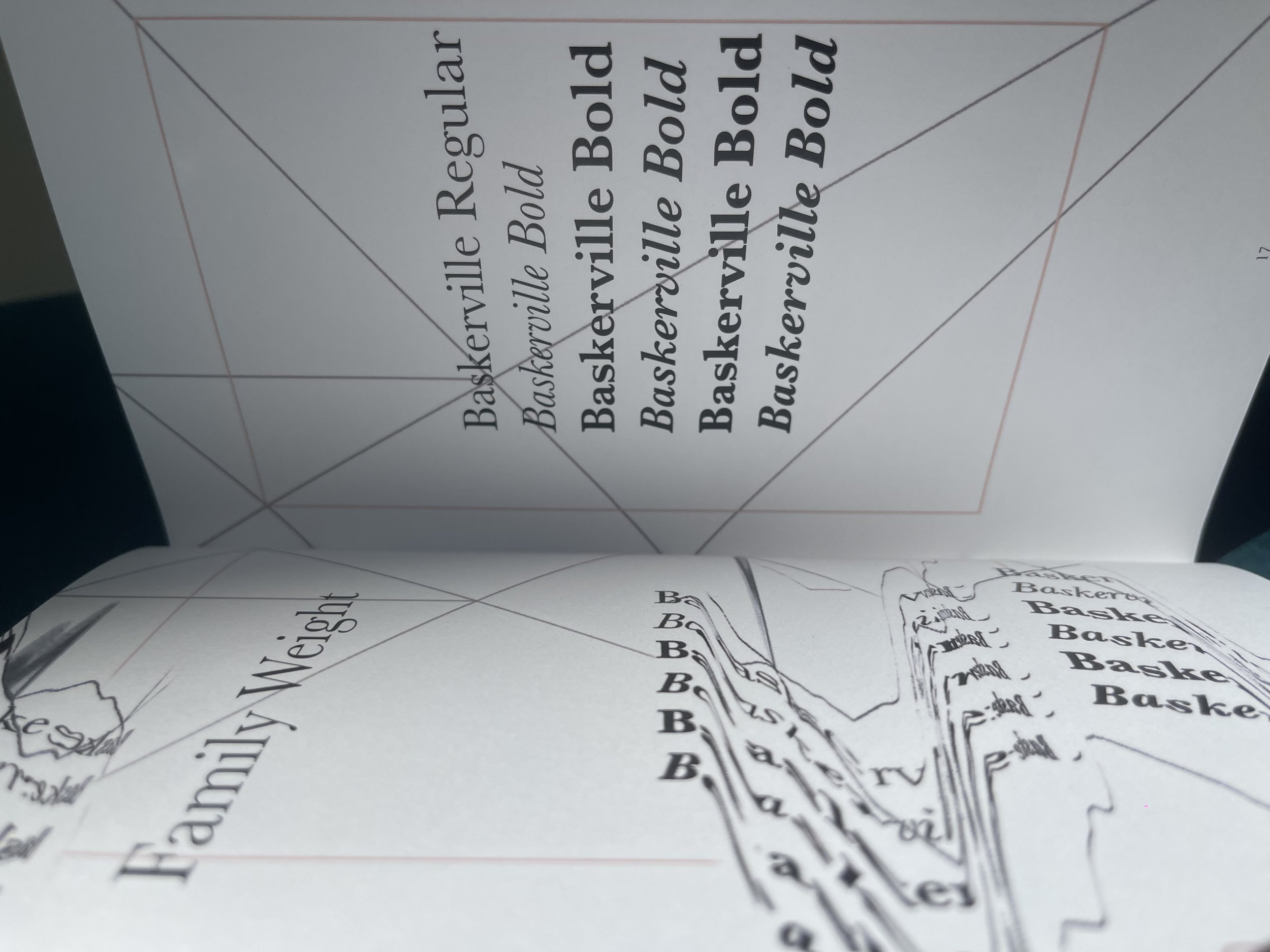
The book embodies ten defining tones: fluid, detailed, sophisticated, timeless, precise, readable, crisp, harmonious, experimental, and classic. With a neutral color palette, it celebrates the idea of perfecting something—a principle Baskerville championed throughout his work.


To accompany the Baskerville: The Journey to Perfection book, I created a motion piece designed as an advertisement to promote the Baskerville typeface. The animation reflects the elegance and precision of the font, using smooth transitions, refined typography, and a sophisticated aesthetic to engage viewers and encourage them to explore the typeface’s legacy.
This video captures a full flip-through of Baskerville: The Journey to Perfection, providing a closer look at the book’s layout, typography, and design details. It allows viewers to experience the structure and flow of the book, showcasing how the visual elements come together to celebrate the precision and elegance of the Baskerville typeface.