

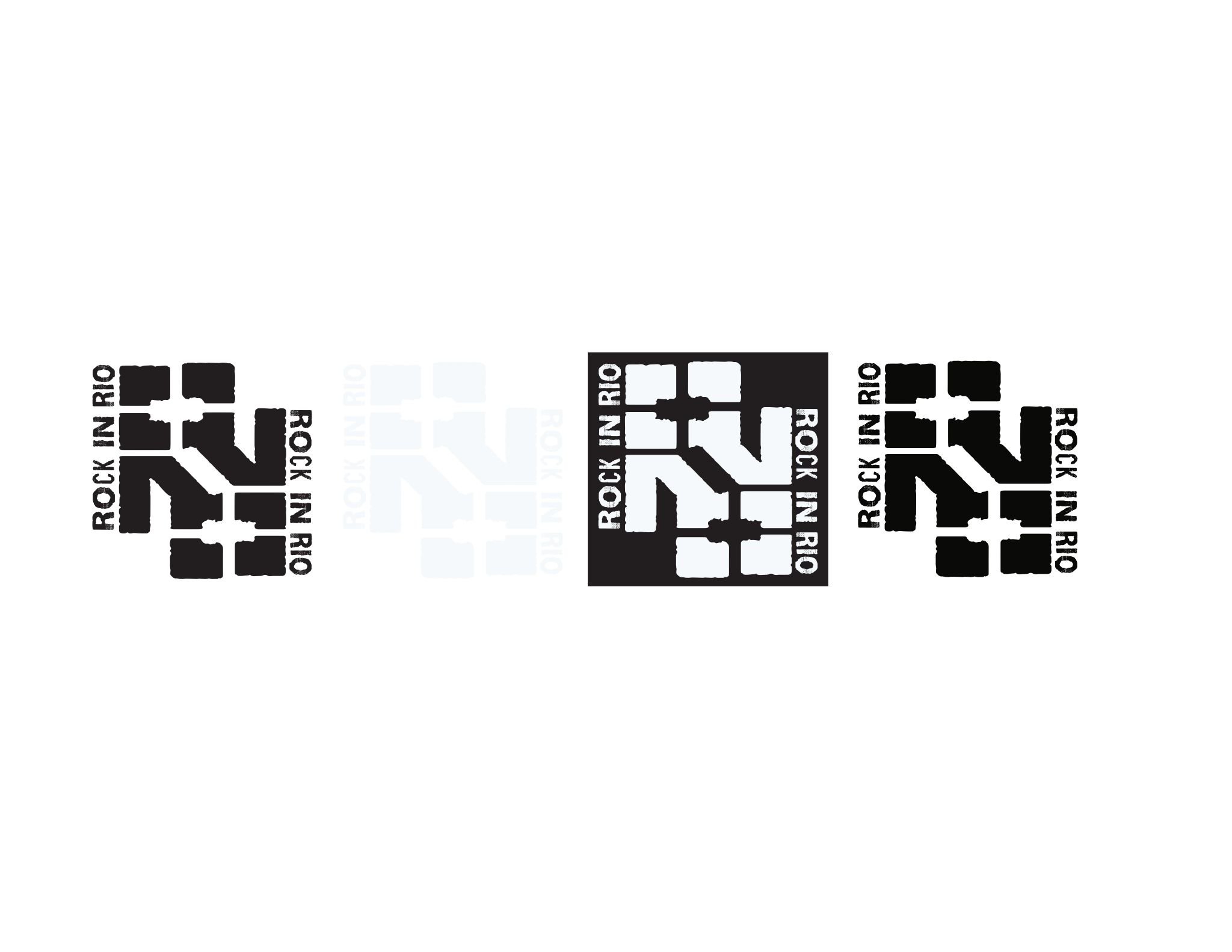
ROCK IN RIO : Rebrand
For our SCAD Graphic Design Studio II: Brand Direction class, our team—The Powerpuff Girls—was tasked with rebranding Rock in Rio for its 40th anniversary.
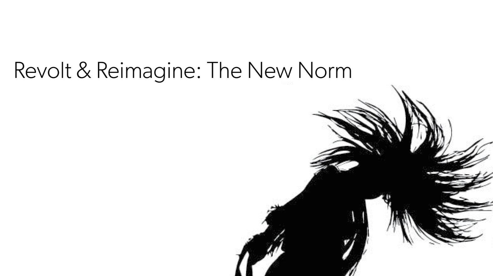
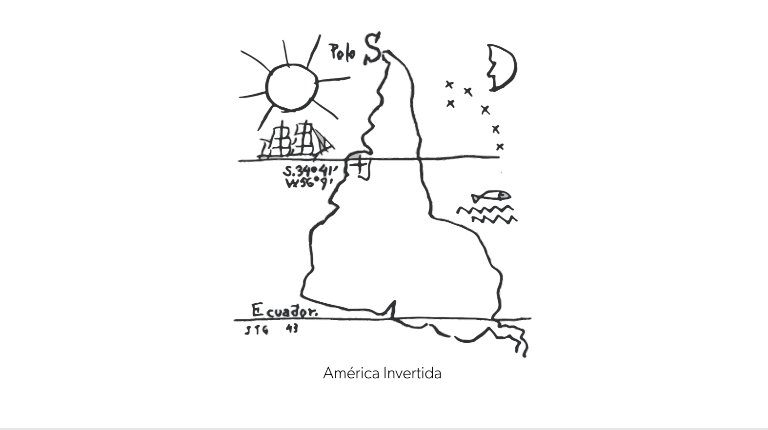
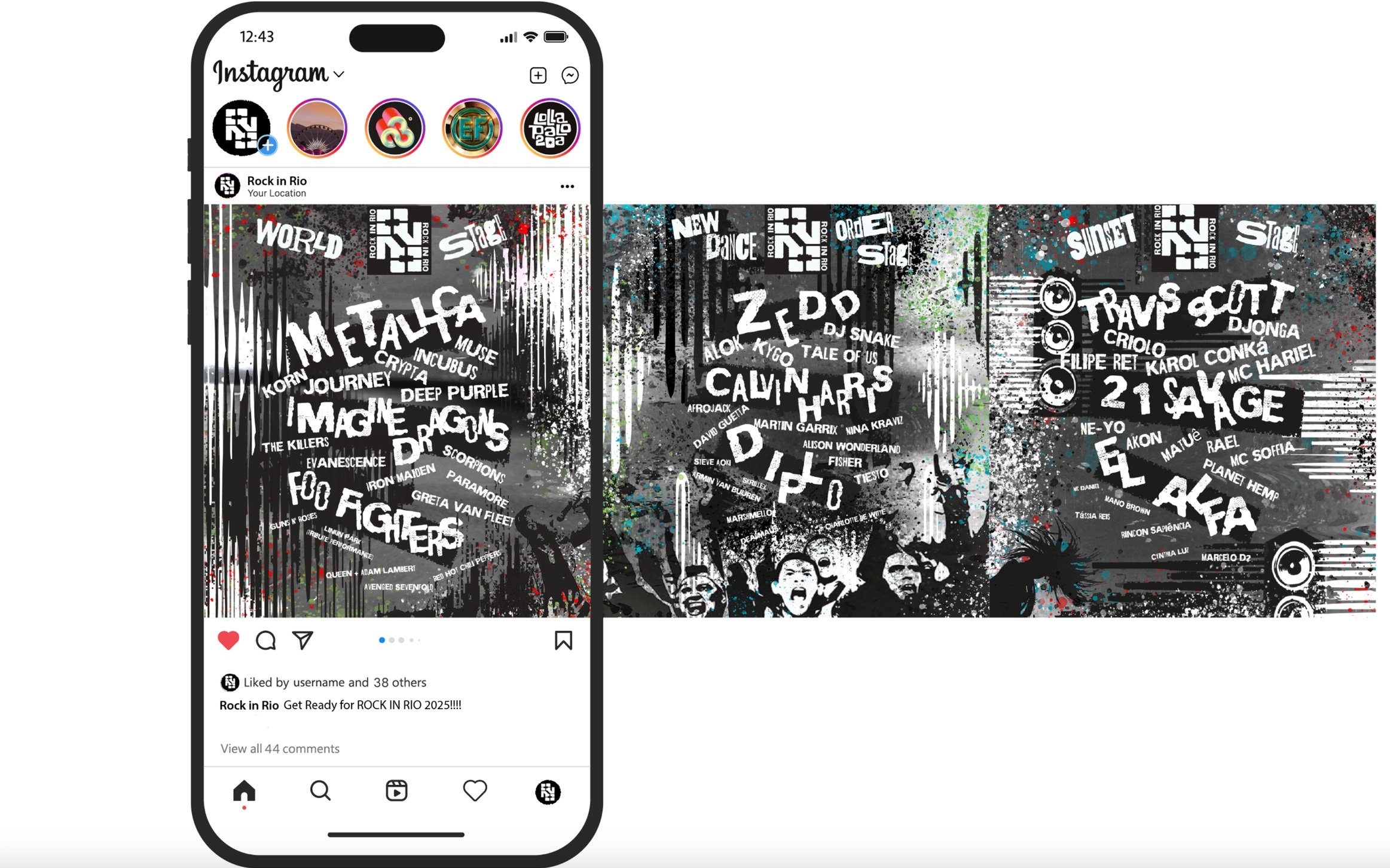
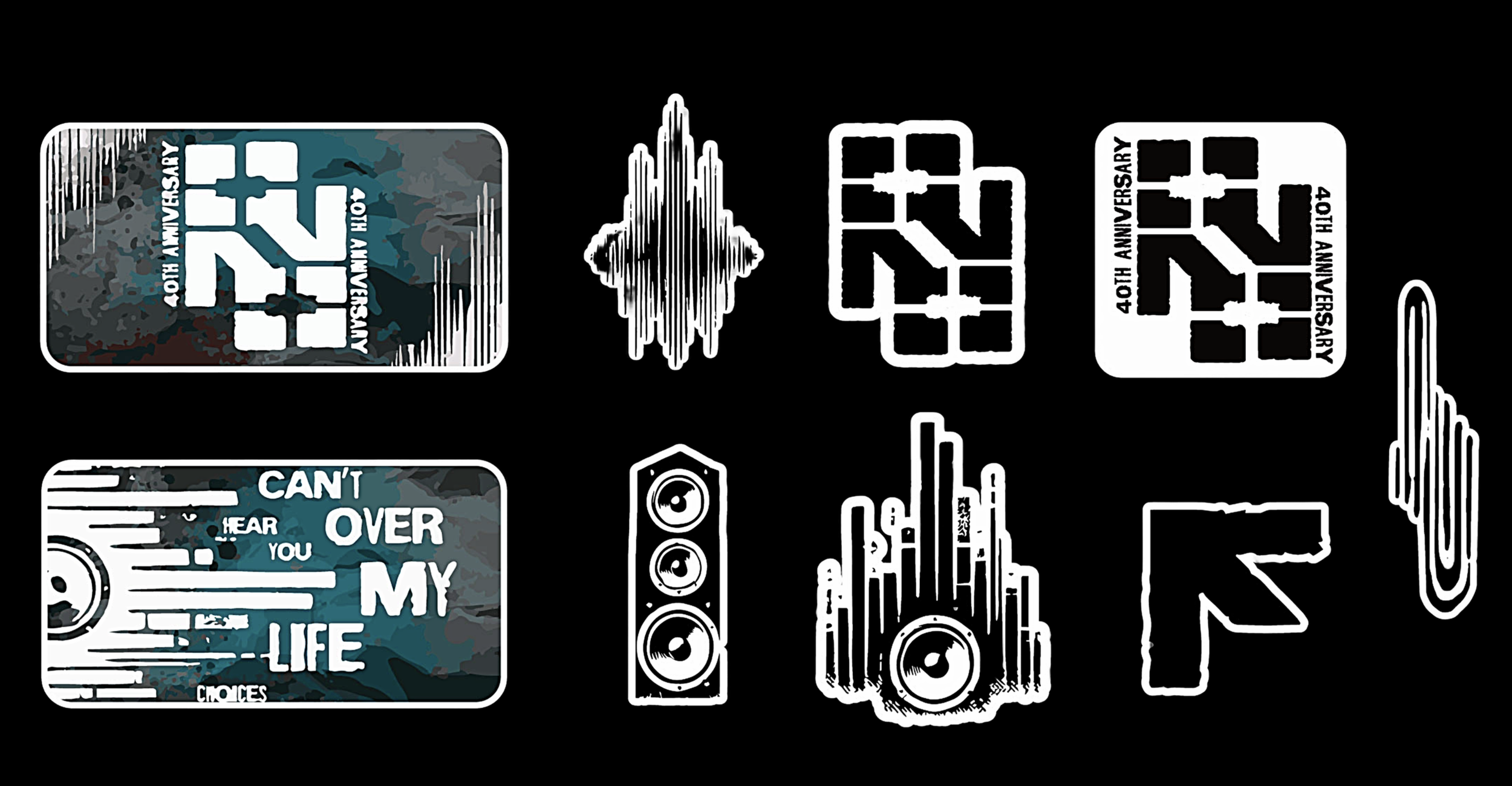
Being from the region, I introduced the idea of incorporating América Invertida, a 1943 pen-and-ink drawing by Uruguayan artist Joaquín Torres García, as a conceptual foundation. Together, our team developed "Revolt and Reimagine – The New Norm," a theme that challenges traditional perspectives—much like the artwork itself, which reorients South America to break societal norms. Given Rock in Rio’s origins in Brazil—a country where the festival emerged as a cultural revival after dictatorship—we redefined rebellion not as defiance, but as a force for inclusivity, diversity, and artistic freedom.
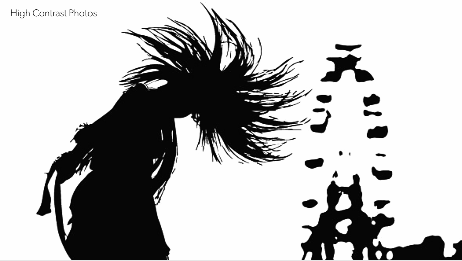
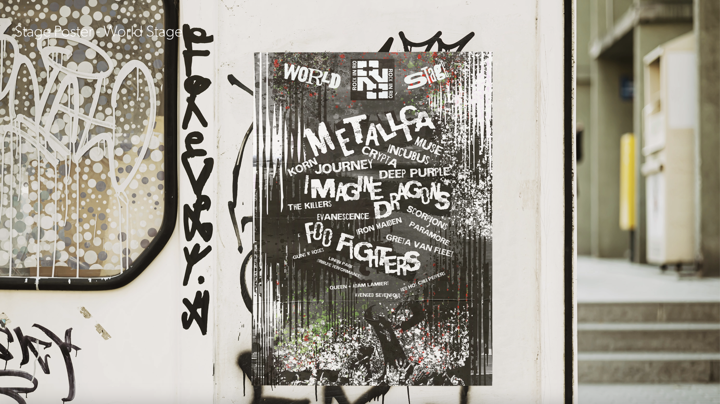
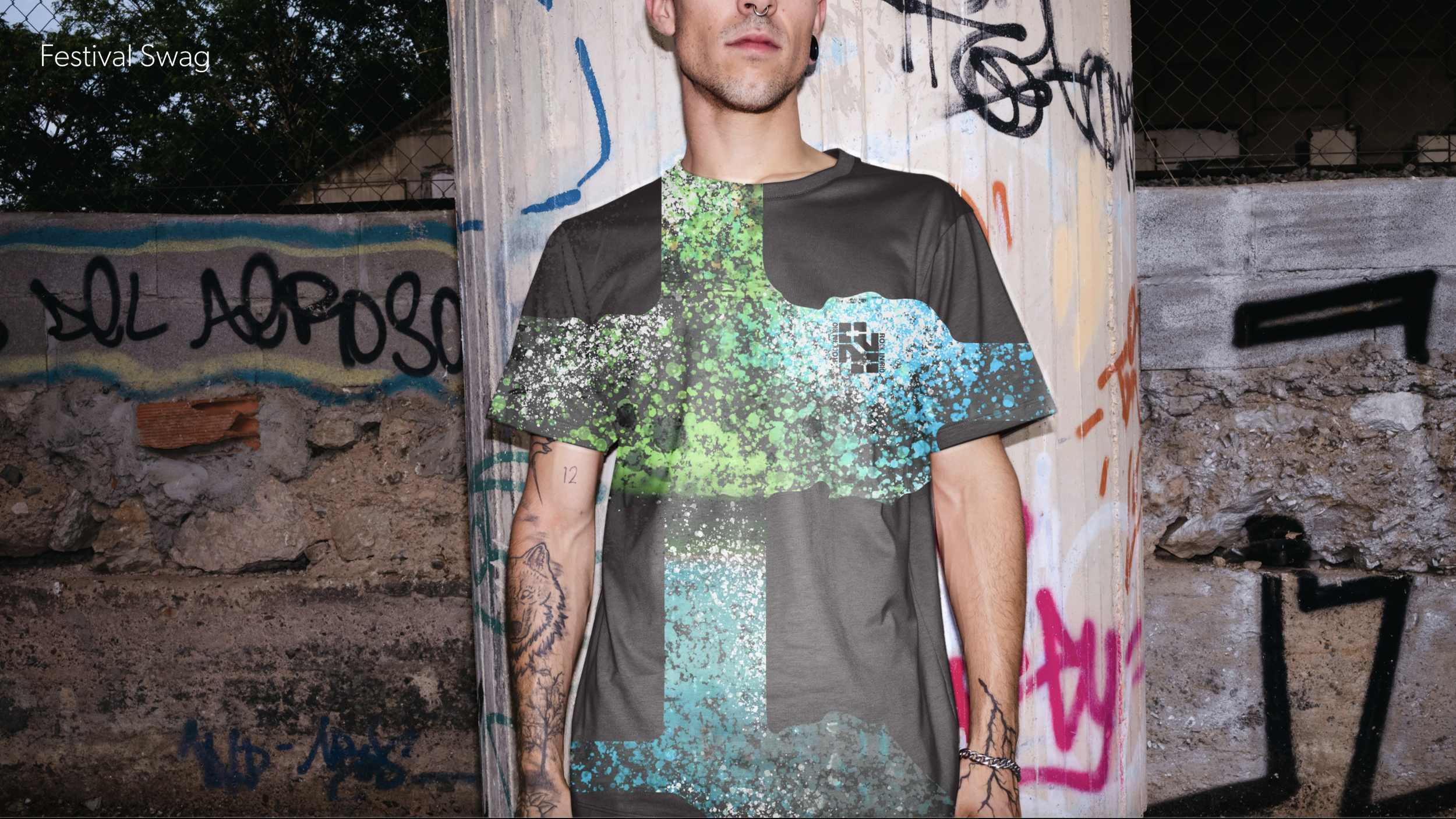
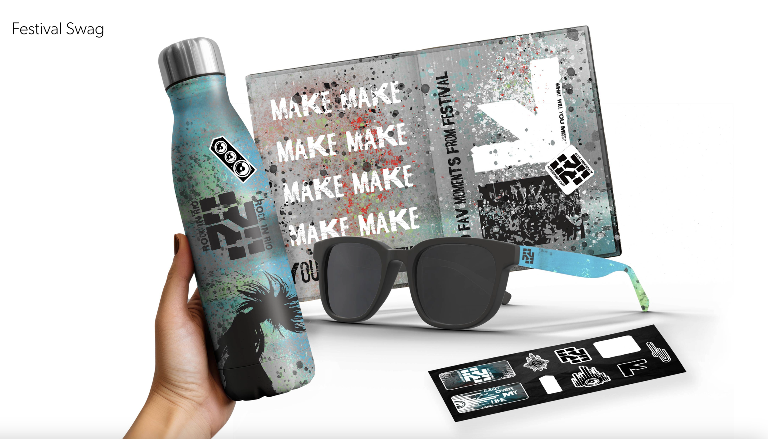
As part of the design team, I contributed to color development, typology, concept ideation, and mockups, ensuring our visual identity reflected the festival’s dynamic energy and Latin American roots. I also incorporated hand-scanned textures and backgrounds to add depth and authenticity, blending organic elements with bold digital compositions. Our design system featured bold gradients, high-contrast imagery, and custom iconography, connecting the festival’s history with a fresh, rebellious aesthetic.
Together, we created a rebrand that celebrates Rock in Rio’s legacy while embracing its future—a festival that doesn’t just exist within culture but actively reshapes it.


MOTION
A groundbreaking audiovisual experience that brings the energy of Rock in Rio to life through cutting-edge technology, immersive storytelling, and high-impact visuals. Designed to amplify the festival’s atmosphere, Rock in Rio Motion blends music, art, and innovation, transforming performances into unforgettable multi-sensory experiences. Whether through massive LED screens, dynamic stage effects, or interactive elements, it pushes the boundaries of live entertainment, making every moment feel larger than life.