

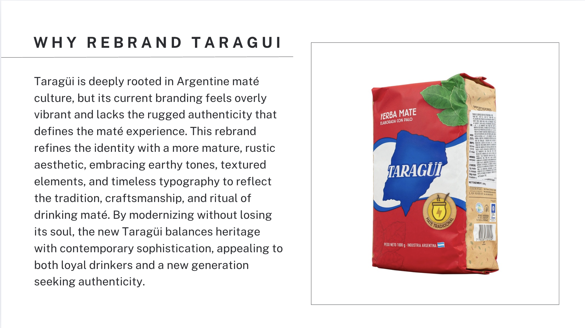
Taragüi: maté REBRAND
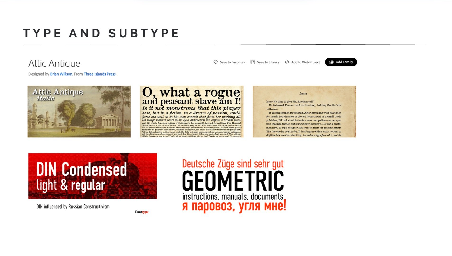
This rebrand of Taragüi, created for my SCAD portfolio class, reinterprets the heritage of Argentine maté with a more refined, mature aesthetic. By deepening the brand’s signature red (B83332) and blue (17313F) palette and introducing Attic Antique typography paired with DIN Condensed Bold, the design embraces the rustic, time-honored nature of maté culture while maintaining a sense of modern sophistication.
Maté is more than a drink—it is a ritual, a moment of pause, and a connection to tradition. This rebrand enhances that essence through earthy, muted tones and textured elements, reflecting the handcrafted origins of maté cultivation and the raw, authentic experience of sharing it. The packaging and accessories are designed to feel as enduring and timeless as the practice itself, balancing heritage with a contemporary, understated elegance.
The campaign slogan, "Mismo Gusto, Otro Estilo" (Same Taste, New Style), encapsulates this evolution—preserving the soul of Taragüi while refining its visual identity for a new generation of maté drinkers.
This project highlights my skills in branding, packaging, and visual storytelling, creating a cohesive, market-ready design that respects tradition while embracing the future.


This 5-second motion graphic encapsulates the essence of Taragüi’s rebrand, blending heritage with modern design. Through dynamic typography, smooth transitions, and rich color contrasts, the animation highlights the ritual and authenticity of maté culture. The Corrientes province shape subtly animates, reinforcing the brand’s roots, while the deep red and blue palette maintains its recognizable identity. The sequence ends with the tagline "Mismo Gusto, Otro Estilo", symbolizing the fusion of tradition and contemporary appeal.